这篇文章给大家分享的是有关使用纯CSS实现一张纪念卓别林卡片的方法是什么的内容。小编觉得挺实用的,因此分享给大家做个参考。一起跟随小编过来看看吧。
https://github.com/comehope/front-end-daily-challenges
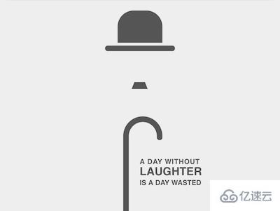
定义 dom,容器中包含的 3 个元素分别代表帽子、胡须和手杖:
<figure class="chaplin">
    <span class="hat"></span>
    <span class="beard"></span>
    <span class="stick"></span>
</figure>
居中显示:
body {
    margin: 0;
    height: 100vh;
    display: flex;
    align-items: center;
    justify-content: center;
}
定义容器尺寸,并设置子元素水平居中:
.chaplin {
    width: 40em;
    height: 30em;
    font-size: 10px;
    background-color: #eee;
    box-shadow: 0 0 3em rgba(0, 0, 0, 0.2);
    display: flex;
    flex-direction: column;
    align-items: center;
}
定义默认颜色,后面用 currentColor 引用此颜色:
.chaplin {
    color: #555;
}
画出帽子的轮廓:
.chaplin {
    position: relative;
}
.hat {
    position: absolute;
    width: 6.4em;
    height: 4.6em;
    background-color: currentColor;
    border-radius: 2.3em 2.3em 0 0;
    top: 1.4em;
}
用伪元素画出帽沿:
.hat::before {
    content: '';
    position: absolute;
    width: 10em;
    height: 0.8em;
    background-color: currentColor;
    border-radius: 0.4em;
    top: calc(100% + 0.4em);
    left: calc((100% - 10em) / 2);
}
画出胡子:
.beard {
    position: absolute;
    width: 1.5em;
    height: 0;
    top: 11.6em;
    border: solid transparent;
    border-width: 0 0.4em 1em 0.4em;
    border-bottom-color: currentColor;
}
画出手杖的杖杆:
.stick {
    position: absolute;
    width: 0.8em;
    height: 10.5em;
    background-color: currentColor;
    bottom: 0;
}
用 ::before 伪元素画出手杖的握柄:
.stick::before {
    content: '';
    position: absolute;
    box-sizing: border-box;
    width: 5.6em;
    height: 3em;
    border: 0.8em solid;
    border-radius: 5.6em 5.6em 0 0;
    border-bottom: none;
    top: -3em;
}
用 ::after 伪元素修饰握柄的端点,使其圆润自然:
.stick::after {
    content: '';
    position: absolute;
    width: 0.8em;
    height: 0.8em;
    background-color: currentColor;
    border-radius: 50%;
    left: calc(5.6em - 0.8em);
    top: -0.4em;
}
使手杖水平居中:
.stick {
    left: calc((100% - (5.6em - 0.8em)) / 2);
}
至此,抽象的卓别林形象完成,接下来排版一句他的名言。
在 dom 中增加一个 .quote 元素,并把一句话分为 3 段:
<figure class="chaplin">
    <span class="hat"></span>
    <span class="beard"></span>
    <span class="stick"></span>
    <p class="quote">
        <span>a day without</span>
        <span>laughter</span>
        <span>is a day wasted</span>
    </p>
</figure>
定位文字,并竖排 3 段文字:
.quote {
    position: absolute;
    left: 50%;
    bottom: 2.5em;
    font-family: sans-serif;
    text-transform: uppercase;
    font-weight: bold;
    display: flex;
    flex-direction: column;
}
调整字号和字间距,使 3 段文字对齐:
.quote span:nth-child(1) {
    letter-spacing: 0.05em;
}

.quote span:nth-child(2) {
    font-size: 1.6em;
}
感谢各位的阅读!关于使用纯CSS实现一张纪念卓别林卡片的方法是什么就分享到这里了,希望以上内容可以对大家有一定的帮助,让大家可以学到更多知识。如果觉得文章不错,可以把它分享出去让更多的人看到吧!
免责声明:本站发布的内容(图片、视频和文字)以原创、转载和分享为主,文章观点不代表本网站立场,如果涉及侵权请联系站长邮箱:is@yisu.com进行举报,并提供相关证据,一经查实,将立刻删除涉嫌侵权内容。


