这篇文章将为大家详细讲解有关css中clip-path属性如何使用,小编觉得挺实用的,因此分享给大家做个参考,希望大家阅读完这篇文章后可以有所收获。
clip-path的使用
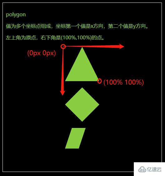
polygon
值为多个坐标点组成,坐标第一个值是x方向,第二个值是y方向。
左上角为原点,右下角是(100%,100%)的点。</p>
body {
  background-color: #000;
}

.fa {
  border: 1px solid #fff;
  color: yellowgreen;
  padding: 10px;
  margin: 10px;
}

.fa>p {
  width: 110px;
  height: 110px;
  background-color: yellowgreen;
  margin: 20px auto;
}

.polygon1 {
  clip-path: polygon(50% 0px, 100% 100%, 0px 100%)
}

.polygon2 {
  clip-path: polygon(0px 50%, 50% 0, 100% 50%, 50% 100%)
}

.polygon3 {
  clip-path: polygon(0% 60%, 20% 0%, 60% 0%, 40% 60%)
}
<div class="fa"> <p>polygon</p> <p>值为多个坐标点组成,坐标第一个值是x方向,第二个值是y方向。</p> <p>左上角为原点,右下角是(100%,100%)的点。</p> <div class="polygon1"></div> <div class="polygon2"></div> <div class="polygon3"></div> </div>
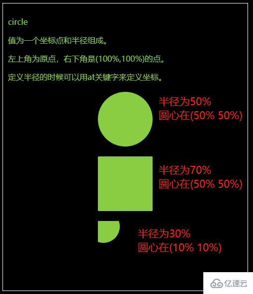
circle
值为一个坐标点和半径组成。
左上角为原点,右下角是(100%,100%)的点。
定义半径的时候可以用at关键字来定义坐标。
body {
  background-color: #000;
}

.fa {
  border: 1px solid #fff;
  color: yellowgreen;
  padding: 10px;
  margin: 10px;
}

.fa>p {
  width: 110px;
  height: 110px;
  background-color: yellowgreen;
  margin: 20px auto;
}

.circle1 {
  clip-path: circle(50% at 50% 50%)
}

.circle2 {
  clip-path: circle(70% at 50% 50%)
}

.circle3 {
  clip-path: circle(30% at 10% 10%)
}
<div class="fa"> <p>circle</p> <p>值为一个坐标点和半径组成。</p> <p>左上角为原点,右下角是(100%,100%)的点。</p> <p>定义半径的时候可以用at关键字来定义坐标。</p> <div class="circle1"></div> <div class="circle2"></div> <div class="circle3"></div> </div>
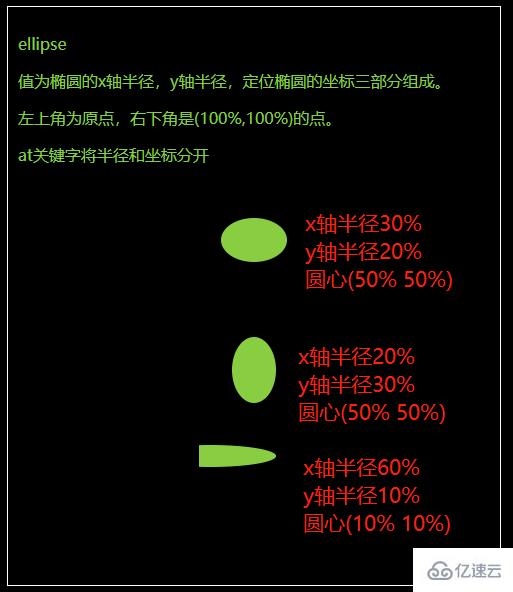
ellipse
值为椭圆的x轴半径,y轴半径,定位椭圆的坐标三部分组成。
左上角为原点,右下角是(100%,100%)的点。
at关键字将半径和坐标分开。
body {
  background-color: #000;
}

.fa {
  border: 1px solid #fff;
  color: yellowgreen;
  padding: 10px;
  margin: 10px;
}

.fa>p {
  width: 110px;
  height: 110px;
  background-color: yellowgreen;
  margin: 20px auto;
}

.ellipse1 {
  clip-path: ellipse(30% 20% at 50% 50%)
}

.ellipse2 {
  clip-path: ellipse(20% 30% at 50% 50%)
}

.ellipse3 {
  clip-path: ellipse(60% 10% at 10% 10%)
}
<div class="fa"> <p>ellipse</p> <p>值为椭圆的x轴半径,y轴半径,定位椭圆的坐标三部分组成。</p> <p>左上角为原点,右下角是(100%,100%)的点。</p> <p>at关键字将半径和坐标分开</p> <div class="ellipse1"></div> <div class="ellipse2"></div> <div class="ellipse3"></div> </div>
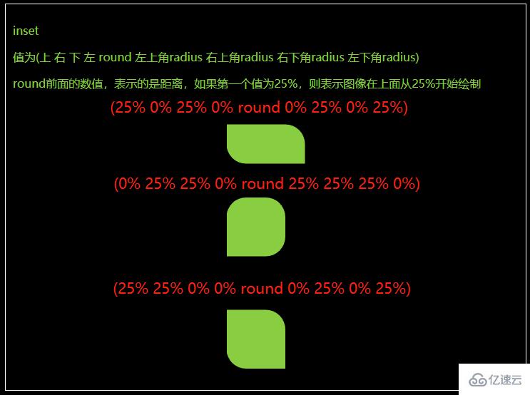
inset
值为(上 右 下 左 round 左上角radius 右上角radius 右下角radius 左下角radius)
round前面的数值,表示的是距离,如果第一个值为25%,则表示图像在上面从25%开始绘制。
body {
  background-color: #000;
}

.fa {
  border: 1px solid #fff;
  color: yellowgreen;
  padding: 10px;
  margin: 10px;
}

.fa>p {
  width: 110px;
  height: 110px;
  background-color: yellowgreen;
  margin: 20px auto;
}

.inset1 {
  clip-path: inset(25% 0% 25% 0% round 0% 25% 0% 25%)
}

.inset2 {
  clip-path: inset(0% 25% 25% 0% round 25% 25% 25% 0%)
}

.inset3 {
  clip-path: inset(25% 25% 0% 0% round 0% 25% 0% 25%)
}
<div class="fa"> <p>inset</p> <p>值为(上 右 下 左 round 左上角radius 右上角radius 右下角radius 左下角radius)</p> <p>round前面的数值,表示的是距离,如果第一个值为25%,则表示图像在上面从25%开始绘制</p> <div class="inset1"></div> <div class="inset2"></div> <div class="inset3"></div> </div>
关于css中clip-path属性如何使用就分享到这里了,希望以上内容可以对大家有一定的帮助,可以学到更多知识。如果觉得文章不错,可以把它分享出去让更多的人看到。
免责声明:本站发布的内容(图片、视频和文字)以原创、转载和分享为主,文章观点不代表本网站立场,如果涉及侵权请联系站长邮箱:is@yisu.com进行举报,并提供相关证据,一经查实,将立刻删除涉嫌侵权内容。


