css3е®һзҺ°еҫӘзҺҜжү§иЎҢеҠЁз”»зҡ„ж–№жі•
иҝҷзҜҮж–Үз« дё»иҰҒд»Ӣз»Қcss3е®һзҺ°еҫӘзҺҜжү§иЎҢеҠЁз”»зҡ„ж–№жі•пјҢж–Үдёӯд»Ӣз»Қзҡ„йқһеёёиҜҰз»ҶпјҢе…·жңүдёҖе®ҡзҡ„еҸӮиҖғд»·еҖјпјҢж„ҹе…ҙи¶Јзҡ„е°Ҹдјҷдјҙ们дёҖе®ҡиҰҒзңӢе®ҢпјҒ
дёҖгҖҒжңҖз»Ҳж•Ҳжһң

йңҖжұӮпјҡgiftеӣҫзүҮзҡ„е°ҸеҠЁз”»жҜҸйҡ”2sжү§иЎҢдёҖж¬ЎгҖӮ
йңҖжұӮе°ұдёҖеҸҘиҜқпјҢжҲ‘们зңӢдёҖдёӢе®һзҺ°иҝҮзЁӢгҖӮ
дәҢгҖҒе®һзҺ°иҝҮзЁӢ
1гҖҒзҪ‘йЎөз»“жһ„
<!DOCTYPE html>
<html>
<head>
<meta charset="UTF-8">
<title>Document</title>
<style>
a {
display: inline-block;
background-color: #cc2222;
text-decoration: none;
color: #fff;
font-size: 14px;
padding: 10px 12px;
width: 100px;
position: relative;
}
.ico {
position: absolute;
width: 14px;
height: 16px;
background: url(images/ico.png) no-repeat center;
background-size: 100%;
position: absolute;
top: 4px;
right: 27px;
}
</style>
</head>
<body>
<nav>
<a href="javascript:;">
дёҖе…ғеӨәе®қ
<div></div>
</a>
</nav>
</body>
</html>ж•Ҳжһңеӣҫпјҡ

2гҖҒеҺҹе§ӢеҠЁз”»
еҺҹе§ӢеҠЁз”»ж•Ҳжһңдёәпјҡйј ж ҮhoverдёҠеҺ»еҮәзҺ°еҠЁз”»гҖӮ
еҠЁз”»ж ·ејҸеҰӮдёӢпјҡ
/*еҠЁз”»*/
.ico:hover{
-webkit-animation: Tada 1s both;
-moz-animation: Tada 1s both;
-ms-animation: Tada 1s both;
animation: Tada 1s both
}
/*жөҸи§ҲеҷЁе…је®№жҖ§йғЁеҲҶз•ҘиҝҮ*/
@keyframes Tada {
0% {
transform: scale(1);
transform: scale(1)
}
10%,20% {
transform: scale(0.9) rotate(-3deg);
transform: scale(0.9) rotate(-3deg)
}
30%,50%,70%,90% {
transform: scale(1.1) rotate(3deg);
transform: scale(1.1) rotate(3deg)
}
40%,60%,80% {
transform: scale(1.1) rotate(-3deg);
transform: scale(1.1) rotate(-3deg)
}
100% {
transform: scale(1) rotate(0);
transform: scale(1) rotate(0)
}
}ж•Ҳжһңпјҡйј ж ҮhoverдёҠеҺ»giftеӣҫзүҮдјҡеҠЁдёҖеҠЁгҖӮ

3гҖҒе®һзҺ°еҸҳеҢ–еҗҺзҡ„йңҖжұӮ
йңҖжұӮеҸҳеҠЁпјҢиҰҒжұӮдёҚеҶҚжҳҜhoverдёҠеҺ»еұ•зӨәеҠЁз”»пјҢиҖҢжҳҜжҜҸйҡ”2sеұ•зӨәдёҖж¬ЎеҠЁз”»гҖӮ
жҖқи·ҜпјҡдёҚйңҖиҰҒhoverдёҠеҺ»еҮәзҺ°еҠЁз”»пјҢе°ұжҠҠhoverеҺ»жҺүпјҢжҜҸйҡ”2sжҳҫзӨәдёҖж¬ЎеҠЁз”»пјҢеҫҲе®№жҳ“жғіеҲ°е»¶иҝҹ2s,然еҗҺеҠЁз”»дёҖзӣҙжү§иЎҢгҖӮ
жӯӨж—¶зӣёе…іж ·ејҸеҸҳжҲҗпјҡ
.ico {
	-webkit-animation: Tada 1s 2s both infinite;
	-moz-animation: Tada 1s 2s both infinite;
	-ms-animation: Tada 1s 2s both infinite;
	animation: Tada 1s 2s both infinite;
}дҪҶжҳҜжҳҫзӨәзҡ„ж•ҲжһңжҳҜпјҡйЎөйқўеҠ иҪҪ第дёҖж¬ЎеҮәзҺ°еҠЁз”»дјҡ延иҝҹ2sпјҢеҗҺйқўзҡ„еҠЁз”»е°ҶдёҚеҶҚжңү延иҝҹгҖӮеҰӮдёӢпјҢиҝҷжҳҜдёҚз¬ҰеҗҲйңҖжұӮзҡ„гҖӮ
дёәдәҶзңӢеҮәж•ҲжһңпјҢдёӢеӣҫдёә延иҝҹ6sзҡ„ж•ҲжһңгҖӮ

жӯӨж—¶жҚўз§ҚжҖқи·ҜпјҢдёҚиҰҒ延иҝҹжү§иЎҢеҠЁз”»пјҢиҖҢжҳҜеҠЁз”»зҡ„ж•Ҳжһңжң¬иә«е°ұжҳҜеүҚ2sе…ғзҙ дёҚеҠЁпјҢеҗҺ1sжҳҜе…ғзҙ еҠЁпјҢ然еҗҺдёҖзӣҙеҫӘзҺҜжү§иЎҢгҖӮ иҝҷж ·еңЁи§Ҷи§үдёҠе°ұдјҡзңӢиө·жқҘжҳҜ延иҝҹ2sжү§иЎҢ1sеҠЁз”»гҖӮ
и®Ўз®—дёҖдёӢпјҢеҺҹжқҘзҡ„зҷҫеҲҶжҜ”иҠӮзӮ№еҸҳжҲҗдәҶеӨҡе°‘гҖӮ
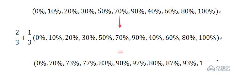
е°ҶеҠЁз”»жҖ»ж—¶й•ҝеҸҳжҲҗ3sпјҢз”Ёи®Ўз®—еҮәзҡ„зҷҫеҲҶжҜ”жӣҝжҚўеҺҹжқҘзҡ„зҷҫеҲҶжҜ”пјҢд»Јз ҒеҰӮдёӢпјҡ
.ico{
    -webkit-animation: Tada 3s both infinite;
    -moz-animation: Tada 3s both infinite;
    -ms-animation: Tada 3s both infinite;
    animation: Tada 3s both infinite;
}
@keyframes Tada {
    0% {
        transform: scale(1);
        transform: scale(1)
    }

    70%,73%{
        transform: scale(0.9) rotate(-3deg);
        transform: scale(0.9) rotate(-3deg)
    }

    77%,83%,90%,97%  {
        transform: scale(1.1) rotate(3deg);
        transform: scale(1.1) rotate(3deg)
    }

    80%,87%,93%{
        transform: scale(1.1) rotate(-3deg);
        transform: scale(1.1) rotate(-3deg)
    }

    100% {
        transform: scale(1) rotate(0);
        transform: scale(1) rotate(0)
    }
}ж•Ҳжһңе°ұжҳҜжҲ‘们жңҹжңӣзҡ„дәҶпјҡ

д»ҘдёҠжҳҜcss3е®һзҺ°еҫӘзҺҜжү§иЎҢеҠЁз”»зҡ„ж–№жі•зҡ„жүҖжңүеҶ…е®№пјҢж„ҹи°ўеҗ„дҪҚзҡ„йҳ…иҜ»пјҒеёҢжңӣеҲҶдә«зҡ„еҶ…е®№еҜ№еӨ§е®¶жңүеё®еҠ©пјҢжӣҙеӨҡзӣёе…ізҹҘиҜҶпјҢж¬ўиҝҺе…іжіЁдәҝйҖҹдә‘иЎҢдёҡиө„и®Ҝйў‘йҒ“пјҒ


