使用纯CSS实现一个圆环旋转错觉的动画效果?这个问题可能是我们日常学习或工作经常见到的。希望通过这个问题能让你收获颇深。下面是小编给大家带来的参考内容,让我们一起来看看吧!
https://github.com/comehope/front-end-daily-challenges
定义 dom,容器中包含 10 个 <div> 子元素,每个 <div> 子元素内还有一个 <span> 子元素:
<figure class="container">
    <div><span></span></div>
    <div><span></span></div>
    <div><span></span></div>
    <div><span></span></div>
    <div><span></span></div>
    <div><span></span></div>
    <div><span></span></div>
    <div><span></span></div>
    <div><span></span></div>
    <div><span></span></div>
</figure>
定义容器尺寸:
.container {
    width: 17em;
    height: 17em;
    font-size: 16px;
}
定义子元素的尺寸,和容器相同:
.container {
    position: relative;
}

.container div {
    position: absolute;
    width: inherit;
    height: inherit;
}
在子元素的正中画一个黄色的小方块:
.container div {
    display: flex;
    align-items: center;
    justify-content: center;
}

.container span {
    position: absolute;
    width: 1em;
    height: 1em;
    background-color: yellow;
}
增加让小方块左右移动的动画效果,动画时长还会在后面用到,所以定义成变量:
.container span {
    --duration: 2s;
    animation: move var(--duration) infinite;
}

@keyframes move {
    0%, 100% {
        left: calc(10% - 0.5em);
    }

    50% {
        left: calc(90% - 0.5em);
    }
}
用贝赛尔曲线调整动画的时间函数,使小方块看起来就像在左右两侧跳来跳去:
.container span {
    animation: move var(--duration) cubic-bezier(0.6, -0.3, 0.7, 0) infinite;
}
增加小方块变形的动画,使它看起来有下蹲起跳的拟人效果:
.container span {
    animation:
        move var(--duration) cubic-bezier(0.6, -0.3, 0.7, 0) infinite,
        morph var(--duration) ease-in-out infinite;
}

@keyframes morph {
    0%, 50%, 100% {
        transform: scale(0.75, 1);
    }

    25%, 75% {
        transform: scale(1.5, 0.5);
    }
}
至此,完成了 1 个方块的动画。接下来设置多个方块的动画效果。
为子元素定义 CSS 下标变量:
.container div:nth-child(1) { --n: 1; }
.container div:nth-child(2) { --n: 2; }
.container div:nth-child(3) { --n: 3; }
.container div:nth-child(4) { --n: 4; }
.container div:nth-child(5) { --n: 5; }
.container div:nth-child(6) { --n: 6; }
.container div:nth-child(7) { --n: 7; }
.container div:nth-child(8) { --n: 8; }
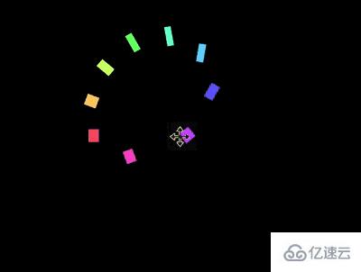
.container div:nth-child(9) { --n: 9; }旋转子元素,使小方块分布均匀地在容器的四周,围合成一个圆形:
.container p {
    transform: rotate(calc(var(--n) * 40deg));
}
设置动画延时,现在看起来就像是一群小方块贴着一个圆的内边线在旋转了(但实际上没有任何元素在做旋转运动,大脑感觉到的旋转是一种错觉):
.container span {
    animation-delay: calc(var(--duration) / 9 * var(--n) * -1);
}
最后,为小方块上色:
.container span {
    background-color: hsl(calc(var(--n) * 80deg), 100%, 70%);
}
感谢各位的阅读!看完上述内容,你们对使用纯CSS实现一个圆环旋转错觉的动画效果大概了解了吗?希望文章内容对大家有所帮助。如果想了解更多相关文章内容,欢迎关注亿速云行业资讯频道。
免责声明:本站发布的内容(图片、视频和文字)以原创、转载和分享为主,文章观点不代表本网站立场,如果涉及侵权请联系站长邮箱:is@yisu.com进行举报,并提供相关证据,一经查实,将立刻删除涉嫌侵权内容。


