这篇文章主要介绍了css3实现文字渐变的方法,具有一定借鉴价值,需要的朋友可以参考下。希望大家阅读完这篇文章后大有收获。下面让小编带着大家一起了解一下。
在开发过程中,UI设计师经常会设计一些带渐变文字的设计图,给到我们程序员,而我们程序员们呢,大多都是默默地叹息传来,不过CSS3的诞生,解决了前端开发过程中的好多个难题,比如动画,遮罩等等
1. 我们今天要实现的就是使用纯CSS实现渐变文字,下面是预览图片:
2. 基础样式:
.gradient-text{
text-align: left;
text-indent:30px;
line-height: 50px;
font-size:40px;
font-weight:bolder;
position: relative;
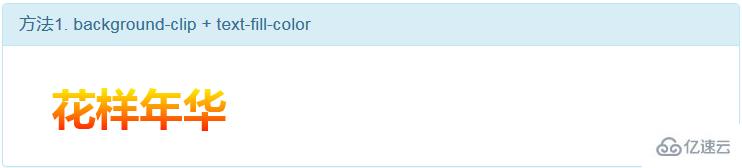
}3. 第一种方法,使用 background-cli、 text-fill-color:
.gradient-text-one{
background-image:-webkit-linear-gradient(bottom,red,#fd8403,yellow);
-webkit-background-clip:text;
-webkit-text-fill-color:transparent;
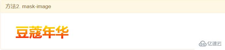
}4. 第二种方法,使用 mask-image:
.gradient-text-two{
color:red;
}
.gradient-text-two[data-content]::after{
content:attr(data-content);
display: block;
position:absolute;
color:yellow;
left:0;
top:0;
z-index:2;
-webkit-mask-image:-webkit-gradient(linear, 0 0, 0 bottom, from(yellow), to(rgba(0, 0, 255, 0)));
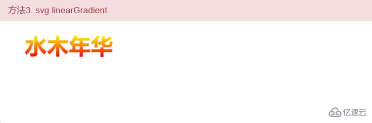
}5.第三种方法,使用 linearGradient、fill:
.gradient-text-three{
    fill:url(#SVGID_1_);
    font-size:40px;
    font-weight:bolder;
}
<svg viewBoxs="0 0 500 300" class="svgBox">
<defs>
<linearGradient id="SVGID_1_" gradientUnits="userSpaceOnUse" x1="0" y1="10" x2="0" y2="50">
<stop offset="0" style="stop-color:yellow"/>
<stop offset="0.5" style="stop-color:#fd8403"/>
<stop offset="1" style="stop-color:red"/>
</linearGradient>
</defs>
<text text-anchor="middle" class="gradient-text-three" x="110px" y="30%">花信年华</text>
</svg>6. 该DEMO全部代码:
<!DOCTYPE html>
<html>
<head>
<meta charset="utf-8">
<meta name="viewport" content="width=device-width, user-scalable=no, initial-scale=1.0, maximum-scale=1.0, minimum-scale=1.0">
<title>CSS3渐变字体</title>
<link rel="stylesheet" href="https://cdn.bootcss.com/bootstrap/3.3.7/css/bootstrap.min.css">
<script src="https://cdn.bootcss.com/jquery/2.1.1/jquery.min.js"></script>
<script src="https://cdn.bootcss.com/bootstrap/3.3.7/js/bootstrap.min.js"></script>
<style type="text/css">
*{margin:0;padding:0;}
body,html{width:100%;height:100%;}
.wrapper{width:80%;margin:0 auto;margin-top:30px;}
.gradient-text{
text-align: left;
text-indent:30px;
line-height: 50px;
font-size:40px;
font-weight:bolder;
position: relative;
}
.gradient-text-one{
background-image:-webkit-linear-gradient(bottom,red,#fd8403,yellow);
-webkit-background-clip:text;
-webkit-text-fill-color:transparent;
}
.gradient-text-two{
color:red;
}
.gradient-text-two[data-content]::after{
content:attr(data-content);
display: block;
position:absolute;
color:yellow;
left:0;
top:0;
z-index:2;
-webkit-mask-image:-webkit-gradient(linear, 0 0, 0 bottom, from(yellow), to(rgba(0, 0, 255, 0)));
}
.gradient-text-three{
fill:url(#SVGID_1_);
font-size:40px;
font-weight:bolder;
}
</style>
</head>
<body>
<section class="wrapper">
<div class="panel panel-info">
<div class="panel-heading">
<h4 class="panel-title">方法1. background-clip + text-fill-color</h4>
</div>
<div class="panel-body">
<h4 class="gradient-text gradient-text-one">花样年华</h4>
</div>
</div>
<div class="panel panel-warning">
<div class="panel-heading">
<h4 class="panel-title">方法2. mask-image</h4>
</div>
<div class="panel-body">
<h4 class="gradient-text gradient-text-two" data-content="豆蔻年华">豆蔻年华</h4>
</div>
</div>
<div class="panel panel-danger">
<div class="panel-heading">
<h4 class="panel-title">方法3. svg linearGradient</h4>
</div>
<div class="panel-body">
<svg viewBoxs="0 0 500 300" class="svgBox">
    <defs>
        <linearGradient id="SVGID_1_" gradientUnits="userSpaceOnUse" x1="0" y1="10" x2="0" y2="50">
            <stop  offset="0" style="stop-color:yellow"/>
            <stop  offset="0.5" style="stop-color:#fd8403"/>
            <stop  offset="1" style="stop-color:red"/>
        </linearGradient>
    </defs>
    <text text-anchor="middle" class="gradient-text-three" x="110px" y="30%">花信年华</text>
</svg>
</div>
</div>
</section>
</body>
</html>感谢你能够认真阅读完这篇文章,希望小编分享css3实现文字渐变的方法内容对大家有帮助,同时也希望大家多多支持亿速云,关注亿速云行业资讯频道,遇到问题就找亿速云,详细的解决方法等着你来学习!
免责声明:本站发布的内容(图片、视频和文字)以原创、转载和分享为主,文章观点不代表本网站立场,如果涉及侵权请联系站长邮箱:is@yisu.com进行举报,并提供相关证据,一经查实,将立刻删除涉嫌侵权内容。


