这篇文章给大家分享的是有关CSS3中input框如何实现类似Google登录的动画效果的内容。小编觉得挺实用的,因此分享给大家做个参考,一起跟随小编过来看看吧。
用css3将input框写出类似Google登录页面的动画效果
效果一
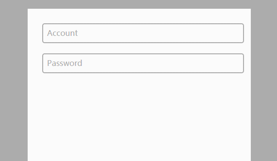
代码如下
CSS
body{
    background-color:#acacac;
  }
  .form-container{
    display: block;
    position: relative;
    width: 400px;
    height: 400px;
    background: #fff;
    margin: 50px auto;
    padding: 30px;
  }

  input{
    display: block;
    position: relative;
    background: none;
    border: 2px solid #acacac;
    border-radius:5px;
    width: 100%;
    font-weight: bold;
    padding-left:10px;
    font-size: 16px;
    height:35px;
    z-index: 1;
  }

  label{
    display: inline-block;
    position: relative;
    top: -32px;
    left: 10px;
    color: #acacac;
    font-size: 16px;
    z-index: 2;
    transition: all 0.2s ease-out;
  }

  input:focus, input:valid{
    outline: none;
    border: 2px solid #00aced;
  }

  input:focus + label, input:valid + label{
    top: -50px;
    font-size: 16px;
    color: #00aced;
    background-color:#fff;
  }
HTML
<div class="main">
    <div class="form-container">
      <input type="text" name="input1" required>
      <label for="input1">Account</label>

      <input type="text" name="input2" required>
      <label for="input2">Password</label>
    </div>
  </div>
效果二
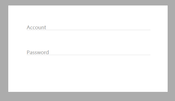
代码如下:
CSS
body{
    background-color:#acacac;
  }
  .form-container{
    display: block;
    position: relative;
    width: 400px;
    background: #fff;
    margin: 50px auto;
    padding: 60px;
  }

  input{
    display: block;
    position: relative;
    background: none;
    border: none;
    border-bottom: 1px solid #ddd;
    width: 100%;
    font-weight: bold;
    font-size: 16px;
    z-index: 2;
  }

  label{
    display: block;
    position: relative;
    top: -20px;
    left: 0px;
    color: #999;
    font-size: 16px;
    z-index: 1;
    transition: all 0.3s ease-out;
    margin-bottom:40px;
  }

  input:focus, input:valid{
    outline: none;
    border-bottom: 1px solid #00aced;
  }

  input:focus + label, input:valid + label{
    top: -50px;
    font-size: 16px;
    color: #00aced;
    background-color:#fff;
  }
HTML
<div class="main">
    <div class="form-container">
      <input type="text" name="input1" required>
      <label for="input1">Account</label>
      <input type="text" name="input2" required>
      <label for="input2">Password</label>
    </div>
  </div>
感谢各位的阅读!关于“CSS3中input框如何实现类似Google登录的动画效果”这篇文章就分享到这里了,希望以上内容可以对大家有一定的帮助,让大家可以学到更多知识,如果觉得文章不错,可以把它分享出去让更多的人看到吧!
免责声明:本站发布的内容(图片、视频和文字)以原创、转载和分享为主,文章观点不代表本网站立场,如果涉及侵权请联系站长邮箱:is@yisu.com进行举报,并提供相关证据,一经查实,将立刻删除涉嫌侵权内容。


