css 中不定宽高的元素居中布局如何解决?很多新手对此不是很清楚,为了帮助大家解决这个难题,下面小编将为大家详细讲解,有这方面需求的人可以来学习下,希望你能有所收获。
1. 水平居中
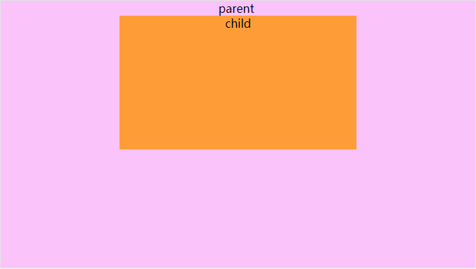
公共代码:
html:
<div class="parent">
    parent
    <br>
    <div class="child">
        child
    </div>
</div>
css:
html, body {
    margin: 0;
    width: 100%;
    height: 100%;

    .parent {
        width: 100%;
        height: 100%;
        background: #fac3fa;

        .child {
            width: 50%;
            height: 50%;
            background: #fe9d38;
        }
    }
}
方案一: text-align(父) + inline-block(子)
代码:
css:
.parent {
text-align: center;
.child {
display: inline-block;
}
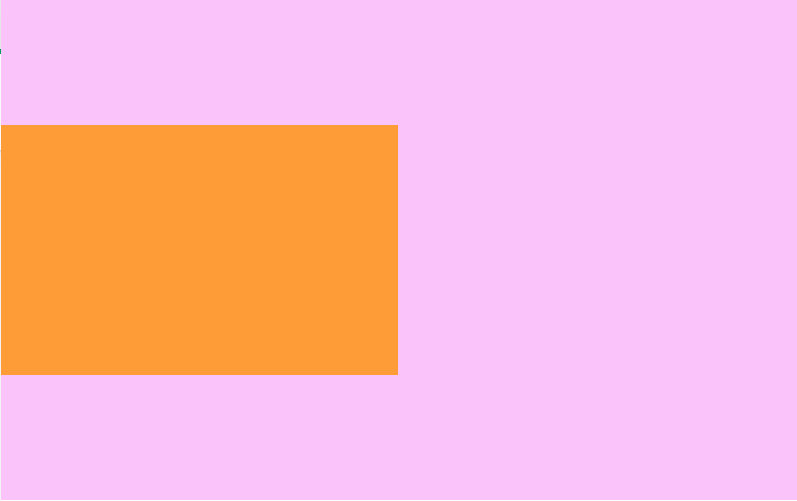
}方案二: 块级元素 + margin: 0 auto;
.child {
display: block; // 非块级元素时设置
margin: 0 auto;
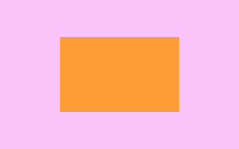
}方案三: absolute + transform
.parent {
    position: absolute;
    left: 50%;
    transform: translateX(-50%);
}
方案四: flex
注: 由于使用flex的关系, 这里去掉了 parent 和<br>
.parent {
    display: flex;
    justify-content: center;
}
2. 垂直居中
公共代码:
html:
<div class="parent">
    <div class="child"></div>
</div>
css:
html, body {
    margin: 0;
    width: 100%;
    height: 100%;
}
.parent {
    display: table-cell;
    width: 800px;
    height: 500px;
    background: #fac3fa;

    .child {
        width: 50%;
        height: 50%;
        background: #fe9d38;
    }
}
方案一: table-cell(父) + vertical-align(子)
.parent {
    display: table-cell;
    vertical-align: middle;
}
方案二: absolute + transform
.parent {
    position: relative;

    .child {
        position: absolute;
        top: 50%;
        transform: translateY(-50%);
    }
}
方案三: flex
.parent {
    display: flex;
    align-items: center;
}
3. 水平垂直居中
公共代码同[垂直居中]
常用方案一: absolute + transform
.parent {
    position: relative;

    .child {
        position: absolute;
        top: 50%;
        left: 50%;
        transform: translate(-50%, -50%);
    }
}
常用方案二: flex
.parent {
    display: flex;
    align-items: center;
    justify-content: center;
}
看完上述内容是否对您有帮助呢?如果还想对相关知识有进一步的了解或阅读更多相关文章,请关注亿速云行业资讯频道,感谢您对亿速云的支持。
免责声明:本站发布的内容(图片、视频和文字)以原创、转载和分享为主,文章观点不代表本网站立场,如果涉及侵权请联系站长邮箱:is@yisu.com进行举报,并提供相关证据,一经查实,将立刻删除涉嫌侵权内容。


