小编给大家分享一下CSS中如何实现Sticky Footer,相信大部分人都还不怎么了解,因此分享这篇文章给大家参考一下,希望大家阅读完这篇文章后大有收获,下面让我们一起去了解一下吧!
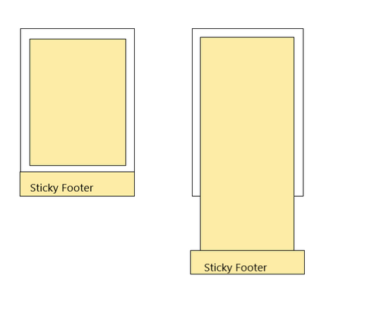
什么是 “Sticky Footer”
所谓 “Sticky Footer”,并不是什么新的前端概念和技术,它指的就是一种网页效果: 如果页面内容不足够长时,页脚固定在浏览器窗口的底部;如果内容足够长时,页脚固定在页面的最底部。但如果网页内容不够长,置底的页脚就会保持在浏览器窗口底部。
先来看看下面的例子, 代码如下
<div class="header">
    顶部
</div>
<div class="main">
    <p>中间部分</p>
    <p>中间部分</p>
    <p>中间部分</p>
    <p>中间部分</p>
    <p>中间部分</p>
    <p>中间部分</p>
    <p>中间部分</p>
    <p>中间部分</p>
    <p>中间部分</p>
    <p>中间部分</p>
    <p>中间部分</p>
    <p>中间部分</p>
    <p>中间部分</p>
    <p>中间部分</p>
    <p>中间部分</p>
</div>
<div class="footer">
    <i class="fa fa-copyright" aria-hidden="true"></i>
    <div>底部</div>
</div>
.header {
    background-color: #3498DB;
    height: 50px;
    line-height: 50px;
    text-align: center;
    color: #fff;
}
.main {
    overflow: auto;
    box-sizing: border-box;
}

.footer {
    background-color: #ECF0F1;
    height: 50px;
    line-height: 50px;
    text-align: center;
}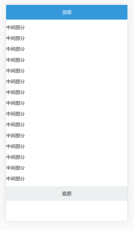
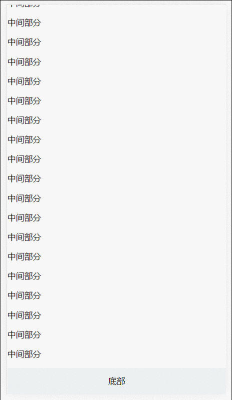
细心读者应该发现问题了,底部 footer 位置会随着主体内容高度变化自动变化,当主体内容小于视口的高度时, footer 并没有黏贴在底部. 那么解决这样问题尼?
negative margin
<div class="main">
    <p>中间部分</p>
    <p>中间部分</p>
    <p>中间部分</p>
    <p>中间部分</p>
    <p>中间部分</p>
    <p>中间部分</p>
    <p>中间部分</p>
    <p>中间部分</p>
    <p>中间部分</p>
    <p>中间部分</p>
    <p>中间部分</p>
    <p>中间部分</p>
    <p>中间部分</p>
    <p>中间部分</p>
    <p>中间部分</p>
    <p>中间部分</p>
    <p>中间部分</p>
    <p>中间部分</p>
    <p>中间部分</p>
    <p>中间部分</p>
    <p>中间部分</p>
    <p>中间部分</p>
    <p>中间部分</p>
    <p>中间部分</p>
</div>
<div class="footer">
    <i class="fa fa-copyright" aria-hidden="true"></i>
    <div>底部</div>
</div>
html,
body {
    height: 100%;
}
.header{
    background-color: #3498DB;
    height: 50px;
    line-height: 50px;
    text-align: center;
    color: #fff;
    position: fixed;
    width: 100%;
}
.main {
    min-height: 100%;
    overflow: auto;
    box-sizing: border-box;
    padding-bottom: 50px;
    padding-top: 50px;
    margin-bottom: -50px;
}

.footer {
    background-color: #ECF0F1;
    height: 50px;
    line-height: 50px;
    text-align: center;
}
固定高度解决方案
使用如下属性
min-height
calc
vh
calc() 是 CSS3引入的,让你在声明CSS属性值时可以执行一些计算.
它可以用在一些数值场合; 详细可以查阅这里MDN
vh(Viewport Height): 顾明思议,表示的是视口的高度.
详细信息以及兼容可以查阅这里: caniuse
针对上面的代码进行修改,如下
.main {
    min-height: calc(100vh - 50px - 50px);
}
这样完成我们期望的,但是有个缺点就是每次我们都要去计算 header、footer 的高度.
这显然不完美, 假如DOM结构层级多的话,需要计算的内容更多.
absolute
absolute相信大家熟悉不过了,这里就不在啰嗦了; 这里注意这个就行, absolute 元素其位置是根据什么来进行计算并进行定位的?
<div class="header">
    头部
</div>
<div class="main">
    <p>中间部分</p>
    <p>中间部分</p>
    <p>中间部分</p>
    <p>中间部分</p>
    <p>中间部分</p>
    <p>中间部分</p>
    <p>中间部分</p>
    <p>中间部分</p>
    <p>中间部分</p>
    <p>中间部分</p>
    <p>中间部分</p>
    <p>中间部分</p>
    <p>中间部分</p>
</div>
<div class="footer">
    <i class="fa fa-copyright" aria-hidden="true"></i>
    <div>底部</div>
</div>
html{
    position: relative;
    min-height: 100%;
}
body{
    margin-bottom: 50px;
}
.header {
    background-color: #3498DB;
    height: 50px;
    line-height: 50px;
    text-align: center;
    color: #fff;
}
.main {
    overflow: auto;
}

.footer {
    position: absolute;
    bottom:0;
    width: 100%;
    background-color: #ECF0F1;
    height: 50px;
    line-height: 50px;
    text-align: center;
}
代码是不是很简单,这里主要 position的应用:
1 默认情况下, 当给某个元素设置为 position:absolute 时, 在祖先元素没有设置 position: absolute or fixed or relative
时, 其默认相对于初始包含块( initial containing block ).
2 什么初始化包含块?
The containing block in which the root element lives is a rectangle called the initial containing block. For continuous media, it has the dimensions of the viewport and is anchored at the canvas origin;
这是w3c对包含块介绍, 这段话大概意思, 根元素(document)为默认为初始化包含块,其初始化块的大小为视口的大小.
理解这几个概念后,我们再来看上面的代码就一目了然了!
html{
        position: relative;
        min-height: 100%;
    }

    body{
        margin-bottom: 50px;
    }
position:relative 改变包含块,让设置absolute元素根据html元素来进行定位.
min-height: 保证在内容不足视口时, footer能黏贴在底部.
margin-bottom 值为 footer 元素的高度,这样保证内容区域不会被footer遮住.
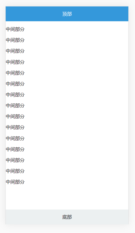
Flexbox
Flexbox是最完美的方案。只需要几行CSS代码就可以实现,而且像上面计算或添加额外的HTML元素。
修改代码如下:
<div class="container">
    <div class="header">
        顶部
    </div>
    <div class="main">
        <p>中间部分</p>
        <p>中间部分</p>
        <p>中间部分</p>
        <p>中间部分</p>
        <p>中间部分</p>
        <p>中间部分</p>
        <p>中间部分</p>
        <p>中间部分</p>
        <p>中间部分</p>
        <p>中间部分</p>
        <p>中间部分</p>
        <p>中间部分</p>
        <p>中间部分</p>
        <p>中间部分</p>
        <p>中间部分</p>
    </div>
    <div class="footer">
        <i class="fa fa-copyright" aria-hidden="true"></i>
        <div>底部</div>
    </div>
</div>
html,
body {
    height: 100%;
}
.container {
    display: flex;
    flex-direction: column;
    min-height: 100%;
}
.header {
    background-color: #3498DB;
    height: 50px;
    line-height: 50px;
    text-align: center;
    color: #fff;
}

.main {
    overflow: auto;
    box-sizing: border-box;
    flex: 1;
}

.footer {
    background-color: #ECF0F1;
    height: 50px;
    line-height: 50px;
    text-align: center;
}
最终效果如下:
negative =margin、固定宽度、absolute 都依赖底部高度为固定.
一般推荐使用 absolute 和 flex 实现方式; 具体用那种可以根据具体场景来使用.
以上是“CSS中如何实现Sticky Footer”这篇文章的所有内容,感谢各位的阅读!相信大家都有了一定的了解,希望分享的内容对大家有所帮助,如果还想学习更多知识,欢迎关注亿速云行业资讯频道!
免责声明:本站发布的内容(图片、视频和文字)以原创、转载和分享为主,文章观点不代表本网站立场,如果涉及侵权请联系站长邮箱:is@yisu.com进行举报,并提供相关证据,一经查实,将立刻删除涉嫌侵权内容。


