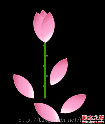
这篇文章主要介绍“怎么用css3+jquery实现荷花图效果”,在日常操作中,相信很多人在怎么用css3+jquery实现荷花图效果问题上存在疑惑,小编查阅了各式资料,整理出简单好用的操作方法,希望对大家解答”怎么用css3+jquery实现荷花图效果”的疑惑有所帮助!接下来,请跟着小编一起来学习吧!
代码如下:
<!doctype html>
<html>
<head>
<meta charset="utf-8" />
<title>flower</title>
<style type="text/css">body,html,div,span,p,ul,li{margin:0;padding:0;}
body{ background:#000;}
#flower{width:300px; position:absolute; top:50%;left:50%; margin:-115px 0 0 -150px; height:330px;}
#leaf { position:relative; z-index:2;}
#leaf strong{ width:75px; height:75px; display:block; border:1px solid #FB96C2; box-shadow:0 0 1px #FB96C2; /* background:red;*/ background:-webkit-linear-gradient(top, #fff ,#FFAFD6 30%, #F493C0 70%,#DB5E86 100%); border-radius:75px 0 75px 0; -webkit-transform:rotate(90deg); position:absolute; transition:all 0.5s; }
#leaf strong:first-child{-webkit-transform:rotate(130deg);}
#leaf strong:nth-child(2){-webkit-transform:rotate(120deg); left:-12px; top:7px;}
#leaf strong:nth-child(3){-webkit-transform:rotate(143deg); left:12px; top:7px;}
#leaf strong:nth-child(4){-webkit-transform:rotate(150deg); left:12px; top:7px;}
#leaf strong:nth-child(5){-webkit-transform:rotate(120deg); left:-12px; top:7px;}
#leaf strong:nth-child(6){-webkit-transform:rotate(160deg); left:26px; top:11px;}
#leaf strong:nth-child(7){-webkit-transform:rotate(105deg); left:-26px; top:11px;}
/*#leaf strong:nth-child(4){-webkit-transform:rotate(110deg); left:-18px; top:12px;}
#leaf strong:nth-child(5){-webkit-transform:rotate(170deg); left:18px; top:12px;}
#leaf strong:nth-child(6){-webkit-transform:rotate(185deg); left:38px; top:27px;}
#leaf strong:nth-child(7){-webkit-transform:rotate(85deg); left:-38px; top:27px;}*/
#three{ position:relative; margin-top:-10px;}
#three div{width:8px; height:200px; background:#390; margin:100px 0 0 37px; border-radius:10px; position:absolute; z-index:1; border-radius:200px 0 0 0;}
#three strong{width:6px; height:6px; border-radius:6px; background:#3B7B6D; display:inline-block; position:absolute; left:34px; top:115px;}
#three strong:nth-child(2){top:150px;left:45px;}
#three strong:nth-child(3){top:185px}
#three strong:nth-child(4){top:220px;left:45px;}
#three strong:nth-child(5){top:255px}</style>
</head>
<body>
<div id="flower">
<div id="leaf">
<strong></strong>
<strong></strong>
<strong></strong>
<strong></strong>
<strong></strong>
<strong></strong>
<strong></strong>
</div>
<div id="three">
<div></div>
<strong></strong>
<strong></strong>
<strong></strong>
<strong></strong>
<strong></strong>
<strong></strong>
<strong></strong>
<strong></strong>
<strong></strong>
<strong></strong>
</div>
</div>
<script type="text/javascript" src="http://code.jquery.com/jquery.min.js"></script>
<script type="text/javascript">$(function(){
setTimeout(function(){
$("#leaf strong:eq(6)").css({left:'-38px',top:'27px',transform:'rotate(85deg)'})
$("#leaf strong:eq(5)").css({left:'38px',top:'27px',transform:'rotate(185deg)'})
$("#leaf strong:eq(4)").css({left:'-18px',top:'12px',transform:'rotate(110deg)'})
$("#leaf strong:eq(3)").css({left:'18px',top:'12px',transform:'rotate(170deg)'})
},1000)
setTimeout(function(){
$("#leaf strong:eq(6)").css({top:'48px',left:'-38px',transform:'rotate(80deg)'})
$("#leaf strong:eq(5)").css({left:'45',top:'48px',transform:'rotate(190deg)'})
$("#leaf strong:eq(4)").css({left:'-42px',top:'28px',transform:'rotate(95deg)'})
$("#leaf strong:eq(3)").css({left:'42px',top:'28px',transform:'rotate(165deg)'})
},2000)
setTimeout(function(){
$("#leaf strong:eq(6)").css({top:'300px',left:'10px'})
},3000)
setTimeout(function(){
$("#leaf strong:eq(5)").css({top:'270px',left:'100px'})
},3100)
setTimeout(function(){
$("#leaf strong:eq(4)").css({top:'210px',left:"-70px"})
},3200)
setTimeout(function(){
$("#leaf strong:eq(3)").css({top:'160px',left:"50px"})
},3300)
})</script>
</body>
</html>
到此,关于“怎么用css3+jquery实现荷花图效果”的学习就结束了,希望能够解决大家的疑惑。理论与实践的搭配能更好的帮助大家学习,快去试试吧!若想继续学习更多相关知识,请继续关注亿速云网站,小编会继续努力为大家带来更多实用的文章!
免责声明:本站发布的内容(图片、视频和文字)以原创、转载和分享为主,文章观点不代表本网站立场,如果涉及侵权请联系站长邮箱:is@yisu.com进行举报,并提供相关证据,一经查实,将立刻删除涉嫌侵权内容。


