本篇内容介绍了“怎么用css3实现图片遮罩效果鼠标hover以后出现文字”的有关知识,在实际案例的操作过程中,不少人都会遇到这样的困境,接下来就让小编带领大家学习一下如何处理这些情况吧!希望大家仔细阅读,能够学有所成!
鼠标hover 以后。图片上面出现一个遮罩, 透明度变化, 显示设置好的文字的文字,完全使用css 实现,下图是效果 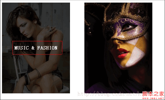
关键代码
代码如下:
.featured-image:hover {
opacity: 0.9;
color: #fff;
background: rgba(0,0,0,0.8);
}
看源码吧
代码如下:
<!doctype html>
<html>
<head>
<meta charset="utf-8">
<title>无标题文档</title>
<style>
#content article {
float: left;
margin-right: 4%;
max-width: 236px;
position: relative;
width: 22%;
margin-bottom: 3.5%;
}
#content article:nth-child(4n+4) {
margin-right: 0;
}
.post-format-content {
position: relative;
background: #111;
}
.post-thumbnail {
max-width: 100%;
height: auto;
overflow: hidden;
}
.content-wrap {
padding: 0;
position: absolute;
text-align: center;
width: 100%;
top: 0;
bottom: 0;
display: table-cell;
vertical-align: middle;
overflow: hidden;
}
.content-wrap h2.entry-title {
display: table;
font-size: 110%;
height: 100%;
text-transform: uppercase;
width: 100%;
margin:0;
}
.edit-link {
z-index: 2;
}
.featured-image {
display: table-cell;
position: relative;
transition: opacity .25s ease-in-out, background .25s ease-in-out;
-moz-transition: opacity .25s ease-in-out, background .25s ease-in-out;
-webkit-transition: opacity .25s ease-in-out, background .25s ease-in-out;
vertical-align: middle;
z-index: 1;
color: #fff;
text-decoration: none;
opacity: 0;
padding: 10%;
}
.featured-image:hover {
opacity: 0.9;
color: #fff;
background: rgba(0,0,0,0.8);
}
.post-thumbnail img {
display: block;
}
img {
max-width: 100%;
height: auto;
}
</style>
</head>
<body>
<div id="content">
<article class="post-152 post type-post status-publish format-standard hentry category-people category-photos">
<div class="post-format-content">
<div class="post-thumbnail"> <img width="480" height="640" src="assets/img/1.jpg" class="attachment-thumbnail wp-post-image" alt="105694702"> </div>
<div class="content-wrap">
<h2 class="entry-title"><a href="" class="featured-image" rel="bookmark">Music & Fashion</a></h2>
</div>
</div>
</article>
<article class="post-152 post type-post status-publish format-standard hentry category-people category-photos">
<div class="post-format-content">
<div class="post-thumbnail"> <img width="480" height="640" src="assets/img/2.jpg" class="attachment-thumbnail wp-post-image" alt="105694702"> </div>
<div class="content-wrap">
<h2 class="entry-title"><a href="" class="featured-image" title="amp; Fashion" rel="bookmark">Music & Fashion</a></h2>
</div>
</div>
</article>
</div>
</body>
</html>
“怎么用css3实现图片遮罩效果鼠标hover以后出现文字”的内容就介绍到这里了,感谢大家的阅读。如果想了解更多行业相关的知识可以关注亿速云网站,小编将为大家输出更多高质量的实用文章!
免责声明:本站发布的内容(图片、视频和文字)以原创、转载和分享为主,文章观点不代表本网站立场,如果涉及侵权请联系站长邮箱:is@yisu.com进行举报,并提供相关证据,一经查实,将立刻删除涉嫌侵权内容。


