这篇文章将为大家详细讲解有关R语言可视化的中心放射状路径图是怎样的,文章内容质量较高,因此小编分享给大家做个参考,希望大家阅读完这篇文章后对相关知识有一定的了解。
最近一直在研究ggplot剩余还没有涉略过的图表类型,试图挖掘出一些新的图表形式,就像是该包的作者所暗示的那样,ggplot2只是给你搭建了一个图层语法环境,至于具体能创造出何种图形,全凭自己的想象力。
慢慢的我发现还有一类geom_segment对象自己一直没有尝试过,于是满心欢喜的尝试了一下,果然还是有收获的,我发现通过这个segment图层,可以批量的创建放射状线条图,也就是路径图,这解决了我一直以来的难题,今天顺便分享给大家。
加载包:
library(ggplot2)
library(ggmap)
library(plyr)
library(maptools)
加载中国省份行政地图:
china_map<-readShapePoly("c:/rstudy/bou2_4p.shp")
x <- china_map@data
xs <- data.frame(id=row.names(x),x)
转换为数据框并合并城市数据:
china_map1 <- fortify(china_map)
china_map_data <- join(china_map1, xs, type = "full")
mydata <- read.csv("c:/rstudy/geshengzhibiao.csv")
china_data <- join(china_map_data, mydata, type="full")
province_city <- read.csv("c:/rstudy/chinaprovincecity.csv")
拆分兰州数据:
newdata<-subset(province_city,city=="兰州")
newdata1<-subset(province_city,city!="兰州")
sourcex<-rep(newdata$jd,33)
sourcey<-rep(newdata$wd,33)
制作以兰州为中心的点对点作图数据:(可以类比之前REmap路径图数据源)
tagetx<-newdata1$jd
tagety<-newdata1$wd
dataA<-data.frame(sourcex,sourcey,tagetx,tagety)
dataB<-newdata1[,1:2]
dataC<-cbind(dataB,dataA)
dataC$point<-round(runif(33,10,50))
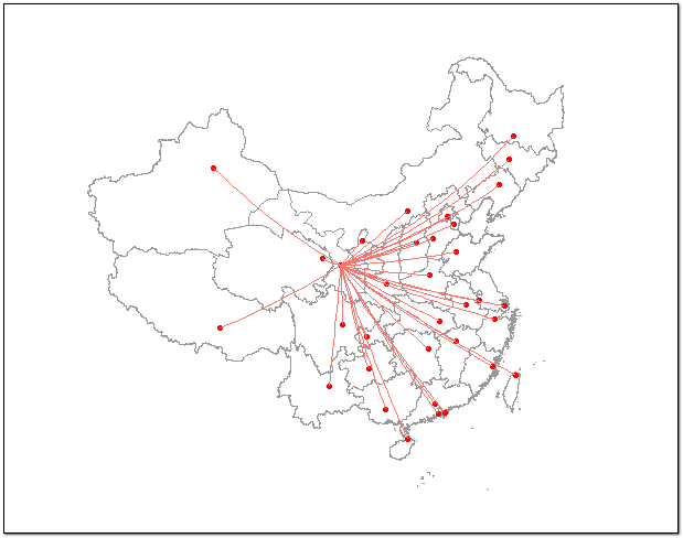
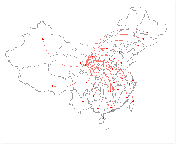
利用geom_segment()图层制作放射路径图:
ggplot()+
geom_polygon(data=china_data,aes(x=long,y=lat,group=group),fill="white",colour="grey60")+
geom_point(data =province_city,aes(x=jd,y=wd),colour="red")+
coord_map("polyconic") +
geom_segment(data=dataC,aes(x=sourcex,y=sourcey,xend=tagetx,yend=tagety,colour="red"))+
theme_nothing()
这里再稍微的扩展一下,其实以上你看到的放射状线条是兰州与其他城市之间的直线,之所以变的有弧度,只是因为加了地图投影的缘故,这里我可以取消投影参数,看下效果。
ggplot()+
geom_polygon(data=china_data,aes(x=long,y=lat,group=group),fill="white",colour="grey60")+
geom_point(data =province_city,aes(x=jd,y=wd),colour="red")+
geom_segment(data=dataC,aes(x=sourcex,y=sourcey,xend=tagetx,yend=tagety,colour="red"))+
theme_nothing()
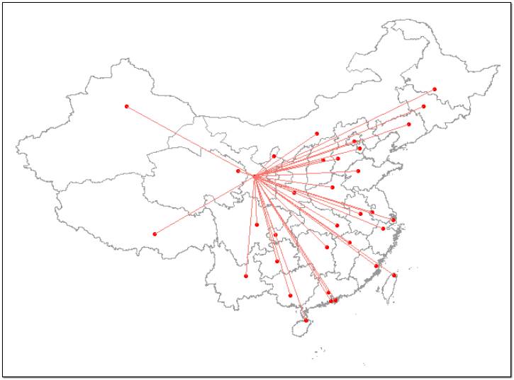
这里取消投影参数之后,线条变成了点间直线,但是默认的不带投影的地图看起来与我们认知中的中国地图形状有些不一样,好像被压扁了一样。
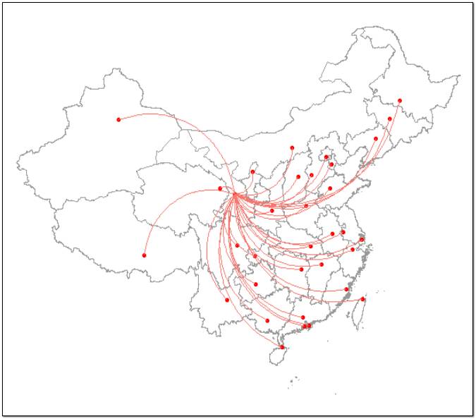
其实这里还有一个图层函数也可以做出来这种放射状线条,geom_curve(),图层,不过它本身就是有弧度的曲线,曲率可以通过参数进行微调。
ggplot()+
geom_polygon(data=china_data,aes(x=long,y=lat,group=group),fill="white",colour="grey60")+
geom_point(data =province_city,aes(x=jd,y=wd),colour="red")+
geom_curve(data=dataC,aes(x=sourcex,y=sourcey,xend=tagetx,yend=tagety,colour="red"))+
theme_nothing()
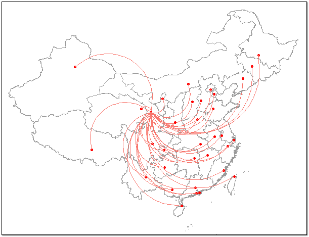
曲率调整:
ggplot()+
geom_polygon(data=china_data,aes(x=long,y=lat,group=group),fill="white",colour="grey60")+
geom_point(data =province_city,aes(x=jd,y=wd),colour="red")+
geom_curve(data=dataC,aes(x=sourcex,y=sourcey,xend=tagetx,yend=tagety,colour="red"),curvature = 0.8)+ #用于调整曲率,范围在-1~1之间。
theme_nothing()
ggplot()+
geom_polygon(data=china_data,aes(x=long,y=lat,group=group),fill="white",colour="grey60")+
geom_point(data =province_city,aes(x=jd,y=wd),colour="red")+
geom_curve(data=dataC,aes(x=sourcex,y=sourcey,xend=tagetx,yend=tagety,colour="red"),curvature =-0.5)+
theme_nothing()
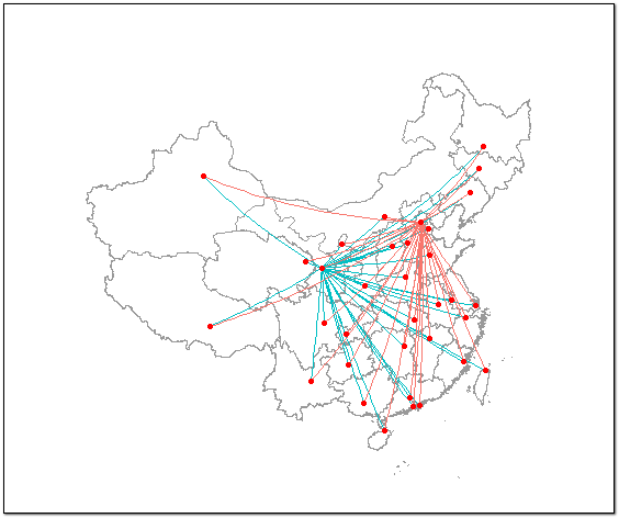
当然,通过图形叠加,我们还可以重复多次这样的放射状线条图。
以下以北京为例:
newdataA<-subset(province_city,city=="北京")
newdataB<-subset(province_city,city!="北京")
soux<-rep(newdataA$jd,33)
souy<-rep(newdataA$wd,33)
tagx<-newdataB$jd
tagy<-newdataB$wd
dataD<-data.frame(soux,souy,tagx,tagy)
dataE<-newdataB[,1:2]
dataF<-cbind(dataD,dataE)
dataF$point<-round(runif(33,10,50))
两个中心的路径图(兰州、北京)
ggplot()+
geom_polygon(data=china_data,aes(x=long,y=lat,group=group),fill="white",colour="grey60")+
coord_map("polyconic") +
geom_segment(data=dataC,aes(x=sourcex,y=sourcey,xend=tagetx,yend=tagety,colour="red"))+
geom_segment(data=dataF,aes(x=soux,y=souy,xend=tagx,yend=tagy,colour="blue"))+
geom_point(data =province_city,aes(x=jd,y=wd),colour="red")+
theme_nothing()
关于R语言可视化的中心放射状路径图是怎样的就分享到这里了,希望以上内容可以对大家有一定的帮助,可以学到更多知识。如果觉得文章不错,可以把它分享出去让更多的人看到。
免责声明:本站发布的内容(图片、视频和文字)以原创、转载和分享为主,文章观点不代表本网站立场,如果涉及侵权请联系站长邮箱:is@yisu.com进行举报,并提供相关证据,一经查实,将立刻删除涉嫌侵权内容。


