这篇文章主要为大家展示了“如何使用R语言绘制散点图结合边际分布图”,内容简而易懂,条理清晰,希望能够帮助大家解决疑惑,下面让小编带领大家一起研究并学习一下“如何使用R语言绘制散点图结合边际分布图”这篇文章吧。
主要使用ggExtra结合ggplot2两个R包进行绘制。(胜在简洁方便)使用cowplot与ggpubr进行绘制。(胜在灵活且美观)
下面的绘图我们均以iris数据集为例。
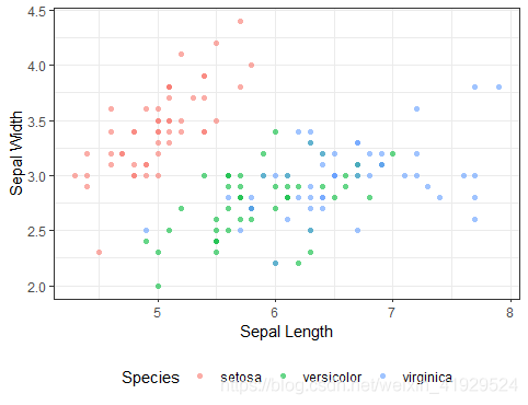
# library
library(ggplot2)
library(ggExtra)

# classic plot
p <- ggplot(iris) +
  geom_point(aes(x = Sepal.Length, y = Sepal.Width, color = Species), alpha = 0.6, shape = 16) +  # alpha 调整点的透明度;shape 调整点的形状
  theme_bw() +
  theme(legend.position = "bottom") + # 图例置于底部
  labs(x = "Sepal Length", y = "Sepal Width") # 添加x,y轴的名称
p
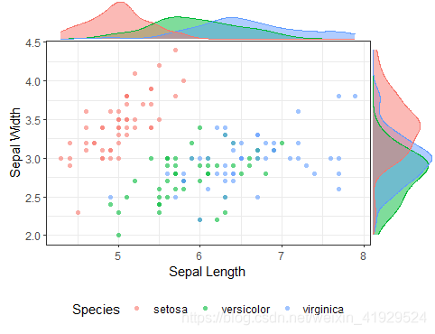
下面我们一行代码添加边际分布(分别以密度曲线与直方图的形式来展现):
# marginal plot: density
ggMarginal(p, type = "density", groupColour = TRUE, groupFill = TRUE)
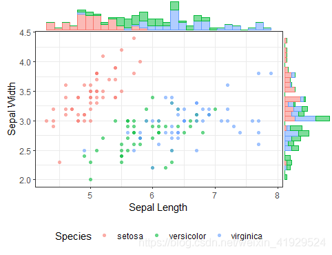
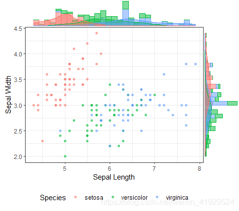
# marginal plot: histogram
ggMarginal(p, type = "histogram", groupColour = TRUE, groupFill = TRUE)
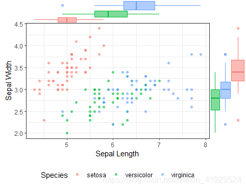
# marginal plot: boxplot
ggMarginal(p, type = "boxplot", groupColour = TRUE, groupFill = TRUE)
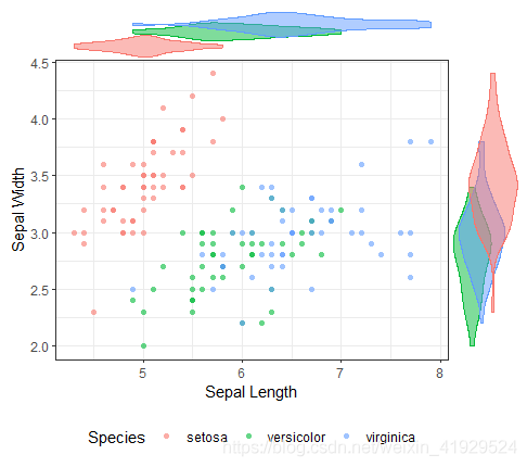
# marginal plot: violin
ggMarginal(p, type = "violin", groupColour = TRUE, groupFill = TRUE)
# marginal plot: densigram
ggMarginal(p, type = "densigram", groupColour = TRUE, groupFill = TRUE)
# Scatter plot colored by groups ("Species")
sp <- ggscatter(iris, x = "Sepal.Length", y = "Sepal.Width",
                color = "Species", palette = "jco",
                size = 3, alpha = 0.6) +
  border() +
  theme(legend.position = "bottom")
sp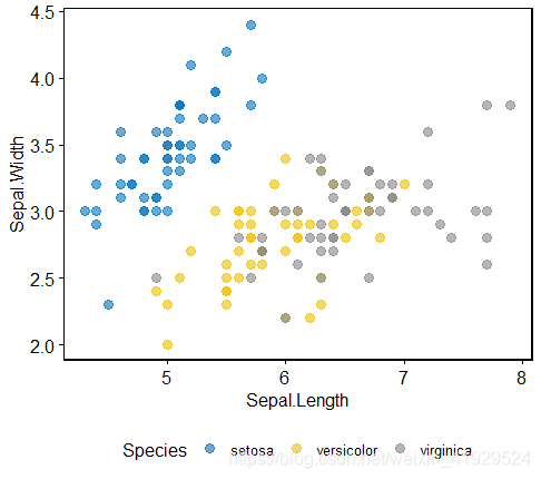
① 密度函数
library(cowplot)
# Marginal density plot of x (top panel) and y (right panel)
xplot <- ggdensity(iris, "Sepal.Length", fill = "Species",
                   palette = "jco")
yplot <- ggdensity(iris, "Sepal.Width", fill = "Species",
                   palette = "jco") +
  rotate()

# Cleaning the plots
sp <- sp + rremove("legend")
yplot <- yplot + clean_theme() + rremove("legend")
xplot <- xplot + clean_theme() + rremove("legend")
# Arranging the plot using cowplot
plot_grid(xplot, NULL, sp, yplot, ncol = 2, align = "hv",
          rel_widths = c(2, 1), rel_heights = c(1, 2))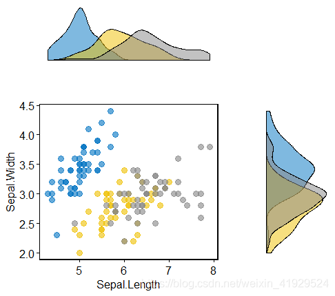
② 未被压缩的箱线图
# Marginal boxplot of x (top panel) and y (right panel)
xplot <- ggboxplot(iris, x = "Species", y = "Sepal.Length",
                   color = "Species", fill = "Species", palette = "jco",
                   alpha = 0.5, ggtheme = theme_bw())+
  rotate()
yplot <- ggboxplot(iris, x = "Species", y = "Sepal.Width",
                   color = "Species", fill = "Species", palette = "jco",
                   alpha = 0.5, ggtheme = theme_bw())
# Cleaning the plots
sp <- sp + rremove("legend")
yplot <- yplot + clean_theme() + rremove("legend")
xplot <- xplot + clean_theme() + rremove("legend")
# Arranging the plot using cowplot
plot_grid(xplot, NULL, sp, yplot, ncol = 2, align = "hv",
          rel_widths = c(2, 1), rel_heights = c(1, 2))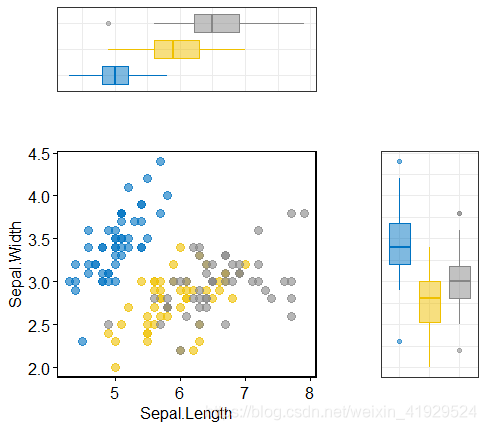
# Main plot
pmain <- ggplot(iris, aes(x = Sepal.Length, y = Sepal.Width, color = Species)) +
  geom_point() +
  color_palette("jco")
# Marginal densities along x axis
xdens <- axis_canvas(pmain, axis = "x") +
  geom_density(data = iris, aes(x = Sepal.Length, fill = Species),
               alpha = 0.7, size = 0.2) +
  fill_palette("jco")
# Marginal densities along y axis
# Need to set coord_flip = TRUE, if you plan to use coord_flip()
ydens <- axis_canvas(pmain, axis = "y", coord_flip = TRUE) +
  geom_density(data = iris, aes(x = Sepal.Width, fill = Species),
               alpha = 0.7, size = 0.2) +
  coord_flip() +
  fill_palette("jco")
p1 <- insert_xaxis_grob(pmain, xdens, grid::unit(.2, "null"), position = "top")
p2 <- insert_yaxis_grob(p1, ydens, grid::unit(.2, "null"), position = "right")
ggdraw(p2)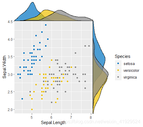
以上是“如何使用R语言绘制散点图结合边际分布图”这篇文章的所有内容,感谢各位的阅读!相信大家都有了一定的了解,希望分享的内容对大家有所帮助,如果还想学习更多知识,欢迎关注亿速云行业资讯频道!
免责声明:本站发布的内容(图片、视频和文字)以原创、转载和分享为主,文章观点不代表本网站立场,如果涉及侵权请联系站长邮箱:is@yisu.com进行举报,并提供相关证据,一经查实,将立刻删除涉嫌侵权内容。


