本篇内容介绍了“python必备库Matplotlib怎么使用”的有关知识,在实际案例的操作过程中,不少人都会遇到这样的困境,接下来就让小编带领大家学习一下如何处理这些情况吧!希望大家仔细阅读,能够学有所成!
前言:
Matplotlib 通常与 NumPy、Pandas 一起使用,是数据分析中不可或缺的重要工具之一。
Matplotlib 是 Python 中类似 MATLAB 的绘图工具,如果您熟悉 MATLAB,那么可以很快的熟悉它。Matplotlib 提供了一套面向对象绘图的 API,它可以轻松地配合 Python GUI 工具包(比如 PyQt,WxPython、Tkinter)在应用程序中嵌入图形。与此同时,它也支持以脚本的形式在 Python、IPython Shell、Jupyter Notebook 以及 Web 应用的服务器中使用。
官网地址:
https://matplotlib.org/
可以看看docs
官网就相当详细了,可以直接参考官网。
pip安装:
pip3 install matplotlib -i https://pypi.tuna.tsinghua.edu.cn/simple
conda安装:
conda install matplotlib
测试是否成功:
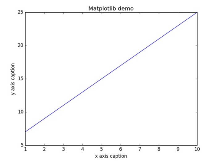
import numpy as np
from matplotlib import pyplot as plt

x = np.arange(1,11)
y =  2  * x +  5
plt.title("Matplotlib demo")
plt.xlabel("x axis caption")
plt.ylabel("y axis caption")
plt.plot(x,y)
plt.show()
成功出现下图就可以动手改造了。
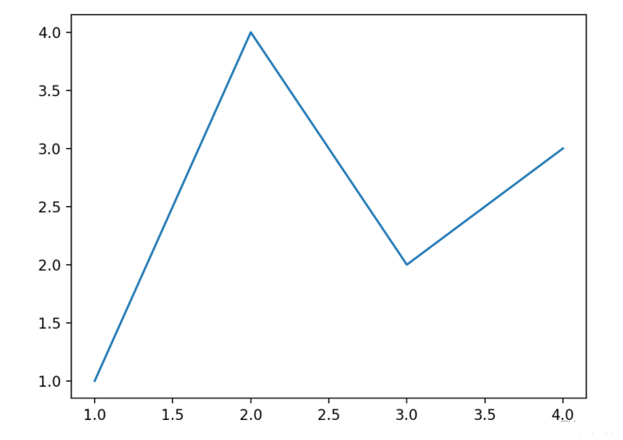
fig, ax = plt.subplots()  # Create a figure containing a single axes.
ax.plot([1, 2, 3, 4], [1, 4, 2, 3]);  # Plot some data on the axes.
fig, ax = plt.subplots(figsize=(5, 2.7))

t = np.arange(0.0, 5.0, 0.01)
s = np.cos(2 * np.pi * t)
line, = ax.plot(t, s, lw=2)

ax.annotate('local max', xy=(2, 1), xytext=(3, 1.5),
            arrowprops=dict(facecolor='black', shrink=0.05))

ax.set_ylim(-2, 2);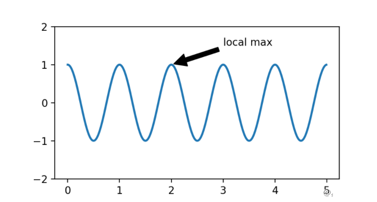
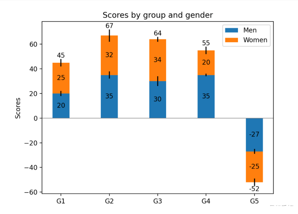
import matplotlib.pyplot as plt
import numpy as np
N = 5
menMeans = (20, 35, 30, 35, -27)
womenMeans = (25, 32, 34, 20, -25)
menStd = (2, 3, 4, 1, 2)
womenStd = (3, 5, 2, 3, 3)
ind = np.arange(N)    # the x locations for the groups
width = 0.35       # the width of the bars: can also be len(x) sequence
fig, ax = plt.subplots()
p1 = ax.bar(ind, menMeans, width, yerr=menStd, label='Men')
p2 = ax.bar(ind, womenMeans, width,
            bottom=menMeans, yerr=womenStd, label='Women')
ax.axhline(0, color='grey', linewidth=0.8)
ax.set_ylabel('Scores')
ax.set_title('Scores by group and gender')
ax.set_xticks(ind, labels=['G1', 'G2', 'G3', 'G4', 'G5'])
ax.legend()
# Label with label_type 'center' instead of the default 'edge'
ax.bar_label(p1, label_type='center')
ax.bar_label(p2, label_type='center')
ax.bar_label(p2)
plt.show()
正常run会出现下图:
计算两个信号的交叉谱密度Compute the cross spectral density of two signals
import numpy as np
import matplotlib.pyplot as plt


fig, (ax1, ax2) = plt.subplots(2, 1)
# make a little extra space between the subplots
fig.subplots_adjust(hspace=0.5)

dt = 0.01
t = np.arange(0, 30, dt)

# Fixing random state for reproducibility
np.random.seed(19680801)


nse1 = np.random.randn(len(t))                 # white noise 1
nse2 = np.random.randn(len(t))                 # white noise 2
r = np.exp(-t / 0.05)

cnse1 = np.convolve(nse1, r, mode='same') * dt   # colored noise 1
cnse2 = np.convolve(nse2, r, mode='same') * dt   # colored noise 2

# two signals with a coherent part and a random part
s1 = 0.01 * np.sin(2 * np.pi * 10 * t) + cnse1
s2 = 0.01 * np.sin(2 * np.pi * 10 * t) + cnse2

ax1.plot(t, s1, t, s2)
ax1.set_xlim(0, 5)
ax1.set_xlabel('time')
ax1.set_ylabel('s1 and s2')
ax1.grid(True)

cxy, f = ax2.csd(s1, s2, 256, 1. / dt)
ax2.set_ylabel('CSD (db)')
plt.show()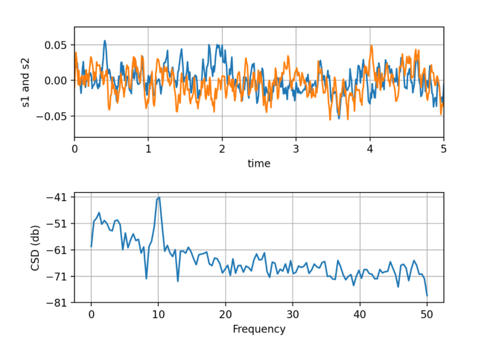
“python必备库Matplotlib怎么使用”的内容就介绍到这里了,感谢大家的阅读。如果想了解更多行业相关的知识可以关注亿速云网站,小编将为大家输出更多高质量的实用文章!
免责声明:本站发布的内容(图片、视频和文字)以原创、转载和分享为主,文章观点不代表本网站立场,如果涉及侵权请联系站长邮箱:is@yisu.com进行举报,并提供相关证据,一经查实,将立刻删除涉嫌侵权内容。


