本篇内容主要讲解“微信小程序弹窗组件如何使用”,感兴趣的朋友不妨来看看。本文介绍的方法操作简单快捷,实用性强。下面就让小编来带大家学习“微信小程序弹窗组件如何使用”吧!
效果图
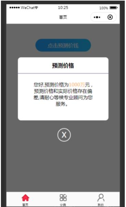
项目需求是需要在页面上通过点击按钮, 然后弹出弹窗蒙层; 因为小小程序当中经常会用到弹窗, 因此这里我直接将弹窗封装成了一个组件, 下次使用的时候,直接调用就可以了。
1、在微信小程序当中, 在当前项目当中, 新建一个component文件夹, 这个文件夹专门用来存放我们要使用的组件, 然后在component文件夹下右击, 新建文件夹popup, 这里就是我们要用的弹窗组件的文件夹, 再右击popup文件夹, 选择新建component, 然后直接输入popup即可, 小程序内部会为我们自动生成.wxss , wxml , json , js等模板文件, 如下图所示,popup文件夹下的文件为我们的组件,index文件夹下的文件为首页上页面:

2、popup弹窗组件的代码部分;
popup.wxml
<view class="wx-popup"  hidden="{{flag}}">
  <view class='popup-container'>
    <view class="wx-popup-title">{{title}}</view>
    <!-- <view class="wx-popup-con" >{{content}}</view> -->
    <view class="wx-popup-con" >
      <text>{{content_leftText}}</text>
      <text class="content_money">{{content_money}}</text>
      <text>{{content_rightText}}</text>
    </view>
    <view class="wx-popup-btn">
      <view class="closeBtn">
        <view class="close-popup" bindtap='_close'>
          <view>X</view>
        </view>
      </view>
    </view>
  </view>
</view>
popup.wxss
.wx-popup {
  position: fixed;
  left: 0;
  bottom: 0;
  top: 0;
  z-index: 2000;
  width: 100%;
  height: 100%;
  background: rgba(0, 0, 0, .6);
}
.popup-container {
  position: fixed;
  left: 10%;
  top: 20%;
  width: 80%;
  max-width: 600rpx;
  border-radius: 20rpx;
  box-sizing: bordre-box;
  background: #fff;
  z-index: 2000;
}
.wx-popup-title {
  width: 100%;
  padding: 28rpx;
  text-align: center;
  font-size: 36rpx;
  font-weight: bold;
  border-bottom: 5rpx solid #9EA3BA;
  box-sizing: border-box;
}
.wx-popup-con {
  margin: 50rpx 10rpx;
  text-align: center;
  padding: 0 86rpx;
}
.wx-popup-con text {
  padding-bottom: 10rpx;
}
.content_money {
  color: #FFB258;
}
.wx-popup-btn {
  display: flex;
  justify-content: space-around;
  margin-bottom: 40rpx;
}
.wx-popup-btn text {
  display: flex;
  align-items: center;
  justify-content: center;
  width: 30%;
  height: 88rpx;
  border: 2rpx solid #ccc;
  border-radius: 88rpx;
}
.wx-popup-btn .closeBtn {
  position: fixed;
  left: 45%;
  bottom: 30%;
}
.wx-popup-btn .close-popup {
  position: relative;
  height: 80rpx;
  width: 80rpx;
  border: 5rpx solid #fff;
  border-radius: 50%;
}
 .wx-popup-btn .close-popup view {
   position: absolute;
   left: 30%;
   top: 8%;
   font-size: 50rpx;
   color: #fff;
 }
popup.js
Component({
options: {
multipleSlots: true // 在组件定义时的选项中启用多slot支持
},
/**
* 组件的属性列表
*/
properties: {
title: { // 属性名
type: String, // 类型(必填),目前接受的类型包括:String, Number, Boolean, Object, Array, null(表示任意类型)
value: '标题' // 属性初始值(可选),如果未指定则会根据类型选择一个
},
// 弹窗内容
content_leftText: {
type: String,
value: '内容'
},
content_money: {
type: String,
value: '内容'
},
content_rightText: {
type: String,
value: '内容'
},
},
/**
* 组件的初始数据
*/
data: {
flag: true,
},
/**
* 组件的方法列表
*/
methods: {
//隐藏弹框
hidePopup: function () {
this.setData({
flag: !this.data.flag
})
},
//展示弹框
showPopup () {
this.setData({
flag: !this.data.flag
})
},
/*
* triggerEvent 用于触发事件
*/
_close() {
this.triggerEvent("close");
}
}
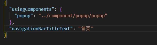
})3、完成模板文件的工作后, 接下来就是在首页当中对这个组件进行配置, 在index文件夹当中对index.json文件进行配置, 代码如下:
4、在首页当中进行使用,代码如下:
<view class="index_popup">
    <view class="btn-area">
        <button type="primary" bindtap="showPopup">点击预测价钱</button>
    </view>
    <popup id='popup'
        title='预测价格'
        content_leftText='您好,预测价格为'
        content_money='{{content_money}}'
        content_rightText='元 , 预测价格和实际价格存在偏差,请耐心等候专业顾问为您服务。'
        bind:close="_close">
    </popup>
</view>5、index.wxss的样式
.index_popup .btn-area button {
  background-image: linear-gradient(to right, rgba(36, 162, 255), rgba(36, 172, 255), rgba(36, 192, 255));
  font-size: 34rpx;
  font-weight: normal;
  border-radius: 50rpx;
  padding: 18rpx 30rpx;
  margin-top: 100rpx;
}6、index.js文件里, 配置对应的点击事件, 还有操作数据
// index.js
// 获取应用实例
const app = getApp()
Page({
  data: {
    content_money: '1000万'
  },
  onReady: function () {
    //获得popup组件
    this.popup = this.selectComponent("#popup");
  },
  showPopup() {
    this.popup.showPopup();
  },
  //取消事件
  _close() {
    console.log('你点击了关闭按钮');
    this.popup.hidePopup();
  },
  onLoad() {
  },
})当点击首页index.wxml上的按钮时, 弹出弹窗组件, 点击弹窗页面下的X按钮, 可以关闭弹窗。
到此,相信大家对“微信小程序弹窗组件如何使用”有了更深的了解,不妨来实际操作一番吧!这里是亿速云网站,更多相关内容可以进入相关频道进行查询,关注我们,继续学习!
免责声明:本站发布的内容(图片、视频和文字)以原创、转载和分享为主,文章观点不代表本网站立场,如果涉及侵权请联系站长邮箱:is@yisu.com进行举报,并提供相关证据,一经查实,将立刻删除涉嫌侵权内容。


