本篇内容介绍了“怎么使用python绘制发散型柱状图、误差阴影时间序列图、双坐标系时间序列图和绘制金字塔图”的有关知识,在实际案例的操作过程中,不少人都会遇到这样的困境,接下来就让小编带领大家学习一下如何处理这些情况吧!希望大家仔细阅读,能够学有所成!
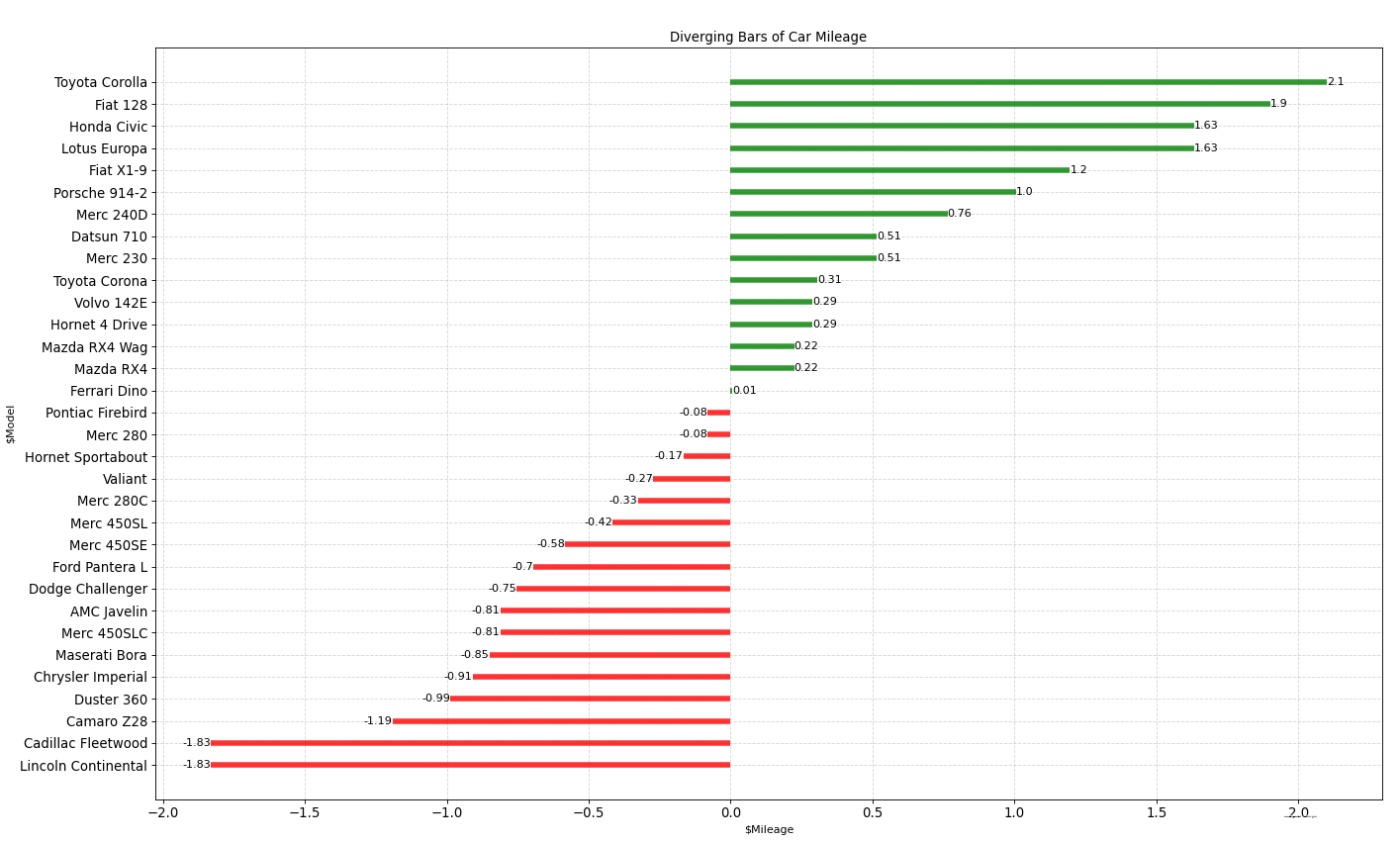
python绘制发散型柱状图,展示单个指标的变化的顺序和数量,在柱子上添加了数值文本。
实现代码:
import numpy as np
import pandas as pd
import matplotlib as mpl
import matplotlib.pyplot as plt
import seaborn as sns
import warnings
warnings.filterwarnings(action='once')
df = pd.read_csv("C:\工作\学习\数据杂坛/datasets/mtcars.csv")
x = df.loc[:, ['mpg']]
df['mpg_z'] = (x - x.mean()) / x.std()
df['colors'] = ['red' if x < 0 else 'green' for x in df['mpg_z']]
df.sort_values('mpg_z', inplace=True)
df.reset_index(inplace=True)
# Draw plot
plt.figure(figsize=(10, 6), dpi=80)
plt.hlines(y=df.index,
           xmin=0,
           xmax=df.mpg_z,
           color=df.colors,
           alpha=0.8,
           linewidth=5)
for x, y, tex in zip(df.mpg_z, df.index, df.mpg_z):
    t = plt.text(x, y, round(tex, 2), horizontalalignment='right' if x < 0 else 'left',

                 verticalalignment='center', fontdict={'color':'black' if x < 0 else 'black', 'size':10})

# Decorations

plt.gca().set(ylabel='$Model', xlabel='$Mileage')
plt.yticks(df.index, df.cars, fontsize=12)
plt.xticks(fontsize=12)
plt.title('Diverging Bars of Car Mileage')
plt.grid(linestyle='--', alpha=0.5)
plt.show()
实现效果:
实现功能:
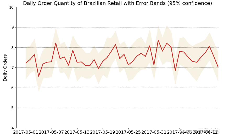
python绘制带误差阴影的时间序列图。
实现代码:
from scipy.stats import sem
import pandas as pd
import matplotlib.pyplot as plt
# Import Data
df_raw = pd.read_csv('F:\数据杂坛\datasets\orders_45d.csv',
                     parse_dates=['purchase_time', 'purchase_date'])

# Prepare Data: Daily Mean and SE Bands
df_mean = df_raw.groupby('purchase_date').quantity.mean()
df_se = df_raw.groupby('purchase_date').quantity.apply(sem).mul(1.96)

# Plot
plt.figure(figsize=(10, 6), dpi=80)
plt.ylabel("Daily Orders", fontsize=12)
x = [d.date().strftime('%Y-%m-%d') for d in df_mean.index]
plt.plot(x, df_mean, color="#c72e29", lw=2)
plt.fill_between(x, df_mean - df_se, df_mean + df_se, color="#f8f2e4")

# Decorations
# Lighten borders
plt.gca().spines["top"].set_alpha(0)
plt.gca().spines["bottom"].set_alpha(1)
plt.gca().spines["right"].set_alpha(0)
plt.gca().spines["left"].set_alpha(1)
plt.xticks(x[::6], [str(d) for d in x[::6]], fontsize=12)
plt.title("Daily Order Quantity of Brazilian Retail with Error Bands (95% confidence)",fontsize=14)

# Axis limits
s, e = plt.gca().get_xlim()
plt.xlim(s, e - 2)
plt.ylim(4, 10)

# Draw Horizontal Tick lines
for y in range(5, 10, 1):
    plt.hlines(y,
               xmin=s,
               xmax=e,
               colors='black',
               alpha=0.5,
               linestyles="--",
               lw=0.5)

plt.show()
实现效果:
实现功能:
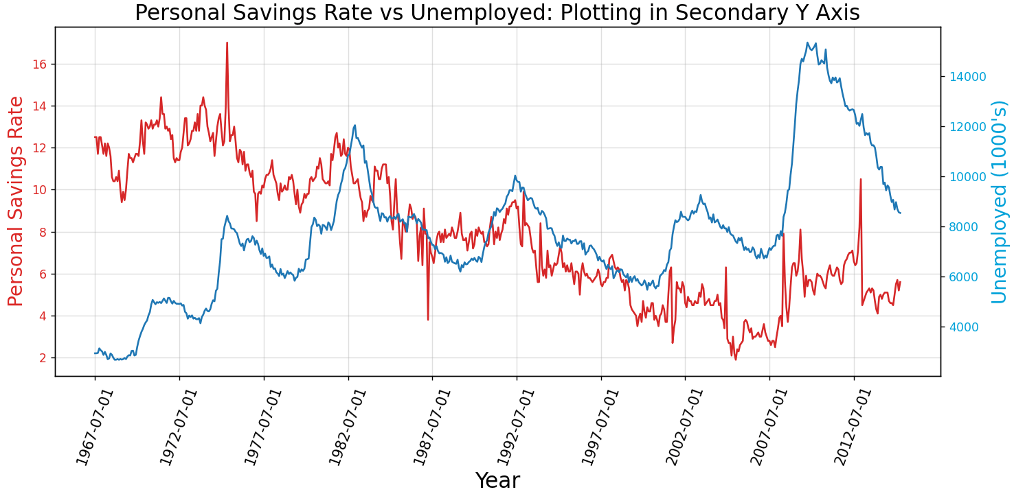
python绘制双坐标系(双变量)时间序列图。
实现代码:
import pandas as pd
import numpy as np
import matplotlib.pyplot as plt

# Import Data
df = pd.read_csv("F:\数据杂坛\datasets\economics.csv")

x = df['date']
y1 = df['psavert']
y2 = df['unemploy']

# Plot Line1 (Left Y Axis)
fig, ax1 = plt.subplots(1, 1, figsize=(12, 6), dpi=100)
ax1.plot(x, y1, color='tab:red')

# Plot Line2 (Right Y Axis)
ax2 = ax1.twinx()  # instantiate a second axes that shares the same x-axis
ax2.plot(x, y2, color='tab:blue')

# Decorations
# ax1 (left Y axis)
ax1.set_xlabel('Year', fontsize=18)
ax1.tick_params(axis='x', rotation=70, labelsize=12)
ax1.set_ylabel('Personal Savings Rate', color='#dc2624', fontsize=16)
ax1.tick_params(axis='y', rotation=0, labelcolor='#dc2624')
ax1.grid(alpha=.4)

# ax2 (right Y axis)
ax2.set_ylabel("Unemployed (1000's)", color='#01a2d9', fontsize=16)
ax2.tick_params(axis='y', labelcolor='#01a2d9')
ax2.set_xticks(np.arange(0, len(x), 60))
ax2.set_xticklabels(x [::60], rotation=90, fontdict={'fontsize': 10})
ax2.set_title(
    "Personal Savings Rate vs Unemployed: Plotting in Secondary Y Axis",
    fontsize=18)
fig.tight_layout()
plt.show()
实现效果:
实现功能:
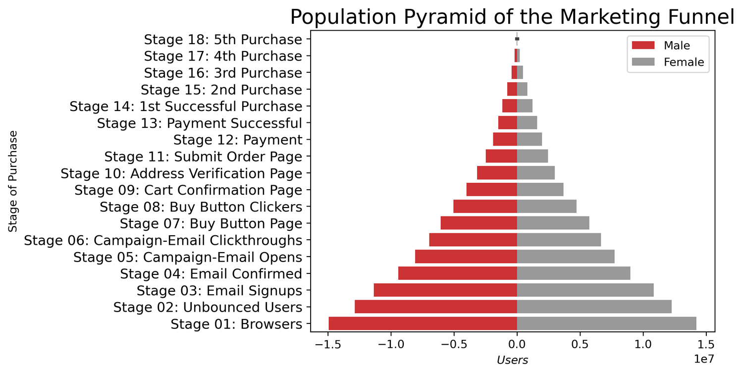
python绘制金字塔图,一种排过序的分组水平柱状图barplot,可很好展示不同分组之间的差异,可可视化逐级过滤或者漏斗的每个阶段。
实现代码:
import pandas as pd
import matplotlib.pyplot as plt
import seaborn as sns

# Read data
df = pd.read_csv("D:\数据杂坛\datasets\email_campaign_funnel.csv")

# Draw Plot
plt.figure()
group_col = 'Gender'
order_of_bars = df.Stage.unique()[::-1]
colors = [
    plt.cm.Set1(i / float(len(df[group_col].unique()) - 1))
    for i in range(len(df[group_col].unique()))
]

for c, group in zip(colors, df[group_col].unique()):
    sns.barplot(x='Users',
                y='Stage',
                data=df.loc[df[group_col] == group, :],
                order=order_of_bars,
                color=c,
                label=group)

# Decorations
plt.xlabel("$Users$")
plt.ylabel("Stage of Purchase")
plt.yticks(fontsize=12)
plt.title("Population Pyramid of the Marketing Funnel", fontsize=18)
plt.legend()
plt.savefig('C:\工作\学习\数据杂坛\素材\\0815\金字塔', dpi=300, bbox_inches = 'tight')
plt.show()
实现效果:
“怎么使用python绘制发散型柱状图、误差阴影时间序列图、双坐标系时间序列图和绘制金字塔图”的内容就介绍到这里了,感谢大家的阅读。如果想了解更多行业相关的知识可以关注亿速云网站,小编将为大家输出更多高质量的实用文章!
免责声明:本站发布的内容(图片、视频和文字)以原创、转载和分享为主,文章观点不代表本网站立场,如果涉及侵权请联系站长邮箱:is@yisu.com进行举报,并提供相关证据,一经查实,将立刻删除涉嫌侵权内容。


