жҖҺд№ҲдҪҝз”Ёhtml+cssе®һзҺ°йЎөйқўд№Ұжң¬зҝ»йЎөзү№ж•Ҳ
жң¬зҜҮеҶ…е®№дё»иҰҒи®Іи§ЈвҖңжҖҺд№ҲдҪҝз”Ёhtml+cssе®һзҺ°йЎөйқўд№Ұжң¬зҝ»йЎөзү№ж•ҲвҖқпјҢж„ҹе…ҙи¶Јзҡ„жңӢеҸӢдёҚеҰЁжқҘзңӢзңӢгҖӮжң¬ж–Үд»Ӣз»Қзҡ„ж–№жі•ж“ҚдҪңз®ҖеҚ•еҝ«жҚ·пјҢе®һз”ЁжҖ§ејәгҖӮдёӢйқўе°ұи®©е°Ҹзј–жқҘеёҰеӨ§е®¶еӯҰд№ вҖңжҖҺд№ҲдҪҝз”Ёhtml+cssе®һзҺ°йЎөйқўд№Ұжң¬зҝ»йЎөзү№ж•ҲвҖқеҗ§!
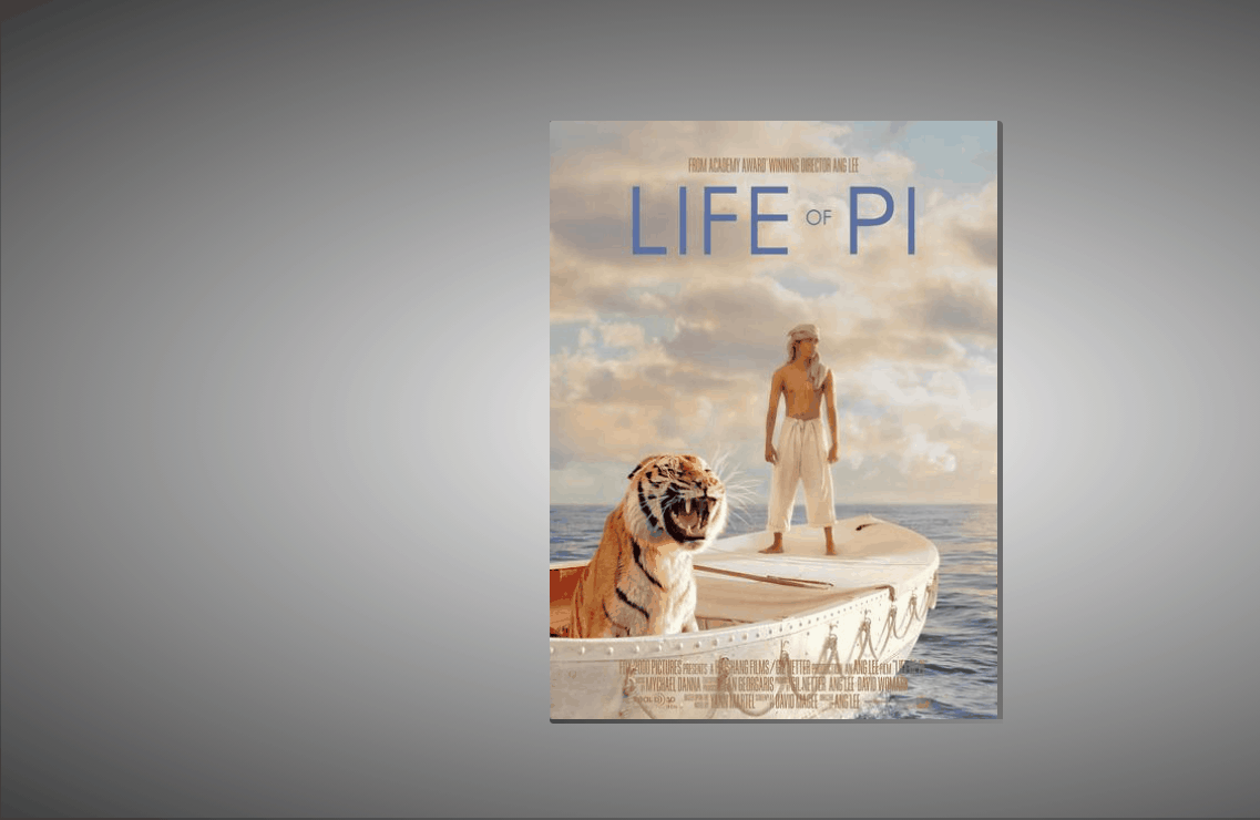
ж•Ҳжһңпјҡ
е®һзҺ°пјҡ
1.е®ҡд№үж ҮзӯҫпјҢshuжҳҜд№Ұжң¬пјҢfengжҳҜе°ҒйқўпјҢwenжҳҜж–Үеӯ—еҶ…е®№гҖӮ
<div class="shu">
<div class="feng"></div>
<div class="wen">
<h4 >Life of Pi</h4>
<p >
He lives in Scarborough. He's a small, slim man вҖ“ nomore than five foot five. Dark hair, dark eyes. Hair greyingat the temples. Can't be older than forty. leasingcoffee-coloured complexion1. Mild fall weather, yet puts on abig winter parka with fur-lined hood2 for the walk to thediner.
</p>
</div>
</div>
2.е®ҡд№үд№Ұжң¬зҡ„еҹәжң¬еұһжҖ§пјҢе®Ҫй«ҳпјҢйҳҙеҪұзӯүпјҢдјӘзұ»жҳҜдёӢйқўе’ҢеҸійқўйӮЈдёӨжқЎйҳҙеҪұгҖӮ
.shu{
position: relative;
width: 300px;
height: 400px;
background-color: rgba(255, 255, 255, 0.774);
transform-style: preserve-3d;
box-shadow: 300px 0px 30px rgb(0, 0, 0,.6) inset;
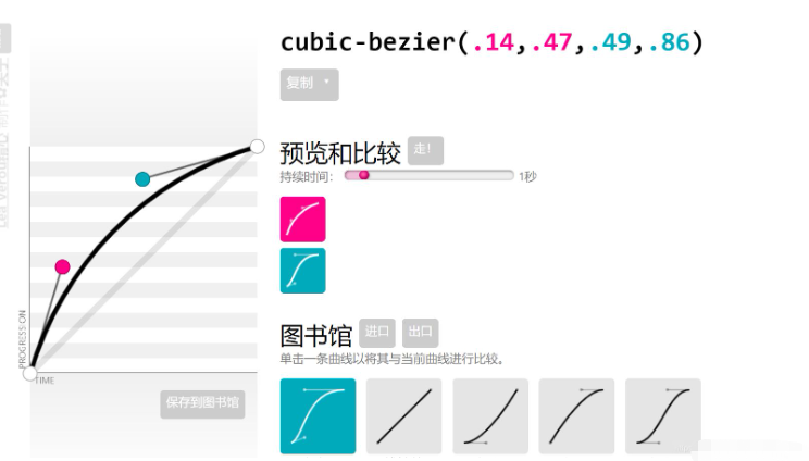
transition: 1s cubic-bezier(.79,.34,.47,.92);
}
.shu::after{
content: '';
position: absolute;
height: 3px;
width: 303px;
left: 0px;
bottom: -3px;
/* background-color: rgb(100, 96, 96); */
background-image: linear-gradient(to right,rgb(71, 68, 68),rgba(124, 120, 120, 0.3) );
border-bottom-left-radius: 5px;
}
.shu::before{
content: '';
position: absolute;
width: 3px;
height: 100%;
right: -3px;
top: 0px;
background-color: rgb(112, 108, 108);
background-image: linear-gradient(to top,rgb(114, 111, 111),rgba(90, 87, 87, 0.5) );;
border-top-right-radius: 3px;
}transition: 1s cubic-bezier(.79,.34,.47,.92); еҸҳеҢ–ж—¶й—ҙдёә1sпјҢиҝҗеҠЁжӣІзәҝдёә cubic-bezier(.79,.34,.47,.92)пјҢиҝҷдёӘеҸҜд»ҘеҺ»дёҖдёӘзҪ‘з«ҷиҮӘе®ҡд№үз”ҹжҲҗпјҡзӮ№жҲ‘гҖӮ
3.йј ж Үз»ҸиҝҮпјҢйҳҙеҪұеҸҳеҢ–пјҢ然еҗҺд№Ұжң¬еҗ‘е·Ұж—ӢиҪ¬пјҡ
 .shu:hover{
            box-shadow:   30px 0px 30px  rgb(0, 0, 0,.6) inset;
            transform: rotate(-5deg);

        }
transform: rotate(-5deg);ж—ӢиҪ¬пјӣ
4.е°Ғйқўзҡ„еҹәжң¬ж ·ејҸпјҡ
 .feng{
            position: absolute;
            width: 100%;
            height: 100%;
            z-index: 2;
            background-image: url(4.jpg);
            background-size: 100% ;
            transform-origin: left;
            transition: 1s cubic-bezier(.79,.34,.47,.92);
            border-top-left-radius: 2px;
            border-bottom-left-radius: 2px;


        }
transform-origin: left; е°Ғйқўж—ӢиҪ¬зҡ„дҪҚзҪ®пјҢж—ӢиҪ¬зӮ№
5.е°Ғйқўж—ӢиҪ¬пјҡ
 .shu:hover .feng{
            transform: rotateY(-140deg);

}ж–Үжң¬зҡ„еҹәжң¬еұһжҖ§пјҡ
 .wen{
            position: absolute;
            top: 0;
            left: 0;
            width: 100%;
            height: 100%;
            font-family: 'fangsong';
            text-align: left;
}е®Ңж•ҙд»Јз Ғпјҡ
<!DOCTYPE html>
<html lang="en">
<head>
<meta charset="UTF-8">
<meta name="viewport" content="width=device-width, initial-scale=1.0">
<title>Document</title>
<style>
*{
margin: 0;
padding: 0;
box-sizing: border-box;
}
body{
height: 100vh;
background-image: radial-gradient(white,black);
display: flex;
justify-content: center;
align-items: center;
}
.shu{
position: relative;
width: 300px;
height: 400px;
background-color: rgba(255, 255, 255, 0.774);
transform-style: preserve-3d;
box-shadow: 300px 0px 30px rgb(0, 0, 0,.6) inset;
transition: 1s cubic-bezier(.79,.34,.47,.92);
}
.shu::after{
content: '';
position: absolute;
height: 3px;
width: 303px;
left: 0px;
bottom: -3px;
/* background-color: rgb(100, 96, 96); */
background-image: linear-gradient(to right,rgb(71, 68, 68),rgba(124, 120, 120, 0.3) );
border-bottom-left-radius: 5px;
}
.shu::before{
content: '';
position: absolute;
width: 3px;
height: 100%;
right: -3px;
top: 0px;
background-color: rgb(112, 108, 108);
background-image: linear-gradient(to top,rgb(114, 111, 111),rgba(90, 87, 87, 0.5) );;
border-top-right-radius: 3px;
}
.shu:hover{
box-shadow: 30px 0px 30px rgb(0, 0, 0,.6) inset;
transform: rotate(-5deg);
}
.feng{
position: absolute;
width: 100%;
height: 100%;
z-index: 2;
background-image: url(4.jpg);
background-size: 100% ;
transform-origin: left;
transition: 1s cubic-bezier(.79,.34,.47,.92);
border-top-left-radius: 2px;
border-bottom-left-radius: 2px;
}
.shu:hover .feng{
transform: rotateY(-140deg);
}
.wen{
position: absolute;
top: 0;
left: 0;
width: 100%;
height: 100%;
font-family: 'fangsong';
text-align: left;
}
</style>
</head>
<body>
<div class="shu">
<div class="feng"></div>
<div class="wen">
<h4 >Life of Pi</h4>
<p >
He lives in Scarborough. He's a small, slim man вҖ“ nomore than five foot five. Dark hair, dark eyes. Hair greyingat the temples. Can't be older than forty. leasingcoffee-coloured complexion1. Mild fall weather, yet puts on abig winter parka with fur-lined hood2 for the walk to thediner.
</p>
</div>
</div>
</body>
</html>еҲ°жӯӨпјҢзӣёдҝЎеӨ§е®¶еҜ№вҖңжҖҺд№ҲдҪҝз”Ёhtml+cssе®һзҺ°йЎөйқўд№Ұжң¬зҝ»йЎөзү№ж•ҲвҖқжңүдәҶжӣҙж·ұзҡ„дәҶи§ЈпјҢдёҚеҰЁжқҘе®һйҷ…ж“ҚдҪңдёҖз•Әеҗ§пјҒиҝҷйҮҢжҳҜдәҝйҖҹдә‘зҪ‘з«ҷпјҢжӣҙеӨҡзӣёе…іеҶ…е®№еҸҜд»Ҙиҝӣе…Ҙзӣёе…ійў‘йҒ“иҝӣиЎҢжҹҘиҜўпјҢе…іжіЁжҲ‘们пјҢ继з»ӯеӯҰд№ пјҒ


