这篇文章主要介绍使用CSS制作对话框气泡的方法,文中介绍的非常详细,具有一定的参考价值,感兴趣的小伙伴们一定要看完!
我们在和别人通过微信或者qq聊天的时候都会有对话框气泡,那么这个对话框气泡是怎么实现的呢?
首先我们来看一下我们需要制作的对话框的效果
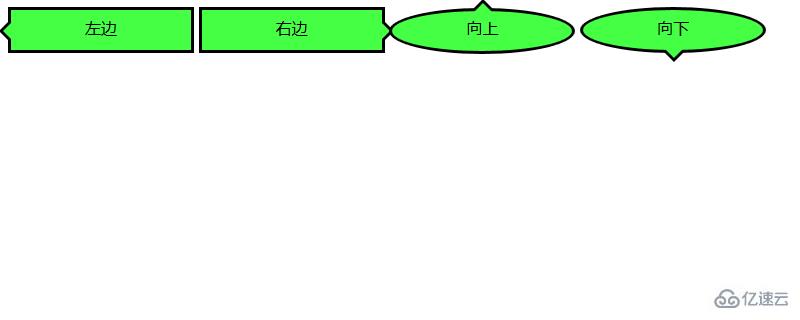
接下来我们就来看看这几种对话气泡的实现方法
我们来看一下如何实现箭头向左的对话气泡
我们需要先来制作一个框架
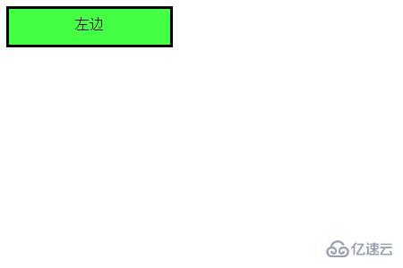
代码如下
HTML代码
<div class="balloon-left">
左边
</div>
CSS代码
 .balloon-left {
  position: relative;
  display: inline-block;
  padding: 0 15px;
  width: auto;
  min-width: 150px;
  height: 40px;
  line-height: 34px;
  text-align: center;
  background: #44FF44;
  border: 3px solid #000000;
  z-index: 0;
}
接着,我们使用:before来制作箭头部分,用:after来制作箭头的边
CSS代码
.balloon-left:before {
  border-style: solid;
  border-width: 10px 10px 10px 0;
  border-color: transparent #44FF44 transparent transparent;
  content: "";
  position: absolute;
  top: 50%; left: -8px;
  margin-top: -9px;
  display: block;
  width: 0px;
  height: 0px;
  z-index: 0;
}
.balloon-left:after {
  border-style: solid;
  border-width: 11px 11px 11px 0;
  border-color: transparent #000000 transparent transparent;
  content: "";
  position: absolute;
  top: 50%; left: -12px;
  margin-top: -10px;
  display: block;
  width: 0px;
  height: 0px;
  z-index: -1;
}
运行效果入下所示
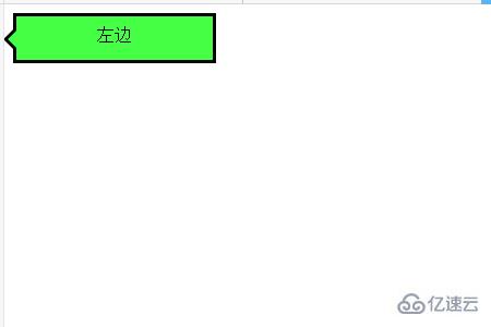
这样就完成了第一个对话气泡
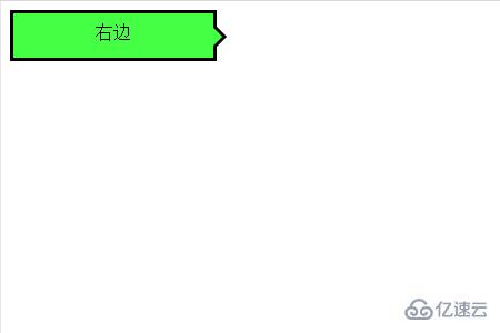
下面我们就来根据上述方法来制作箭头向右的对话气泡
代码如下
HTML代码
<div class="balloon-right">
  右边
</div>
CSS代码
.balloon-right {
  position: relative;
  display: inline-block;
  padding: 0 15px;
  width: auto;
  min-width: 150px;
  height: 40px;
  line-height: 34px;
  text-align: center;
  background: #44FF44;
  border: 3px solid #000000;
  z-index: 0;
}
.balloon-right:before {
  border-style: solid;
  border-width: 10px 0 10px 10px;
  border-color: transparent transparent transparent #44FF44;
  content: "";
  position: absolute;
  top: 50%; right: -8px;
  margin-top: -9px;
  display: block;
  width: 0px;
  height: 0px;
  z-index: 0;
}
.balloon-right:after {
  border-style: solid;
  border-width: 11px 0 11px 11px;
  border-color: transparent transparent transparent #000000;
  content: "";
  position: absolute;
  top: 50%; right: -12px;
  margin-top: -10px;
  display: block;
  width: 0px;
  height: 0px;
  z-index: -1;
}
运行上述代码的效果如下所示:是一个向右的气泡
最后我们来说箭头向左和向右的对话气泡
我们需要用到border-radius属性让气泡变得圆滑
代码如下
HTML代码
<div class="balloon-top">向上</div>
  <div class="balloon-bottom">向下</div>
CSS代码
.balloon-top {
position: relative;
display: inline-block;
padding: 0 15px;
width: auto;
min-width: 150px;
height: 40px;
line-height: 32px;
text-align: center;
background: #44FF44;
border: 3px solid #000000;
z-index: 0;
border-radius: 60%;
}
.balloon-top:before {
border-style: solid;
border-width: 0 10px 10px 10px;
border-color: transparent transparent #44FF44 transparent;
content: "";
position: absolute;
top: -8px; left: 50%;
margin-left: -9px;
display: block;
width: 0px;
height: 0px;
z-index: 0;
}
.balloon-top:after {
border-style: solid;
border-width: 0 11px 11px 11px;
border-color: transparent transparent #000000 transparent;
content: "";
position: absolute;
top: -12px; left: 50%;
margin-left: -10px;
display: block;
width: 0px;
height: 0px;
z-index: -1;
}
.balloon-bottom {
position: relative;
display: inline-block;
padding: 0 15px;
width: auto;
min-width: 150px;
height: 40px;
line-height: 34px;
text-align: center;
background-color: #44FF44;
border: 3px solid #000000;
z-index: 0;
border-radius: 60%;
}
.balloon-bottom:before {
content: "";
position: absolute;
bottom: -8px; left: 50%;
margin-left: -9px;
width: 0px;
height: 0px;
border-style: solid;
border-width: 10px 10px 0 10px;
border-color: #44FF44 transparent transparent transparent;
z-index: 0;
}
.balloon-bottom:after {
border-style: solid;
border-width: 11px 11px 0 11px;
border-color: #000000 transparent transparent transparent;
content: "";
position: absolute;
bottom: -12px; left: 50%;
margin-left: -10px;
width: 0px;
height: 0px;
z-index: -1;
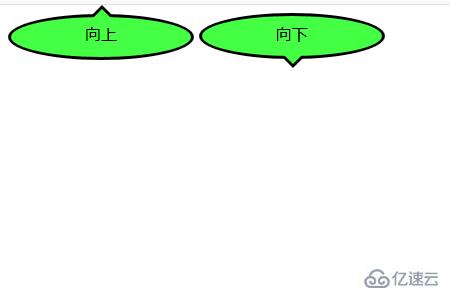
}效果如下所示
CSS部分有点复杂,但你可以根据以上示例通过自定义颜色和形状来制作各种类型的对话框气泡。
以上是使用CSS制作对话框气泡的方法的所有内容,感谢各位的阅读!希望分享的内容对大家有帮助,更多相关知识,欢迎关注亿速云行业资讯频道!
免责声明:本站发布的内容(图片、视频和文字)以原创、转载和分享为主,文章观点不代表本网站立场,如果涉及侵权请联系站长邮箱:is@yisu.com进行举报,并提供相关证据,一经查实,将立刻删除涉嫌侵权内容。


