小编给大家分享一下css中animation-timing-function属性的使用方法,相信大部分人都还不怎么了解,因此分享这篇文章给大家参考一下,希望大家阅读完这篇文章后大有收获,下面让我们一起去了解一下吧!
css animation-timing-function属性是CSS的一个动画属性,用来规定动画的速度曲线,即动画的播放方式,使动画的变化更为平滑。
css animation-timing-function属性怎么用?
作用:animation-timing-function 规定动画的速度曲线。速度曲线定义动画从一套 CSS 样式变为另一套所用的时间。速度曲线用于使变化更为平滑。
语法:
animation-timing-function: value;
说明:animation-timing-function 使用名为三次贝塞尔(Cubic Bezier)函数的数学函数,来生成速度曲线。
您能够在该函数中使用自己的值,也可以预定义的值:
● linear 动画从头到尾的速度是相同的。
● ease 默认。动画以低速开始,然后加快,在结束前变慢。
● ease-in 动画以低速开始。
● ease-out 动画以低速结束。
● ease-in-out 动画以低速开始和结束。
● cubic-bezier(n,n,n,n) 在 cubic-bezier 函数中自己的值。可能的值是从 0 到 1 的数值。
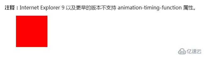
注释:Internet Explorer 9 以及更早的版本不支持 animation-timing-function 属性。
css animation-timing-function属性使用示例
<!DOCTYPE html>
<html>
<head>
<style>
div
{
width:100px;
height:100px;
background:red;
position:relative;
animation:mymove 5s infinite;
animation-timing-function:linear;
/* Safari and Chrome */
-webkit-animation:mymove 5s infinite;
-webkit-animation-timing-function:linear;
}
@keyframes mymove
{
from {left:0px;}
to {left:200px;}
}
@-webkit-keyframes mymove /* Safari and Chrome */
{
from {left:0px;}
to {left:200px;}
}
</style>
</head>
<body>
<p><strong>注释:</strong>Internet Explorer 9 以及更早的版本不支持 animation-timing-function 属性。</p>
<div></div>
</body>
</html>
效果输出:
以上是css中animation-timing-function属性的使用方法的所有内容,感谢各位的阅读!相信大家都有了一定的了解,希望分享的内容对大家有所帮助,如果还想学习更多知识,欢迎关注亿速云行业资讯频道!
免责声明:本站发布的内容(图片、视频和文字)以原创、转载和分享为主,文章观点不代表本网站立场,如果涉及侵权请联系站长邮箱:is@yisu.com进行举报,并提供相关证据,一经查实,将立刻删除涉嫌侵权内容。


