小编给大家分享一下css中:before和:after的使用示例,希望大家阅读完这篇文章后大所收获,下面让我们一起去探讨吧!
根据定义:before和:after是CSS的伪元素,我们可以使用它们在元素内容之前或之后插入内容,有很多的文章都给出了它们的基础知识,所以我想写一篇关于:before和:after在实际应用的文章,表示我们正在使用它们。
语法
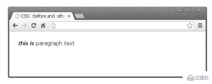
假设我们有以下简单的html标记:
<p>paragraph text</p>
我们可以使用这样的伪元素:
p:before {
    content: "this is ";
    font-weight: bold;
    font-style: italic;
}
结果是:
请注意,实际上是在内容之前或之后添加元素。它不是出现在所选元素旁边的东西,而是与其内容相关。(推荐课程:css视频教程)
图标
使用:before和:after实现一个小图标是非常好用的,因为你可以添加每个CSS样式属性,所以可以将新创建的元素设置为一个块元素并附加背景图像。
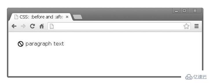
同样,我们有相同的标记
段落文字
看下面的CSS代码:
p:before {
    content: "";
    display: block;
    background: url("icon.jpg") no-repeat;
    width: 20px;
    height: 20px;
    float: left;
    margin: 0 6px 0 0;
    }
icon.jpg是从Photoshop导出的20x20图像。以下是浏览器的外观:
样式外部链接
我在很多产品中看到了这一点。以不同方式设置指向外部资源的链接是一种很好的做法。这可以通过上述技术轻松完成。假设我们有以下段落的文字:
<p>Krasimir Tsonev is <a href="http://krasimirtsonev.com">developer</a>who likes to write and <a href="https://twitter.com/KrasimirTsonev">tweet</a>.</p>
我们可以在该链接后添加一个小图标,表示它指向当前域之外的页面。
a {
    text-decoration: none;
    font-weight: bold;
    color: #000;
    }
a:after {
    content: "";
    display: inline-block;
    background: url("icon-external.jpg") no-repeat top right;
    width: 14px;
    height: 12px;
    }
面包屑(导航)
通常当你做面包屑时,它们之间有链接和分隔符。而不是在DOM中添加元素,您可以使用纯css实现相同的效果。
HTML:
<p>
    <a href="#">Home</a>
    <a href="#">Team</a>
    <a href="#">Developers</a>
</p>
只需几行CSS:
a {
    text-decoration: none;
    font-weight: bold;
    color: #000;
    }
a:after {
    content: " /";}
a:first-child:before {
    content: " » ";
    }
a:last-child:after {
    content: "";
    }
结果如下:
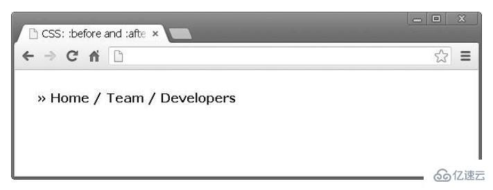
上述结果产生了一下效果。首先,在所有链接之前都有一个符号。我结合两个伪元素的第一个子元素和before表示:“加入了»在第一链接之前”。最后,我做了同样的事情,从列表中的最后一个链接中删除分隔符。
我发现这非常有帮助。主要是因为我不必在生成导航的代码中关注这一点。我的意思是如果我必须用PHP构建相同的东西我应该写一些额外的代码。例如:
$links = array('Home', 'Team', 'Developers');
$str = '» ';for($i=0; $i<count($links); $i++) {
    $str .= '<a href="#">'.$links[$i].'</a>';
    if($i < count($links)-1)
    {
        $str .= ' / ';
    }
    }
    echo $str;
即在上面的代码中,我在链接前添加了符号,并在PHP中添加了分隔符的一些逻辑。这有些不对,因为PHP代码不应该对事物的外观负责。
清除漂浮物
使用float属性仍然很好。毕竟它对布局组织有很大帮助。但是,一旦元素浮动,您需要另一个元素来清除浮动。否则结果不太好。例如,以下代码:
* html
<a href="#">Home</a>
<a href="#">Products</a>
<p>Lorem ipsum dolor sit amet, consectetur adipiscing elit. Donec at purus ac lacus ultrices vehicula.</p>
* css
a {
    float: left;
    display: block;
    width: 100px;
    ... other styling
    }
将产生以下布局:
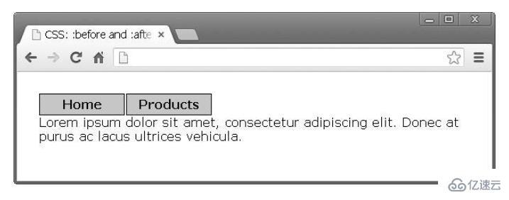
文本应该在链接下面,而不是添加新的DOM节点,可以使用伪元素:before清除浮点数:
p:before {
    content: "";
    display: block;
    clear: both;
    }
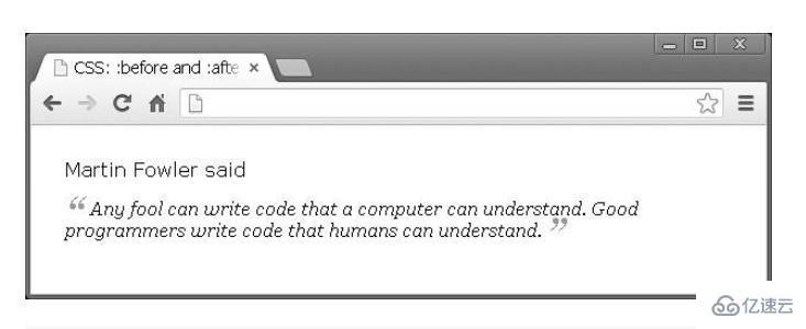
引用
:before和:after非常适合引用文本。假设我们有一个想法,我们想要格式化它。
<p>
    Martin Fowler said
    <span class="quoted">Any fool can write code that a computer can understand.
    Good programmers write code that humans can understand.
    </span>
</p>
只有使用CSS才能实现以下效果:
span.quoted {
    font-family: Georgia;
    font-size: 16px;
    display: block;
    margin: 14px 0 0 0;
    font-style: italic;
    }
    span.quoted:before {
    content: "“";
    font-size: 40px;
    color: #999;
    line-height: 0;
    display: inline-block;
    margin: 0 6px 0 0;
    }
    span.quoted:after {
    content: " ”";
    font-size: 40px;
    color: #999;
    line-height: 0;
    display: inline-block;
    margin: 0 0 0 4px;
    }
箭头
在网页设计时,有时候会为弹出窗口或工具提示添加一些好看的装饰。直接编码它们有点困难。幸运的是,我们可以在没有其他图片或JavaScript时利用CSS文件解决这个问题。下面我们就来具体看一看。
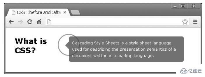
开始,我们的标记看起来像这样
<h3>What is CSS?</h3>
<div class="popup">
    Cascading Style Sheets is a style sheet language used for describing
    the presentation semantics of a document written in a markup language.
    </div>
我们左边有一个标题,右边有弹出窗口。我们需要在描述文本的左侧添加这个小箭头指向标题;怎么解决这个问题呢?我们可以使用简单的边框样式制作箭头并将这样的元素附加到弹出窗口中。
h3 {
    float: left;
    width: 170px;
    }
    .popup {
    float: left;
    width: 340px;
    background: #727272;
    padding: 10px;
    border-radius: 6px;
    color: #FFF;
    position: relative;
    font-size: 12px;
    line-height: 20px;
    }
    .popup:before {
    content: "";
    display: block;
    width: 0;
    height: 0;
    border-top: 12px solid transparent;
    border-bottom: 12px solid transparent;
    border-right: 12px solid #727272;
    position: absolute;
    top: 16px;
    left: -12px;
    }
设计不同的标题类型
目前有一个单页网站的项目,项目中有不同部分的标题。每个标题都包含两行。以下是最终设计的样子:
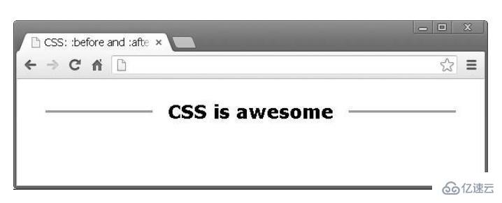
这个就是我们利用:before和:after设计出来的:
h3 {
    width: 100%;
    margin: 0;
    padding: 0;
    text-align: center;
    }
    h3:after {
    display: inline-block;
    margin: 0 0 8px 20px;
    height: 3px;
    content: " ";
    text-shadow: none;
    background-color: #999;
    width: 140px;
    }
    h3:before {
    display: inline-block;
    margin: 0 20px 8px 0;
    height: 3px;
    content: " ";
    text-shadow: none;
    background-color: #999;
    width: 140px;
    }
伪元素:after和:before元素是你可以设置HTML样式而不添加新的DOM节点最好用的方法。
看完了这篇文章,相信你对css中:before和:after的使用示例有了一定的了解,想了解更多相关知识,欢迎关注亿速云行业资讯频道,感谢各位的阅读!
免责声明:本站发布的内容(图片、视频和文字)以原创、转载和分享为主,文章观点不代表本网站立场,如果涉及侵权请联系站长邮箱:is@yisu.com进行举报,并提供相关证据,一经查实,将立刻删除涉嫌侵权内容。


