这篇文章主要介绍使用纯CSS实现在容器中反弹小球的方法,文中介绍的非常详细,具有一定的参考价值,感兴趣的小伙伴们一定要看完!
https://github.com/comehope/front-end-daily-challenges
定义 dom,只有一个元素:
<div class="loader"></div>
居中显示:
body {
    margin: 0;
    height: 100vh;
    display: flex;
    align-items: center;
    justify-content: center;
    background-color: black;
}
定义容器的尺寸:
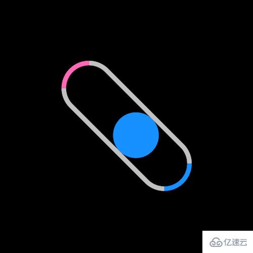
.loader {
    width: 10em;
    height: 3em;
    border: 0.3em solid silver;
    border-radius: 3em;
    font-size: 20px;
}
把容器左右两侧分别涂上不同的颜色:
.loader {
    border-left-color: hotpink;
    border-right-color: dodgerblue;
}
在容器中画一个小球:
.loader {
    position: relative;
}

.loader::before {
    content: '';
    position: absolute;
    top: 0;
    left: 0;
    width: 3em;
    height: 3em;
    border-radius: 50%;
    background-color: dodgerblue;
}
让小球在容器中往复移动:
.loader::before {
    animation: shift 3s linear infinite;
}

@keyframes shift {
    50% {
        left: 7em;
    }
}
再让小球在撞到两端时变色:
.loader::before {
    animation:
        shift 3s linear infinite,
        change-color 3s linear infinite;
}

@keyframes change-color {
    0%, 55% {
        background-color: dodgerblue;
    }

    5%, 50% {
        background-color: hotpink;
    }
}
最后,让容器不停地旋转:
.loader {
    animation: spin 3s linear infinite;
}

@keyframes spin {
    to {
        transform: rotate(360deg);
    }
}
以上是使用纯CSS实现在容器中反弹小球的方法的所有内容,感谢各位的阅读!希望分享的内容对大家有帮助,更多相关知识,欢迎关注亿速云行业资讯频道!
免责声明:本站发布的内容(图片、视频和文字)以原创、转载和分享为主,文章观点不代表本网站立场,如果涉及侵权请联系站长邮箱:is@yisu.com进行举报,并提供相关证据,一经查实,将立刻删除涉嫌侵权内容。


