使用纯CSS实现一个人独自行走的动画效果?这个问题可能是我们日常学习或工作经常见到的。希望通过这个问题能让你收获颇深。下面是小编给大家带来的参考内容,让我们一起来看看吧!
https://github.com/comehope/front-end-daily-challenges
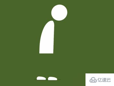
定义 dom,容器中包含 3 个元素,分别代表头、身体和脚:
<div class="man">
    <span class="head"></span>
    <span class="body"></span>
    <span class="feet"></span>
</div>
居中显示:
body {
    margin: 0;
    height: 100vh;
    display: flex;
    align-items: center;
    justify-content: center;
    background: radial-gradient(lightgray 20%, whitesmoke);
}
定义容器尺寸:
.man {
    width: 12em;
    height: 33em;
    font-size: 10px;
    position: relative;
}
定义主色:
.man {
    color: white;
}
画出头部:
.head {
    position: absolute;
    width: 7em;
    height: 7em;
    background-color: currentColor;
    border-radius: 50%;
    right: 0;
}
画出身体:
.body {
    position: absolute;
    width: 6.2em;
    height: 14.4em;
    background-color: currentColor;
    top: 7em;
    border-radius: 100% 20% 0 0;
}
画出脚,现在只能看到一只脚,是因为两只脚重叠在一起,一会儿动起来时就能看到两只脚了:
.feet::before,
.feet::after {
    content: '';
    position: absolute;
    width: 4em;
    height: 1.4em;
    background-color: white;
    bottom: 0;
    left: -1.6em;
    border-radius: 1em 80% 0.4em 0.4em;
}
用伪元素画出阴影:
.man::before {
    content: '';
    position: absolute;
    width: 12em;
    height: 0.8em;
    background-color: rgba(0, 0, 0, 0.1);
    bottom: -0.2em;
    left: -3em;
    border-radius: 50%;
}
接下来增加动画效果。
增加行走的动画效果,并使两只脚的动画时间交错:
.feet::before,
.feet::after {
    animation: feet-animation 2s ease-in-out infinite;
}

.feet::after {
    animation-delay: 1s;
}

@keyframes feet-animation {
    20% {
        transform: translateX(3.4em) translateY(-1.6em) rotate(4deg);
    }

    30% {
        transform: translateX(4.6em) translateY(-1em) rotate(0deg);
    }

    40% {
        transform: translateX(5.6em) translateY(-0.6em) rotate(4deg);
    }

    44% {
        transform: translateX(5.6em) translateY(0) rotate(0deg);
    }
}
增加头和身体起伏的动画效果:
.head,
.body {
    animation: body-animation 4s ease-in-out infinite;
}

@keyframes body-animation {
    0%, 100% {
        transform: translateY(0) skewX(-2deg);
    }

    25%, 75% {
        transform: translateY(0.5em) skewX(0deg);
    }

    50% {
        transform: translateY(0) skewX(0deg);
    }
}
增加阴影面积随身体运动而变化的动画效果:
.man::before {
    animation: shadow-animate 4s ease-in-out infinite;
}

@keyframes shadow-animate {
    0%, 50%, 100% {
        transform: scale(1);
    }

    25%, 75% {
        transform: scale(1.15);
    }
}
感谢各位的阅读!看完上述内容,你们对使用纯CSS实现一个人独自行走的动画效果大概了解了吗?希望文章内容对大家有所帮助。如果想了解更多相关文章内容,欢迎关注亿速云行业资讯频道。
免责声明:本站发布的内容(图片、视频和文字)以原创、转载和分享为主,文章观点不代表本网站立场,如果涉及侵权请联系站长邮箱:is@yisu.com进行举报,并提供相关证据,一经查实,将立刻删除涉嫌侵权内容。


