这期内容当中小编将会给大家带来有关纯CSS如何实现接扎啤的特效,文章内容丰富且以专业的角度为大家分析和叙述,阅读完这篇文章希望大家可以有所收获。
https://github.com/comehope/front-end-daily-challenges
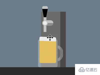
定义 dom,容器中包含一个表示酒桶的 .keg 元素和表示啤酒杯的 .glass 元素。酒桶有 2 个子元素,.handle 表示把手,.pipe 表示出水管,酒杯有 1 个表示啤酒的子元素 .beer:
<div class="container">
    <div class="keg">
        <span class="handle"></span>
        <span class="pipe"></span>
    </div>
    <div class="glass">
        <span class="beer"></span>
    </div>
</div>
居中显示:
body {
    margin: 0;
    height: 100vh;
    display: flex;
    justify-content: center;
    background: linear-gradient(
        lightslategray 300px,
        #333 300px
    );
}
定义容器尺寸和伪元素的共有属性:
.container {
    width: 700px;
    height: 300px;
    position: relative;
}

.container *::before,
.container *::after {
    content: '';
    position: absolute;
}
画出酒桶:
.keg {
    position: absolute;
    width: 90px;
    height: 200px;
    background: linear-gradient(
        to right,
        #777 70px,
        #555 70px
    );
    bottom: 0;
    left: 310px;
}
画出出水管和它的支架:
.keg .pipe {
    position: absolute;
    width: 10px;
    height: 40px;
    background-color: #ccc;
    top: 33px;
    left: 10px;
}

.keg .pipe::before {
    width: 40px;
    height: 20px;
    background:
        radial-gradient(
            circle at 10px 10px,
            #eee 7px,
            #ccc 7px, #ccc 10px,
            transparent 10px
        ),
        linear-gradient(
            #ccc 50%,
            #999 50%
        );
    border-radius: 10px;
    top: -2px;
    left: -5px;
}
画出把手:
.keg .handle {
    position: absolute;
    border-style: solid;
    border-width: 50px 10px 0 10px;
    border-color: black transparent transparent transparent;
    top: -10px;
    left: 5px;
}

.keg .handle::before {
    width: 20px;
    height: 10px;
    background-color: #ccc;
    top: -60px;
    left: -10px;
    border-radius: 5px 5px 0 0;
}

.keg .handle::after {
    width: 10px;
    height: 20px;
    background-color: #ccc;
    top: -20px;
    left: -5px;
}
画出酒杯:
.glass {
    position: absolute;
    width: 70px;
    height: 100px;
    color: rgba(255, 255, 255, 0.3);
    background-color: currentColor;
    bottom: 0;
    left: 300px;
    border-radius: 5px;
}

.glass::before {
    width: 50px;
    height: 40px;
    border: 10px solid;
    top: 20px;
    right: -20px;
    border-radius: 0 40% 40% 0;
    clip-path: inset(0 0 0 72%);
}
画出杯中的啤酒和泡沫:
.beer {
    position: absolute;
    width: 60px;
    height: 80px;
    background-color: rgba(255, 206, 84, 0.8);
    bottom: 15px;
    left: 5px;
    border-radius: 0 0 5px 5px;
    border-top: solid rgba(255, 206, 84, 0.8);
}

.beer::before {
    width: inherit;
    height: 15px;
    background-color: #eee;
    top: -15px;
    border-radius: 5px 5px 0 0;
}
接下来制作动画。
增加酒杯把手被压下的动画效果:
.keg .handle {
    transform-origin: center 50px;
    animation: handle 5s infinite;
}

@keyframes handle {
    10%, 60% {
        transform: rotate(0deg);
    }

    20%, 50% {
        transform: rotate(-90deg);
    }
}
增加啤酒被斟满的动画效果:
.beer {
    animation: fillup 5s infinite;
}

@keyframes fillup {
    0%, 20% {
        height: 0px;
        border-width: 0px;
    }

    40% {
        height: 40px;
    }

    80%, 100% {
        height: 80px;
        border-width: 5px;
    }
}
增加啤酒泡沫泛起的动画效果:
.beer::before {
    animation:
        wave 0.5s infinite alternate,
        fillup-foam 5s linear infinite;
}

@keyframes fillup-foam {
    0%, 20% {
        top: 0;
        height: 0;
    }

    60%, 100% {
        top: -15px;
        height: 15px;
    }
}

@keyframes wave {
    from {
        transform: skewY(-3deg);
    }

    to {
        transform: skewY(3deg);
    }
}
增加啤酒从出水口流出的效果:
.keg .pipe::after {
    width: 10px;
    background-color: rgba(255, 206, 84, 0.5);
    animation: flow 5s infinite;
}

@keyframes flow {
    0%, 15% {
        top: 40px;
        height: 0;
    }

    20% {
        height: 115px;
    }

    40% {
        height: 75px;
    }

    55% {
        top: 40px;
        height: 50px;
    }

    60%, 100% {
        top: 80px;
        height: 0;
    }
}
最后,增加酒杯滑动的效果:
.glass {
    animation: slide 5s ease infinite;
}

@keyframes slide {
    0% {
        left: 0;
        filter: opacity(0);
    }

    20%, 80% {
        left: 300px;
        filter: opacity(1);
    }

    100% {
        left: 600px;
        filter: opacity(0);
    }
}
上述就是小编为大家分享的纯CSS如何实现接扎啤的特效了,如果刚好有类似的疑惑,不妨参照上述分析进行理解。如果想知道更多相关知识,欢迎关注亿速云行业资讯频道。
免责声明:本站发布的内容(图片、视频和文字)以原创、转载和分享为主,文章观点不代表本网站立场,如果涉及侵权请联系站长邮箱:is@yisu.com进行举报,并提供相关证据,一经查实,将立刻删除涉嫌侵权内容。


