bootstrap中文网上有这么一个bootstrap-switch组件,很实用,看demo学习并记录一下。

<!DOCTYPE html>
<html>
<head>
<meta charset=utf-8>
<meta name=description content="">
<meta name=viewport content="width=device-width, initial-scale=1">
<title></title>
<link href="css/bootstrap.min.css" rel="external nofollow" rel="stylesheet" />
<link href="css/bootstrap-switch.min.css" rel="external nofollow" rel="stylesheet" />
<script src="js/jquery/jquery.1.11.3.min.js"></script>
<script src="js/bootstrap.min.js"></script>
<script src="js/bootstrap-switch.min.js"></script>
</head>
<body>
<input name="status" type="checkbox" data-size="small">
<script type="text/javascript">
$('[name="status"]').bootstrapSwitch({
onText:"启动",
offText:"停止",
onColor:"success",
offColor:"info",
size:"small",
onSwitchChange:function(event,state){
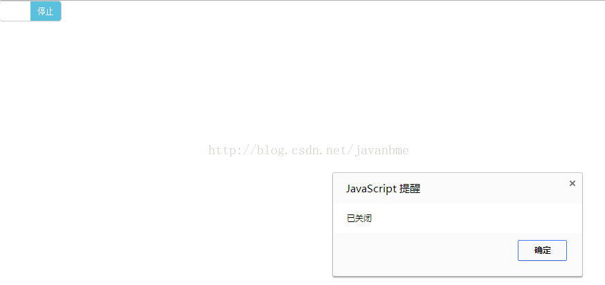
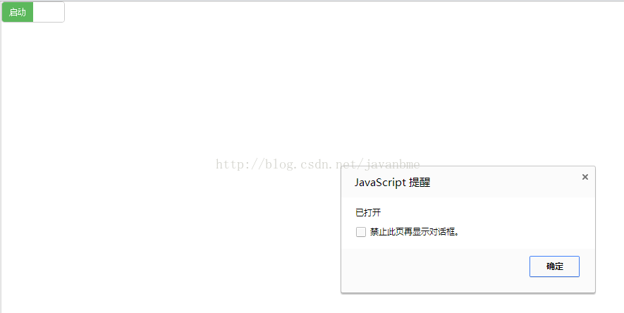
if(state==true){
alert('已打开');
}else{
alert('已关闭');
}
}
})
</script>
</body>
</html>
Bootstrap-Switch源码地址:https://github.com/nostalgiaz/bootstrap-switch
Bootstrap-Switch文档以及Demo:http://www.bootstrap-switch.org/examples.html
常用的属性
size:开关大小。可选值有'mini', 'small', 'normal', 'large'
onColor:开关中开按钮的颜色。可选值有'primary', 'info', 'success', 'warning', 'danger', 'default'
offColor:开关中关按钮的颜色。可选值'primary', 'info', 'success', 'warning', 'danger', 'default'
onText:开关中开按钮的文本,默认是“ON”。
offText:开关中关按钮的文本,默认是“OFF”。
onInit:初始化组件的事件。
onSwitchChange:开关变化时的事件。
以上就是本文的全部内容,希望对大家的学习有所帮助,也希望大家多多支持亿速云。
免责声明:本站发布的内容(图片、视频和文字)以原创、转载和分享为主,文章观点不代表本网站立场,如果涉及侵权请联系站长邮箱:is@yisu.com进行举报,并提供相关证据,一经查实,将立刻删除涉嫌侵权内容。


