今天就跟大家聊聊有关使用vue 如何实现一个可全局调用弹窗,可能很多人都不太了解,为了让大家更加了解,小编给大家总结了以下内容,希望大家根据这篇文章可以有所收获。
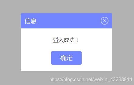
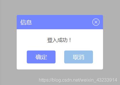
1.实现效果图
2.第一步,新建一个.vue文件 定义一个弹框的基本模板
style样式放在了文章的最底部,如果需要看效果,需要将样式放入这个vue文件里,样式是用less写的,需要你的项目引入less
注意:我这里的组件右上角关闭是一张图片 需要换成你自己本地的路径
<template>
 <div id="tip_alertModal">
  <div class="t-alert-mask"></div>
  <div class="t-alert-container">
   <div class="t-alert-title">
    <span>
     {{title}}
    </span>
    <img @click="close" src="../../../static/images/alert/guanbi.png" alt="">
   </div>
   <div class="t-alert-content">
    <span class="content-text">
     {{content}}
    </span>
   </div>
   <div class="t-alert-confirm">
    <button @click="confirm">确定</button>
    <!-- 默认是没有取消按钮的,data定义默认true false -->
    <button class="cancel-btn" v-show="cancelBtn" @click="cancel">取消</button>
   </div>
  </div>
 </div>
</template>

<script>
 export default {
  data() {
   return {
    show: true, // 通过这个属性,控制是否移除dom元素
    title:'', // 顶部标题
    content:'', // 内容
    cancelBtn: false // 取消按钮
   };
  },
  methods: {
   close() {
    // 右上角关闭
    this.a_close && this.a_close();
    this.show = false;
    // 删除判断增加的window属性
    delete window.alertIsShow;
   },
   confirm() {
    // 确定
    this.a_confirm && this.a_confirm();
    this.show = false;
    // 删除判断增加的window属性
    delete window.alertIsShow;
   },
   cancel() {
    // 取消
    this.a_cancel && this.a_cancel();
    this.show = false;
    // 删除判断增加的window属性
    delete window.alertIsShow;
   }
  },
  watch: {
   show(cur, old) {
    // 通过监控data里的show属性 弹框有三个事件(右上角取消 确定按钮 取消按钮)
    // 每个事件写了 this.show = false
    // 当弹框出现的时候 点击任何一个事件 都会触发这里的监控事件 将页面上的弹框Dom移除
    if (cur === false) {
     let tip_alert = document.getElementById('tip_alertModal');
     tip_alert.parentNode.removeChild(tip_alert);
    }
   }
  }
 }
</script>
3.定义一个js文件
import Vue from 'vue';
import Alert from '@/components/public/alertModal'; //引入刚才写的弹框组件
let AlertConstructor = Vue.extend(Alert); // 返回一个“扩展实例构造器”

let AlertModal = (o) => {
 let alertDom = new AlertConstructor({
  el: document.createElement('div'); //将Alert组件挂载到新创建的div上
 })
 document.body.appendChild(alertDom.$el); //把Alert组件的dom添加到body里

 // 标题
 alertDom.title = o.title || '信息';
 // 单条内容
 alertDom.content = o.content;
 // 关闭按钮
 alertDom.cancelBtn = o.cancelBtn;

 // 弹框三个事件 右上角关闭 确定 取消
 alertDom.a_close = o.close || null;
 alertDom.a_confirm = o.confirm || null;
 alertDom.a_cancel = o.cancel || null;

}
export default AlertModal;
4.mian.js
import alert from '@/common/alertModal' //这里引入的是js文件
Vue.prototype.$alert = alert;
5.在任意组件调用
<template>
 <div>
  <button @click="operate">点击调用弹框</button>
 </div>
</template>

<script>
export default {
 methods: {
  operate() {
   this.$alert({
    title: '信息',
    content: '登入成功!',
    cancelBtn: true, //这个是启用取消按钮,
    close() {
     // 这里执行点击右上角需要做的事,默认执行关闭弹框
    },
    confirm() {
     // 这里执行点击确定按钮需要做的事,默认执行关闭弹框
    },
    cancel() {
     // 这里执行点击取消按钮需要做的事,默认执行关闭弹框
    }
   })
  }
 }
}
</script>
取消按钮开启
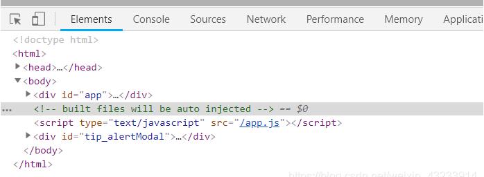
调用之后是往body添加元素
5.通过window.alertIsShow,给window增加一个属性,来控制一个页面只会出现一个弹框
methods: {
  operate () {
   if (!window.alertIsShow) {
    // 弹框模板有个 delete window.alertIsShow 是为了弹框关闭之后能再次显示
    this.$alert({
     title: '信息',
     content: '登入成功!',
     cancelBtn: true,
     close () {
      // 这里执行点击右上角需要做的事,默认执行关闭弹框
     },
     confirm () {
      // 这里执行点击确定按钮需要做的事,默认执行关闭弹框
     },
     cancel () {
      // 这里执行点击取消按钮需要做的事,默认执行关闭弹框
     }
    })
    window.alertIsShow = true;
   }
  }
 }
6.最后是弹框组件的less样式
<style lang="less" scoped>
 #tip_alertModal {
  position: fixed;
  left: 0;
  top: 0;
  z-index: 100;
  width: 100%;
  height: 100%;

  .t-alert-mask {
   position: absolute;
   top: 0;
   left: 0;
   width: 100%;
   height: 100%;
   background-color: rgba(0, 0, 0, .3);
  }

  .t-alert-container {
   position: absolute;
   top: 50%;
   left: 50%;
   min-width: 240px;
   max-width: 400px;
   height: auto;
   background-color: #fff;
   transform: translate(-50%, -50%);
   border-radius: 4px;

   .t-alert-title {
    position: relative;
    width: 100%;
    height: 40px;
    line-height: 40px;
    background-color: rgba(115, 134, 255, 1);
    border-radius: 4px 4px 0px 0px;

    span {
     position: absolute;
     top: 50%;
     left: 10px;
     font-weight: 500;
     font-size: 16px;
     color: #fff;
     transform: translate(0, -50%);
    }

    img {
     position: absolute;
     top: 50%;
     right: 10px;
     transform: translate(0, -50%);
     cursor: pointer;
    }
   }

   .t-alert-content {
    text-align: center;
    span {
     font-family: PingFangSC-Regular;
     font-weight: 400;
     font-size: 14px;
     color: rgba(51,51,51,1);
    }

    span.content-text {
     display: inline-block;
     width: 100%;
     height: auto;
     font-weight: 400;
     font-size: 14px;
     color: #333;
     padding: 20px 18px;
    }
    .t-content-list {
      min-width: 320px;
      height: auto;
      text-align: left;
     .list-title {
      position: relative;
      padding: 10px 0 10px 10px;
      img {
       display: inline-block;
       position: absolute;
       width: 20px;
       margin-right: 10px;
      }
      span {
       display: inline-block;
       vertical-align: middle;
       padding-left: 31px;
      }
     }
     .list-content {
      width: 100%;
      height: auto;
      ul {
       padding-bottom: 10px;
       li {
        width: 100%;
        height: auto;
        padding-bottom: 10px;
        span {
         vertical-align: top;
        }
        span.title {
         display: inline-block;
         padding-left: 41px;
         padding-right: 3px;
         text-align: left;
        }
       }
      }
     }
    }
   }

   .t-alert-confirm {
    width: 100%;
    padding-bottom: 17px;
    text-align: center;

    button {
     display: inline-block;
     width: 80px;
     height: 36px;
     border: none;
     background: rgba(115, 134, 255, 1);
     font-weight: 400;
     font-size: 16px;
     color: #fff;
     border-radius: 4px;
     outline: none;
     cursor: pointer;
    }
    .cancel-btn {
     margin-left:20px;
     background:rgba(151,193,234,1);
     font-family: PingFangSC-Regular;
     font-weight: 400;
     font-size: 16px;
     color: rgba(255,255,255,1);
    }
   }
  }
 }
</style>
如果本篇文章对你有帮助的话,很高兴能够帮助上你。
补充知识:Vue注册全局组件-弹窗组件
在src目录下新建components文件夹
1.新建module文件夹,然后新建v-alert.vue
<template>
<transition name="fade">
<div
class="v-alert g-center"
:>
<div
class="v-cont"
:class="{shadow:!hideCont}"
:>
<div
v-if="title.trim()"
:
class="title g-font18">
{{title}}
<span class="title-data">{{titleData}}</span>
</div>
<div
v-if="isCancel"
class="v-cancel">
<div
class="cancel-icon"
:
@click="cancel">

</div>
</div>
<slot name="slot3"></slot>
<div
v-if="!hideCont"
:
class="content">
<slot></slot>
</div>
<slot name="slot2"></slot>
</div>
<div
class="g-fixed alert-wrap"
@click="$emit('cancel')"
:></div>
</div>
</transition>
</template><script>
export default {
name: "v-alert",
props: {
title: {default: ""},
// titFontSize:{default: '16'},
bgColorTit: {default: "#40404C"},
bgColor: {default: "#fff"}, // 背景色
bgWrapColor: {default: "rgba(42, 47, 59, 0.6)"}, //外套背景色
cancelCol: {default: "#fff"}, //按钮颜色
width: {required: true, type: Number}, //宽度
minWidth: {type: Number, default: 0},
isCancel: {type: Boolean, default: true}, //是否显示关闭按钮
titleData: {default: ""},
hideCont: {type: Boolean, default: false}, //是否隐藏cont
zIndex: {default: 2000},
styles: {
default() {
return {};
},
type: Object
},
titleStyle: {
default() {
return {};
},
type: Object
},
},
components: {},
computed: {
innerWidth() {
let dfu = {
backgroundColor: this.bgColor
};
this.minWidth > 0
? dfu.minWidth = `${this.minWidth}px`
: dfu.width = `${this.width}px`;
return dfu;
}
},
methods: {
cancel() {
this.$emit("cancel");
}
},
mounted() {
document.addEventListener(
"keydown",
event => {
let keyCode = this.$_lib.getKeycode(event);
if (keyCode === 'Escape' || keyCode === 27) this.$emit("cancel");
},
false
);
}
};
</script><style lang="scss"
rel="stylesheet/scss"
scoped>
.v-alert {
position: fixed;
top: 0;
left: 0;
width: 100%;
height: 100%;
z-index: 2000;
.alert-wrap {
top: 0;
left: 0;
width: 100%;
height: 100%;
/*z-index: 2000;*/
}
.v-cont {
min-width: 100px;
min-height: 100px;
background-color: #ffffff;
position: relative;
border-radius: 2px;
.shadow {
box-shadow: 0 2px 30px rgba(42, 47, 59, 0.2);
}
z-index: 2001;
.title {
width: 100%;
line-height: 70px;
color: #ffffff;
padding-left: 30px;
}
.title-data {
color: #f8e19a;
}
.content {
padding: 40px;
/*padding: 60px 40px 50px 40px;*/
word-wrap: break-word;
text-align: left;
}
}
.v-cancel {
position: absolute;
top: 0;
right: 0;
width: 100%;
height: 70px;
}
.cancel-icon {
position: absolute;
text-align: center;
width: 20px;
height: 20px;
line-height: 20px;
right: 20px;
top: 50%;
margin-top: -10px;
color: #ffffff;
cursor: pointer;
transition: 200ms;
&:hover {
-webkit-transform: rotate(90deg);
-moz-transform: rotate(90deg);
-ms-transform: rotate(90deg);
-o-transform: rotate(90deg);
transform: rotate(90deg);
}
}
}
</style>2.在nodule同级目录新建vue-component.js
import VAlert from './v-alert'; //弹窗

export default {
 install(Vue) {
  Vue.component('VAlert', VAlert);
 }
};
3.在main.js中注册为全局组件
import vueComponent from "./components/vue-component";
Vue.use(vueComponent);
4.在其他组件可以直接用了,无需import
<template>
  <v-alert
   v-if="is_alert"
   @cancel="is_alert=false"
   bg-color-tit="#40404C"
   cancel-col="#fff"
   :title="提示"
   :width="680">
   <div></div>
  </v-alert>
</template>
看完上述内容,你们对使用vue 如何实现一个可全局调用弹窗有进一步的了解吗?如果还想了解更多知识或者相关内容,请关注亿速云行业资讯频道,感谢大家的支持。
免责声明:本站发布的内容(图片、视频和文字)以原创、转载和分享为主,文章观点不代表本网站立场,如果涉及侵权请联系站长邮箱:is@yisu.com进行举报,并提供相关证据,一经查实,将立刻删除涉嫌侵权内容。


