这篇文章主要介绍了css设置图片不停旋转的方法,具有一定借鉴价值,需要的朋友可以参考下。希望大家阅读完这篇文章后大有收获。下面让小编带着大家一起了解一下。
css设置图片不停旋转的方法:可以通过使用animation属性和transform属性来进行设置,如【-webkit-transform: rotate(360deg);animation: rotation;】。
相关属性:
animation动画属性
animation: name duration timing-function delay iteration-count direction fill-mode play-state;
属性值:
animation-name 指定要绑定到选择器的关键帧的名称
animation-duration 动画指定需要多少秒或毫秒完成
animation-timing-function 设置动画将如何完成一个周期
animation-delay 设置动画在启动前的延迟间隔。
animation-iteration-count 定义动画的播放次数。
animation-direction 指定是否应该轮流反向播放动画。
animation-fill-mode 规定当动画不播放时(当动画完成时,或当动画有一个延迟未开始播放时),要应用到元素的样式。
animation-play-state 指定动画是否正在运行或已暂停。
initial 设置属性为其默认值。
inherit 从父元素继承属性。
Transform属性应用于元素的2D或3D转换。这个属性允许你将元素旋转,缩放,移动,倾斜等。
transform: none|transform-functions;
属性值:
none 定义不进行转换。
matrix(n,n,n,n,n,n) 定义 2D 转换,使用六个值的矩阵。
matrix3d(n,n,n,n,n,n,n,n,n,n,n,n,n,n,n,n) 定义 3D 转换,使用 16 个值的 4x4 矩阵。
translate(x,y) 定义 2D 转换。
translate3d(x,y,z) 定义 3D 转换。
代码实现:
html代码:
<div class="demo">
    <img class="an img" src="/test/img/2.png" width="500" height="500"/>
</div>
旋转代码:
.demo{
text-align: center;
margin-top: 100px;
}
@-webkit-keyframes rotation{
from {-webkit-transform: rotate(0deg);}
to {-webkit-transform: rotate(360deg);}
}
.an{
-webkit-transform: rotate(360deg);
animation: rotation 3s linear infinite;
-moz-animation: rotation 3s linear infinite;
-webkit-animation: rotation 3s linear infinite;
-o-animation: rotation 3s linear infinite;
}
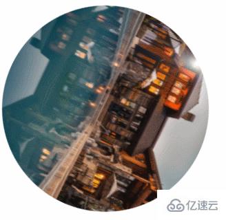
.img{border-radius: 250px;}实现效果:
感谢你能够认真阅读完这篇文章,希望小编分享css设置图片不停旋转的方法内容对大家有帮助,同时也希望大家多多支持亿速云,关注亿速云行业资讯频道,遇到问题就找亿速云,详细的解决方法等着你来学习!
免责声明:本站发布的内容(图片、视频和文字)以原创、转载和分享为主,文章观点不代表本网站立场,如果涉及侵权请联系站长邮箱:is@yisu.com进行举报,并提供相关证据,一经查实,将立刻删除涉嫌侵权内容。


