这篇文章给大家分享的是有关 纯CSS如何实现鼠标放上滑动出半透明效果的内容。小编觉得挺实用的,因此分享给大家做个参考,一起跟随小编过来看看吧。
效果如下:
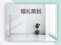
实例1
实例2以实例1【婚礼策划】为例
HTML:
<div class="itemInWorks" >
   婚礼策划
   <div class="mask">
       状态:待完成<br>
       执行者:张三<br>
       截止日期:2020/03/15
   </div>
</div>
CSS:
/*外层div部分*/
.itemInWorks{
    width: 180px;
    height: 130px;
    border-radius:5px;/*圆角*/
    font-size: 18px;
    font-weight: 600;
    color: dimgrey;
    text-align: center;/*文字“婚礼策划”水平居中*/
    line-height: 50px;/*文字“婚礼策划”垂直居中*/
    background: url('image/works_image/4.jpg');
    background-repeat: no-repeat;
    background-size: 180px 130px;
    box-shadow: #909090 0px 0px 10px;/*周围阴影*/
    /*以上根据个人的效果自定义*/
    overflow: hidden;
    position: relative;
}
/*半透明部分*/
.itemInWorks .mask{
    height:80px;
    width:172px;
    color: #f5f1e5;
    line-height: 23px;
    text-align: left;
    padding-left: 8px;
    border-radius:2px 2px 5px 5px;
    font-size: 14px;
    font-weight: 300;
    /*以上根据个人的效果自定义*/
    position: absolute;
    top:130px;/*鼠标不放时,半透明部分最高处离外层div顶端的距离*/
    background-color:rgba(0,0,0,0.5);/*透明度*/
    transition:top 0.5s ease-in-out;/*改变top属性,0.5秒完成,慢开始慢结束*/
}
.itemInWorks:hover .mask{
    top:50px ;/*鼠标放上时,滑动到的最高处离外层div顶端的距离*/
}
全部代码:
<!DOCTYPE html>
<html lang="en">
<head>
    <meta charset="UTF-8">
    <title>Title</title>
</head>
<style>
    .itemInWorks{
        width: 180px;
        height: 130px;
        border-radius:5px;
        font-size: 18px;
        font-weight: 600;
        color: dimgrey;
        text-align: center;
        line-height: 50px;
        background: url('image/works_image/4.jpg');
        background-repeat: no-repeat;
        background-size: 180px 130px;
        box-shadow: #909090 0px 0px 10px;
        overflow: hidden;
        position: relative;
    }
    /*半透明部分*/
    .itemInWorks .mask{
        height:80px;
        width:172px;
        color: #f5f1e5;
        line-height: 23px;
        text-align: left;
        padding-left: 8px;
        border-radius:2px 2px 5px 5px;
        font-size: 14px;
        font-weight: 300;
        position: absolute;
        top:130px;
        background-color:rgba(0,0,0,0.5);
        transition:top 0.5s ease-in-out;
    }
    .itemInWorks:hover .mask{
        top:50px ;
    }
</style>
<body>
<div class="itemInWorks" >
    婚礼策划
    <div class="mask">
        状态:待完成<br>
        执行者:张三<br>
        截止日期:2020/03/15
    </div>
</div>
</body>
</html>
感谢各位的阅读!关于“ 纯CSS如何实现鼠标放上滑动出半透明效果”这篇文章就分享到这里了,希望以上内容可以对大家有一定的帮助,让大家可以学到更多知识,如果觉得文章不错,可以把它分享出去让更多的人看到吧!
免责声明:本站发布的内容(图片、视频和文字)以原创、转载和分享为主,文章观点不代表本网站立场,如果涉及侵权请联系站长邮箱:is@yisu.com进行举报,并提供相关证据,一经查实,将立刻删除涉嫌侵权内容。


