小编给大家分享一下CSS3中如何实现Flexbox骰子布局,相信大部分人都还不怎么了解,因此分享这篇文章给大家参考一下,希望大家阅读完这篇文章后大有收获,下面让我们一起去了解一下吧!
一、First Face
我们知道,骰子有六个面,每个面的点的个数代表该面的值,第一个面由一个水平垂直居中的点组成。下面来看具体的实现:
 <section name="01" class="face-01">
  <span class="dot"></span>
 </section>
face-01 {
display: flex;
justify-content: center;
align-items: center;
关于justify-content和align-items的用法请参考这里justify-content,align-items。使用flexbox,垂直居中两行属性就可以搞定,很easy!
二、Second Face
.face-02 {
 display: flex;
 justify-content: space-between;
}
.face-02 .dot:nth-of-type(2) {
 align-self: flex-end;
}
  <section name="02" class="face-02">
   <span class="dot"></span>
   <span class="dot"></span>
  </section>
这里我们不能使用align-items属性,使用它两个点都会受影响,flexbox提供了一个align-self属性,这个属性可以让我们更方便的控制flex items的各项沿着cross axias方向,设置不同的布局。align-self的用法参考这里align-self。
三、Third Face
.face-03 {
 display: flex;
 justify-content: space-between;
}
.face-03 .dot:nth-of-type(2) {
 align-self: center;
}
.face-03 .dot:nth-of-type(3) {
 align-self: flex-end;
}
<section name="03" class="face-03">
 <span class="dot"></span>
 <span class="dot"></span>
 <span class="dot"></span>
</section>
该face与second face 使用的属性相同,不再解释。
四、Fourth Face
.face-04 {
 display: flex;
 justify-content: space-between;
 flex-direction: column;
}
.face-04 .column {
 display: flex;
 justify-content: space-between;
}
<section name="04" class="face-04">
  <div class="column">
    <span class="dot"></span>
    <span class="dot"></span>
  </div>
  <div class="column">
    <span class="dot"></span>
    <span class="dot"></span>
  </div>
</section>
本例中使用了flex-direction,从字面意思可以看出,是用来控制flex的方向,即按列还是按行来布局,该属性更详细的用法可以参考这里flex-direction
后面Fifth Face 和 Sixth Face,根据前面的布局思想,就很easy了不再赘述!
写到此,想想配合JS写一个玩骰子的小游戏应该很easy了吧。
五、实现1,2,3,4,6,12等份
.row {
  display: flex;
  box-sizing: border-box;
}

.column {
  margin: 10px;
  flex-grow: 1;
  flex-shrink: 1;
  flex-basis: 0;
  box-sizing: border-box;
}
<section class="row">
  <div class="column">One</div>
</section>
<section class="row">
  <div class="column">One Half</div>
  <div class="column">One Half</div>
</section>
<section class="row">
  <div class="column">One Third</div>
  <div class="column">One Third</div>
  <div class="column">One Third</div>
</section>
<section class="row">
  <div class="column">One Fourth</div>
  <div class="column">One Fourth</div>
  <div class="column">One Fourth</div>
  <div class="column">One Fourth</div>
</section>
<section class="row">
  <div class="column">One Sixth</div>
  <div class="column">One Sixth</div>
  <div class="column">One Sixth</div>
  <div class="column">One Sixth</div>
  <div class="column">One Sixth</div>
  <div class="column">One Sixth</div>
</section>
<section class="row">
  <div class="column">One Twelve</div>
  <div class="column">One Twelve</div>
  <div class="column">One Twelve</div>
  <div class="column">One Twelve</div>
  <div class="column">One Twelve</div>
  <div class="column">One Twelve</div>
  <div class="column">One Twelve</div>
  <div class="column">One Twelve</div>
  <div class="column">One Twelve</div>
  <div class="column">One Twelve</div>
  <div class="column">One Twelve</div>
  <div class="column">One Twelve</div>
</section>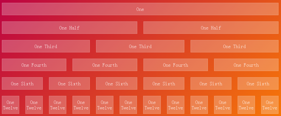
在本例中用到了flex-grow,flex-shrink,flex-basis三个属性。
1. flex-grow:根据需要用来定义伸缩项目的扩展能力。它接受一个不带单位的值做为一个比例。主要用来决定伸缩容器剩余空间按比例应扩展多少空间。
如果所有伸缩项目的“flex-grow”设置了“1”,那么每个伸缩项目将设置为一个大小相等的剩余空间。如果你给其中一个伸缩项目设置了“flex-grow”值为“2”,那么这个伸缩项目所占的剩余空间是其他伸缩项目所占剩余空间的两倍。负值无效。
2. flex-shrink:根据需要用来定义伸缩项目收缩的能力。负值同样无效。
3. flex-basis: 用来设置伸缩基准值,剩余的空间按比率进行伸缩,不支持负值。如果设置为0,围绕内容的额外的空间不会考虑在内。如果设置为auto,额外的空间是基于flex-grow的值分配。
六、实现2-3-7布局
.row237 .column:first-of-type {
  flex-grow: 2;
  flex-basis: 5px;
}
.row237 .column:nth-of-type(2) {
  flex-grow: 3;
  flex-basis: 18px;
}
.row237 .column:nth-of-type(3) {
  flex-grow: 7;
  flex-basis: 70.5px;
}

<section class="row row237">
  <div class="column">One Half</div>
  <div class="column">One Third</div>
  <div class="column">One Seventh</div>
</section>
此处各项flex-basis的值的计算,应该有个公式(待解决),如果有这个公式,配合sass,less等预处理语言实现多列自适应布局将会很方便。
以上是“CSS3中如何实现Flexbox骰子布局”这篇文章的所有内容,感谢各位的阅读!相信大家都有了一定的了解,希望分享的内容对大家有所帮助,如果还想学习更多知识,欢迎关注亿速云行业资讯频道!
免责声明:本站发布的内容(图片、视频和文字)以原创、转载和分享为主,文章观点不代表本网站立场,如果涉及侵权请联系站长邮箱:is@yisu.com进行举报,并提供相关证据,一经查实,将立刻删除涉嫌侵权内容。


