这篇文章主要介绍“CSS制作的三角形和圆形小按钮代码分享”,在日常操作中,相信很多人在CSS制作的三角形和圆形小按钮代码分享问题上存在疑惑,小编查阅了各式资料,整理出简单好用的操作方法,希望对大家解答”CSS制作的三角形和圆形小按钮代码分享”的疑惑有所帮助!接下来,请跟着小编一起来学习吧!
参考了天猫、微博等网站的做法,用纯html和css实现,效果还是不错的。
以下是成果,兼容主流浏览器,包括ie6。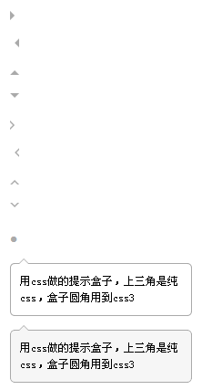
CSS Code复制内容到剪贴板
<!DOCTYPE html PUBLIC "-//W3C//DTD XHTML 1.0 Strict//EN" "http://www.w3.org/TR/xhtml1/DTD/xhtml1-strict.dtd">
<html xmlns="http://www.w3.org/1999/xhtml">
<head>
<meta http-equiv="Content-Type" content="text/html; charset=utf-8" />
<meta http-equiv="Content-Language" content="zh-CN" />
<meta name="Keywords" content="" />
<meta name="Description" content="" />
<title></title>
</head>
<style type="text/css">
*{margin:0; padding:0; list-style:none; font:normal 12px/150% 宋体; }
body{ padding:20px; }
.arrow{ margin-bottom:20px; }
/* css三角形 */
.arrow,.arrow s { position:relative; display:block; font-size: 0; line- height: 0; width: 0; height: 0; border-color:transparent; border-style:dashed; border-width:5px; }
.arrowR,.arrowR s{ border-left-color:#aaa; border-left-style:solid; }
.arrowR s{ border-left-color:#fff; position:absolute; left:-7px; top:-5px; }
.arrowR:hover{ border-left-color:#f60; }
.arrowL,.arrowL s{ border-right-color:#aaa; border-right-style:solid; }
.arrowL s{ border-right-color:#fff; position:absolute; rightright:-7px; top:-5px; }
.arrowL:hover{ border-right-color:#f60; }
.arrowT,.arrowT s{ border-bottom-color:#aaa; border-bottom-style:solid; }
.arrowT s{ border-bottom-color:#fff; position:absolute; left:-5px; top:-3px; }
.arrowT:hover{ border-bottom-color:#f60; }
.arrowB,.arrowB s{ border-top-color:#aaa; border-top-style:solid; }
.arrowB s{ border-top-color:#fff; position:absolute; left:-5px; bottombottom:-3px; }
.arrowB:hover{ border-top-color:#f60; }
/* css圆形 */
.circle{ line-height:100%; overflow:hidden; font- family:Tahoma,Helvetica; font-size:18px; color:#aaa; }
.circle:hover{ color:#f60; }
/* 提示盒子 */
.tipBox{ width:200px; margin-top:10px; }
.tipBox .hd{ height:5px; position:relative; }
.tipBox .hd .arrow{ position:absolute; top:-5px; left:10px; }
.tipBox .hd .arrow s{ top:-4px; }
.tipBox .bd{ border:1px solid #aaa; padding:10px; -webkit-border- radius:5px; -moz-border-radius:5px; border-radius:5px; }
.tipBoxA .arrow s{ border-bottom-color:#f6f6f6; }
.tipBoxA .bd{ background:#f6f6f6; }
</style>
<body>
<a class="arrow arrowR"></a>
<a class="arrow arrowL"></a>
<a class="arrow arrowT"></a>
<a class="arrow arrowB"></a>
<a class="arrow arrowR"><s></s></a>
<a class="arrow arrowL"><s></s></a>
<a class="arrow arrowT"><s></s></a>
<a class="arrow arrowB"><s></s></a>
<a class="circle">?</a>
<div class="tipBox">
<div class="hd">
<s class="arrow arrowT"><s></s></s>
</div>
<div class="bd">
用css做的提示盒子,上三角是纯css,盒子圆角用到css3
</div>
</div>
<div class="tipBox tipBoxA">
<div class="hd">
<s class="arrow arrowT"><s></s></s>
</div>
<div class="bd">
用css做的提示盒子,上三角是纯css,盒子圆角用到css3
</div>
</div>
</body>
</html>
到此,关于“CSS制作的三角形和圆形小按钮代码分享”的学习就结束了,希望能够解决大家的疑惑。理论与实践的搭配能更好的帮助大家学习,快去试试吧!若想继续学习更多相关知识,请继续关注亿速云网站,小编会继续努力为大家带来更多实用的文章!
免责声明:本站发布的内容(图片、视频和文字)以原创、转载和分享为主,文章观点不代表本网站立场,如果涉及侵权请联系站长邮箱:is@yisu.com进行举报,并提供相关证据,一经查实,将立刻删除涉嫌侵权内容。


