这篇文章主要讲解了“CSS3怎么实现照片墙功能”,文中的讲解内容简单清晰,易于学习与理解,下面请大家跟着小编的思路慢慢深入,一起来研究和学习“CSS3怎么实现照片墙功能”吧!
HTML
代码如下:
<body>
<h3>照片墙制作</h3>
<div class="container">
<img class="img1" src="img/img (1).jpg" height="150" width="150" alt="">
<img class="img2" src="img/img (2).jpg" height="160" width="200" alt="">
<img class="img3" src="img/img (3).jpg" height="170" width="200" alt="">
<img class="img4" src="img/img (4).jpg" height="240" width="200" alt="">
<img class="img5" src="img/img (5).jpg" height="300" width="300" alt="">
</div>
</body>
CSS(此处省略了浏览器私有属性前缀!)
代码如下:
<style>
* {margin:0; padding:0;}
body { background-color: #eee; padding-top: 50px;}
h3 { text-align: center;}
.container { position: relative; width:1000px; height:700px; margin:0px auto; }
img { position: absolute; top:50px; left:100px; cursor: pointer;
padding:10px 10px 25px; background-color: #fff; border:1px solid #ddd;
transition:0.5s; box-shadow: 3px 3px 3px #ccc;
}
.img1 { left:40px; top:20px; transform:rotate(30deg); z-index: 1;}
.img2 { left:156px; top:156px; transform:rotate(-30deg); z-index: 1;}
.img3 { left:381px; top:60px; transform:rotate(30deg); z-index: 1;}
.img4 { left:458px; top:256px; transform:rotate(30deg); z-index: 1;}
.img5 { left:684px; top:110px; transform:rotate(-40deg); z-index: 1;}
img:hover { transform:rotate(0deg); transform:scale(1.5); box-shadow: 6px 6px 6px #656565; z-index: 2;}
</style>
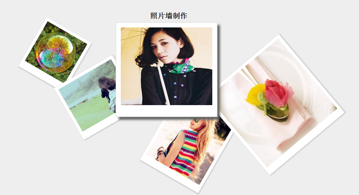
效果图:
感谢各位的阅读,以上就是“CSS3怎么实现照片墙功能”的内容了,经过本文的学习后,相信大家对CSS3怎么实现照片墙功能这一问题有了更深刻的体会,具体使用情况还需要大家实践验证。这里是亿速云,小编将为大家推送更多相关知识点的文章,欢迎关注!
免责声明:本站发布的内容(图片、视频和文字)以原创、转载和分享为主,文章观点不代表本网站立场,如果涉及侵权请联系站长邮箱:is@yisu.com进行举报,并提供相关证据,一经查实,将立刻删除涉嫌侵权内容。


