cssжҖҺж ·еҲ¶дҪңеңҶ
е°Ҹзј–з»ҷеӨ§е®¶еҲҶдә«дёҖдёӢcssжҖҺж ·еҲ¶дҪңеңҶпјҢзӣёдҝЎеӨ§йғЁеҲҶдәәйғҪиҝҳдёҚжҖҺд№ҲдәҶи§ЈпјҢеӣ жӯӨеҲҶдә«иҝҷзҜҮж–Үз« з»ҷеӨ§е®¶еҸӮиҖғдёҖдёӢпјҢеёҢжңӣеӨ§е®¶йҳ…иҜ»е®ҢиҝҷзҜҮж–Үз« еҗҺеӨ§жңү收иҺ·пјҢдёӢйқўи®©жҲ‘们дёҖиө·еҺ»дәҶи§ЈдёҖдёӢеҗ§пјҒ
еңЁcssдёӯпјҢеҸҜд»ҘеҲ©з”Ёborder-radiusеұһжҖ§жқҘеҲ¶дҪңеңҶпјӣborder-radiusеұһжҖ§еҸҜд»Ҙдёәе…ғзҙ ж·»еҠ еңҶи§’иҫ№жЎҶпјҢеҸӘйңҖиҰҒз»ҷе®Ҫй«ҳзӣёеҗҢзҡ„жӯЈж–№еҪўе…ғзҙ зҡ„и®ҫзҪ®вҖңborder-radius: 100%;вҖқж ·ејҸеҚіеҸҜгҖӮ
p+CssеҲ¶дҪңеӣӣеҲҶд№ӢдёҖеңҶдё»иҰҒжҳҜдҪҝз”ЁCss3.0дёӯзҡ„border-radiusиҝҷдёӘеңҶи§’йҡҗи—ҸеұһжҖ§.еҲ©з”ЁиҝҷдёҖеұһжҖ§,жҲ‘们еҸҜд»Ҙз”»еңҶ,з”»еҚҠеңҶ,еӣӣеҲҶд№ӢдёүеңҶ,еӣӣеҲҶд№ӢдёҖеңҶзӯү.д»ҘеҗҺжҲ‘дјҡжӣҙж–°вҖҰвҖҰ
еҰӮдҪ•дҪҝз”Ёborder-radiusеұһжҖ§,дёӢйқўжҳҜborder-radiusеұһжҖ§жңҖеҹәжң¬зҡ„дҪҝз”Ёж–№жі•:
.round {
border-radius: 5px; /* жүҖжңүи§’йғҪдҪҝз”ЁеҚҠеҫ„дёә5pxзҡ„еңҶи§’пјҢжӯӨеұһжҖ§дёәCSS3ж ҮеҮҶеұһжҖ§ */
-moz-border-radius: 5px; /* MozillaжөҸи§ҲеҷЁзҡ„з§ҒжңүеұһжҖ§ */
-webkit-border-radius: 5px; /* WebkitжөҸи§ҲеҷЁзҡ„з§ҒжңүеұһжҖ§ */
border-radius: 5px 4px 3px 2px; /* еӣӣдёӘеҚҠеҫ„еҖјеҲҶеҲ«жҳҜе·ҰдёҠи§’гҖҒеҸідёҠи§’гҖҒеҸідёӢи§’е’Ңе·ҰдёӢи§’ */
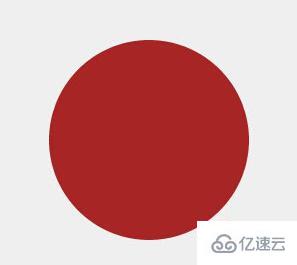
}1гҖҒз”Ёborder-radiusз”»еңҶ:
#circle {
    width: 200px;
    height: 200px;
    background-color: #a72525;
    -webkit-border-radius: 100px;
    /*-webkit-border-radius: 100%;*/
}д»”з»Ҷжғіжғі,дёҖдёӘжӯЈж–№еҪў(200*200),йҮҢйқўжңҖеӨ§зҡ„еңҶжҳҜзҡ„еҚҠеҫ„жҳҜ:100.
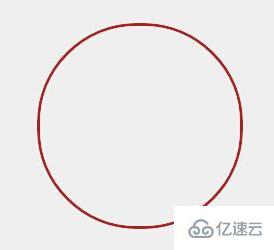
2.з©әеҝғеңҶд»Јз Ғ:з©әеҝғеңҶе…¶е®һе°ұжҳҜеҸӘжңүиҫ№жЎҶ,з©әеҝғйғЁеҲҶеЎ«дёҠе…¶д»–йўңиүІ:
#circle {
    width: 200px;
    height: 200px;
    background-color: #efefef; /* Can be set to transparent */
    border: 3px #a72525 solid;
    -webkit-border-radius: 100px;
}
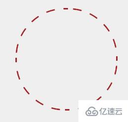
еҗҢзҗҶиҷҡзәҝеңҶд»Јз Ғ:
#circle {
    width: 200px;
    height: 200px;
    background-color: #efefef; /* Can be set to transparent */
    border: 3px #a72525 dashed;
    -webkit-border-radius: 100px 100px 100px 100px;
}
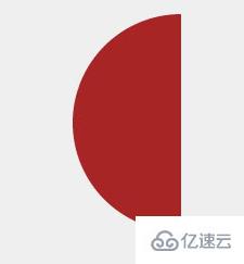
3.еҚҠеңҶе’ҢеӣӣеҲҶд№ӢдёҖеңҶд»Јз Ғ:
#quartercircle {
    width: 200px;
    height: 200px;
    background-color: #a72525;
    -webkit-border-radius: 200px 0 0 0;
}
<!doctype html>
<html>
<head>
<meta charset="UTF-8">
<meta name="Generator" content="EditPlusВ®">
<meta name="Author" content="">
<meta name="Keywords" content="">
<meta name="Description" content="">
<title>Document</title>
<style type="text/css">
#quartercircle{
width: 200px;
height: 200px;
background-color: #ffffaa;
border-radius:0 0 0 200px;
-webkit-border-radius: 0 0 0 200px;
-moz-border-radius: 0 0 0 200px;
-ms-border-radius: 0 0 0 200px;
-o-border-radius: 0 0 0 200px;
}
#quartercircle .dianxuan{
font-family:Arial;
color:gray;
font-size:25px;
padding-top: 55px;
padding-left: 90px;
transform:rotate(32deg);
-ms-transform:rotate(32deg); /* Internet Explorer */
-moz-transform:rotate(32deg); /* Firefox */
-webkit-transform:rotate(32deg); /* Safari е’Ң Chrome */
-o-transform:rotate(32deg); /* Opera */
}
</style>
</head>
<body>
<div id="quartercircle">
<div>зӮ№йҖү</div>
</div>
</body>
</html>
и§ЈйҮҠ:
-moz(дҫӢеҰӮ -moz-border-radius)з”ЁдәҺFirefox
-webkit(дҫӢеҰӮпјҡ-webkit-border-radius)з”ЁдәҺSafariе’ҢChrome
е…¶дёӯborder-radiusеҗ„дёӘжөҸи§ҲеҷЁж”ҜжҢҒжғ…еҶөеҰӮиЎЁ:
| жөҸи§ҲеҷЁ | ж”ҜжҢҒжҖ§ |
|---|
| Firefox(2гҖҒ3+) | вҲҡ |
| Google Chrome(1.0.154+вҖҰ) | вҲҡ |
| Google Chrome(2.0.156+вҖҰ) | вҲҡ |
| Safari(3.2.1+ windows) | вҲҡ |
| Internet Explorer(IE7, IE8) | Г— |
| Opera 9.6 | Г— |
д»ҘдёҠжҳҜвҖңcssжҖҺж ·еҲ¶дҪңеңҶвҖқиҝҷзҜҮж–Үз« зҡ„жүҖжңүеҶ…е®№пјҢж„ҹи°ўеҗ„дҪҚзҡ„йҳ…иҜ»пјҒзӣёдҝЎеӨ§е®¶йғҪжңүдәҶдёҖе®ҡзҡ„дәҶи§ЈпјҢеёҢжңӣеҲҶдә«зҡ„еҶ…е®№еҜ№еӨ§е®¶жңүжүҖеё®еҠ©пјҢеҰӮжһңиҝҳжғіеӯҰд№ жӣҙеӨҡзҹҘиҜҶпјҢж¬ўиҝҺе…іжіЁдәҝйҖҹдә‘иЎҢдёҡиө„и®Ҝйў‘йҒ“пјҒ


