这篇文章给大家分享的是有关css如何使用transform: rotate配合overflow: hidden绘制三角形的内容。小编觉得挺实用的,因此分享给大家做个参考,一起跟随小编过来看看吧。
transform: rotate 配合 overflow: hidden 绘制三角形
这种方法还是比较常规的,使用 transform: rotate 配合 overflow: hidden。一看就懂,一学就会,简单的动画示意图如下:
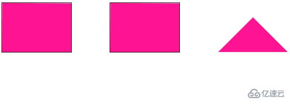
设置图形的旋转中心在左下角 left bottom,进行旋转,配合 overflow: hidden。
完整的代码:
<div class="demo"></div>
<div class="demo-opacity"></div>
<div class="triangle"></div>
html, body {
    width: 100%;
    height: 100%;
    display: flex;
}

div {
    width: 141px;
    height: 100px;
    margin: auto;
}

.demo-opacity {
    overflow: hidden;
}

.demo,
.demo-opacity {
    position: relative;
    border: 1px solid #000;
    background: unset;

    &::before {
        content: "";
        position: absolute;
        top: 0;
        left: 0;
        right: 0;
        bottom: 0;
        animation: conicmove 3s infinite linear;
        background: deeppink;
        transform-origin: left bottom;
        z-index: -1;
    }
}

.triangle {
    position: relative;
    background: unset;
    overflow: hidden;

    &::before {
        content: "";
        position: absolute;
        top: 0;
        left: 0;
        right: 0;
        bottom: 0;
        background: deeppink;
        transform-origin: left bottom;
        transform: rotate(45deg);
        z-index: -1;
    }
}

@keyframes conicmove {
    100% {
        transform: rotate(45deg);
    }
}
感谢各位的阅读!关于“css如何使用transform: rotate配合overflow: hidden绘制三角形”这篇文章就分享到这里了,希望以上内容可以对大家有一定的帮助,让大家可以学到更多知识,如果觉得文章不错,可以把它分享出去让更多的人看到吧!
免责声明:本站发布的内容(图片、视频和文字)以原创、转载和分享为主,文章观点不代表本网站立场,如果涉及侵权请联系站长邮箱:is@yisu.com进行举报,并提供相关证据,一经查实,将立刻删除涉嫌侵权内容。


