这篇文章主要讲解了“CSS3边框border怎么用”,文中的讲解内容简单清晰,易于学习与理解,下面请大家跟着小编的思路慢慢深入,一起来研究和学习“CSS3边框border怎么用”吧!
使用方法:
border-radius:10px; /* 所有角都使用半径为10px的圆角 */
border-radius: 5px 4px 3px 2px; /* 四个半径值分别是左上角、右上角、右下角和左下角,顺时针 */
不要以为border-radius的值只能用px单位,你还可以用百分比或者em。
 1 <!DOCTYPE html>
 2 <html lang="en">
 3
 4 <head>
 5     <meta charset="UTF-8">
 6     <meta name="viewport" content="width=device-width, initial-scale=1.0">
 7     <meta http-equiv="X-UA-Compatible" content="ie=edge">
 8     <title>border-radius</title>
 9     <style>
10         #box {
11             width: 100px;
12             height: 100px;
13             background-color: aquamarine;
14             border-radius: 5px;
15         }
16
17         #box1 {
18             width: 100px;
19             height: 100px;
20             background-color: red;
21             border-radius: 50%;
22         }
23
24         #box2 {
25             width: 100px;
26             height: 100px;
27             background-color: blue;
28             border-radius: 5px 10px 20px 30px;
29         }
30
31         #box3 {
32             width: 50px;
33             height: 100px;
34             background-color: coral;
35             border-radius: 50px 0px 0px 50px;
36         }
37     </style>
38 </head>
39
40 <body>
41     <h5>为正方形添加圆角效果</h5>
42     <div id="box"></div>
43
44     <br>
45
46     <h5>实心圆</h5>
47     <div id="box1"></div>
48
49     <br>
50
51     <h5>为正方形4个角分别添加不同的圆角幅度</h5>
52     <div id="box2"></div>
53
54     <br>
55
56     <h5>半圆</h5>
57     <div id="box3"></div>
58 </body>
59
60 </html>
border-radius实用
box-shadow是向盒子添加阴影。支持添加一个或者多个。 语法: box-shadow: X轴偏移量 Y轴偏移量 [阴影模糊半径] [阴影扩展半径] [阴影颜色] [投影方式]; 参数介绍: 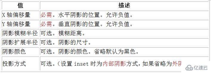 注意:inset 可以写在参数的第一个或最后一个,其它位置是无效的。
1、阴影模糊半径与阴影扩展半径的区别
阴影模糊半径:此参数可选,其值只能是为正值,如果其值为0时,表示阴影不具有模糊效果,其值越大阴影的边缘就越模糊;
阴影扩展半径:此参数可选,其值可以是正负值,如果值为正,则整个阴影都延展扩大,反之值为负值时,则缩小;
2、X轴偏移量和Y轴偏移量值可以设置为负数
注意:如果添加多个阴影,只需用逗号隔开即可 
 1 <!DOCTYPE html>
 2 <html lang="en">
 3
 4 <head>
 5     <meta charset="UTF-8">
 6     <meta name="viewport" content="width=device-width, initial-scale=1.0">
 7     <meta http-equiv="X-UA-Compatible" content="ie=edge">
 8     <title>box-shadow</title>
 9     <style>
10         #box {
11             width: 100px;
12             height: 100px;
13             box-shadow: 4px 2px 6px #333333;
14         }
15
16         #box1 {
17             width: 100px;
18             height: 100px;
19             box-shadow: 4px 2px 6px #333333 inset;
20         }
21
22         #box2 {
23             width: 100px;
24             height: 100px;
25             box-shadow: 4px 2px 6px #f00,
26                 -4px -2px 6px #000,
27                 0px 0px 12px 5px #33cc00 inset
28         }
29
30         #box3 {
31             width: 100px;
32             height: 100px;
33             box-shadow: -4px 2px 6px #333333;
34         }
35
36         #box4 {
37             width: 100px;
38             height: 100px;
39             box-shadow: 4px -2px 6px #333333;
40         }
41     </style>
42 </head>
43
44 <body>
45
46     <h4>外阴影</h4>
47     <div id="box"></div>
48
49     <h4>内阴影</h4>
50     <div id="box1"></div>
51
52     <h4>添加多个阴影</h4>
53     <div id="box2"></div>
54
55     <h4>X轴偏移量为负数</h4>
56     <div id="box3"></div>
57
58     <h4>Y轴偏移量为负数</h4>
59     <div id="box4"></div>
60 </body>
61
62 </html>border-image 顾名思义就是为边框应用背景图片,它和我们常用的background属性比较相似。
border-image的语法:
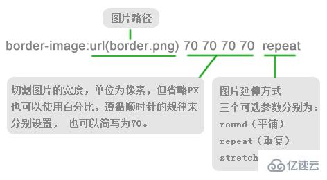
repeat就是一直重复,然后超出部分剪裁掉,而且是居中开始重复。
Round可以理解为圆满的铺满。为了实现圆满所以会压缩(或拉伸)。
Stretch 很好理解就是拉伸,有多长拉多长。有多远“滚”多远。
webkit浏览器对于round属性和repeat属性似乎没有区分,显示效果是一样的。
 1 <!DOCTYPE html>
 2 <html lang="en">
 3
 4 <head>
 5     <meta charset="UTF-8">
 6     <meta name="viewport" content="width=device-width, initial-scale=1.0">
 7     <meta http-equiv="X-UA-Compatible" content="ie=edge">
 8     <title>border-image</title>
 9     <style>
10         #box {
11             width: 180px;
12             height: 180px;
13             background: #F4FFFA;
14             border: 70px solid #ddd;
15             border-image: url(/img/1.png) 70 repeat
16         }
17
18         #box1 {
19             width: 170px;
20             height: 170px;
21             border: 70px solid;
22             border-image: url(/img/1.png) 70 round;
23         }
24
25         #box2 {
26             width: 170px;
27             height: 170px;
28             border: 70px solid;
29             border-image: url(/img/1.png) 70 stretch;
30         }
31
32         #border_image {
33             height: 100px;
34             width: 450px;
35             border: 15px solid #ccc;
36             border-image: url(http://img.mukewang.com/52e22a1c0001406e03040221.jpg) 30 round;
37         }
38     </style>
39 </head>
40
41 <body>
42
43
44     <h4>repeat(重复)</h4>
45     <div id="box"></div>
46
47     <h4>round(平铺)</h4>
48     <div id="box1"></div>
49
50     <h4>stretch(拉伸)</h4>
51     <div id="box2"></div>
52
53     <h4>请为我镶嵌上漂亮的画框吧</h4>
54     <div id="border_image">
55
56 </body>
57
58 </html>
感谢各位的阅读,以上就是“CSS3边框border怎么用”的内容了,经过本文的学习后,相信大家对CSS3边框border怎么用这一问题有了更深刻的体会,具体使用情况还需要大家实践验证。这里是亿速云,小编将为大家推送更多相关知识点的文章,欢迎关注!
免责声明:本站发布的内容(图片、视频和文字)以原创、转载和分享为主,文章观点不代表本网站立场,如果涉及侵权请联系站长邮箱:is@yisu.com进行举报,并提供相关证据,一经查实,将立刻删除涉嫌侵权内容。


