温馨提示×

温馨提示×

您好,登录后才能下订单哦!

密码登录×
登录注册×
其他方式登录
点击 登录注册 即表示同意《亿速云用户服务条款》

vue怎么使用echarts实现折线图

发布时间:2022-03-22 09:06:22 来源:亿速云 阅读:1203 作者:iii 栏目:开发技术

这篇文章主要讲解了“vue怎么使用echarts实现折线图”,文中的讲解内容简单清晰,易于学习与理解,下面请大家跟着小编的思路慢慢深入,一起来研究和学习“vue怎么使用echarts实现折线图”吧!
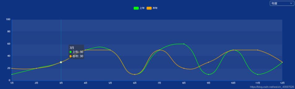
效果图:

vue怎么使用echarts实现折线图

代码:

<template>
            <div class="proCharts" ref='charts'>
            </div>
</template>

<script>
import echarts from 'echarts'   //npm install echarts@4.9.0
export default {
    data () {
        return {
            option:{
                    color:['rgb(8,252,7)','rgb(255,168,0)',],
                    title: {
                        text: ''
                    },
                    tooltip: { //提示框
                        trigger: 'axis',
                    },
                    legend: {//图例的类型
                        icon:'roundRect',//图例icon图标
                        data: [
                            {
                                name:"上年",
                                textStyle: {
                                    color: '#fff'
                                }
                                
                            },{
                                name:"本年",
                                textStyle: {
                                    color: '#fff'
                                }
                            },
                        ],
                        
                    },
                    grid: {
                        left: '3%',
                        right: '4%',
                        bottom: '3%',
                        top:'17%',
                        containLabel: true //grid区域是否包含坐标轴的刻度标签
                    },
                    xAxis: {
                        type: 'category', //坐标轴类型。
                        boundaryGap: false, //坐标轴两边留白策略
                        data: ['1月', '2月', '3月', '4月', '5月', '6月', '7月','8月','9月','10月','11月','12月'],
                        axisLabel: {//坐标轴刻度标签的相关设置
                            interval:0,
                            textStyle: {
                            color: '#fff',
                            fontSize :10
                            },
                        },
                        axisLine:{//坐标轴轴线相关设置
                            show :true,
                            lineStyle:{
                                color:'rgb(2,121,253)'
                            }
                        },
                        axisTick:{ //坐标轴刻度相关设置。
                            show :false,
                        }
                    },
                    yAxis: {
                        type: 'value',
                        axisLabel: { //x轴的坐标文字
                            show: true,
                            textStyle: {
                                color: '#fff' //文字的颜色
                            },
                            
                        },
                        max:100,//最大值100
                        axisLine:{//坐标轴轴线相关设置
                            show :true,
                            lineStyle:{
                                color:'rgb(2,121,253)'
                            }
                        },
                        axisTick:{ //坐标轴刻度相关设置。
                            show :false,
                        },
                        splitLine:{  //坐标在grid区域的分割线
                          lineStyle: { //设置分割线的样式(图表横线颜色)
                                color: ['#153a8a']
                            }
                        }
                    },
                    series: [
                        {
                            name: '上年',
                            type: 'line',
                            data: [10,20,30,50,50,10,50,60,10,50,10,30],
                            lineStyle:{
                                color:'rgb(8,252,7)'  //线的颜色
                            }
                        },
                        {
                            name: '本年',
                            type: 'line',
                            data: [20,20,30,50,50,10,50,20,30,50,50,30],
                            lineStyle:{
                                color:'rgb(255,168,0)' //线的颜色
                            }
                        }
                    ]
                }
        }
    },
    created () {
        
    },
    mounted () {
        this.mycharts()
    },
    methods: {
        mycharts(){
            let myChart =echarts.init(this.$refs.charts,"macarons");
            myChart.setOption(this.option)
            //图表自适应
            window.addEventListener("resize",function(){
                myChart.resize()  // myChart 是实例对象
            })
        }
    }
}
</script>

<style scoped>
.proCharts{
    width: 100%;
    height: 400px;
    background: rgb(14, 51, 129);
}
</style>

感谢各位的阅读,以上就是“vue怎么使用echarts实现折线图”的内容了,经过本文的学习后,相信大家对vue怎么使用echarts实现折线图这一问题有了更深刻的体会,具体使用情况还需要大家实践验证。这里是亿速云,小编将为大家推送更多相关知识点的文章,欢迎关注!

向AI问一下细节

免责声明:本站发布的内容(图片、视频和文字)以原创、转载和分享为主,文章观点不代表本网站立场,如果涉及侵权请联系站长邮箱:is@yisu.com进行举报,并提供相关证据,一经查实,将立刻删除涉嫌侵权内容。

AI