这篇文章主要讲解了“基于WPF如何实现控件轮廓跑马灯动画效果”,文中的讲解内容简单清晰,易于学习与理解,下面请大家跟着小编的思路慢慢深入,一起来研究和学习“基于WPF如何实现控件轮廓跑马灯动画效果”吧!
代码如下
一、创建EdgeLight.xaml代码如下。
<ResourceDictionary xmlns="http://schemas.microsoft.com/winfx/2006/xaml/presentation"
                    xmlns:x="http://schemas.microsoft.com/winfx/2006/xaml"
                    xmlns:controls="clr-namespace:WPFDevelopers.Controls">
    <ResourceDictionary.MergedDictionaries>
        <ResourceDictionary Source="Basic/ControlBasic.xaml"/>
    </ResourceDictionary.MergedDictionaries>

    <Style TargetType="{x:Type controls:EdgeLight}" BasedOn="{StaticResource ControlBasicStyle}">
        <Setter Property="BorderBrush" Value="{DynamicResource PrimaryNormalSolidColorBrush}"/>
        <Setter Property="HorizontalContentAlignment" Value="Center"/>
        <Setter Property="VerticalContentAlignment" Value="Center"/>
        <Setter Property="HorizontalAlignment" Value="Center"/>
        <Setter Property="VerticalAlignment" Value="Center"/>
        <Setter Property="Padding" Value="20"/>
        <Setter Property="Template">
            <Setter.Value>
                <ControlTemplate TargetType="{x:Type controls:EdgeLight}">
                    <ControlTemplate.Resources>
                        <Storyboard x:Key="EdgeLightStoryboard">
                            <DoubleAnimation Duration="00:00:0.5"
                                             To="1"
                                             Storyboard.TargetName="PART_Top"
                                             Storyboard.TargetProperty="ScaleX"/>
                            <DoubleAnimation Duration="00:00:0.5"
                                             BeginTime="00:00:0.5"
                                             To="1"
                                             Storyboard.TargetName="PART_Right"
                                             Storyboard.TargetProperty="ScaleY"/>
                            <DoubleAnimation Duration="00:00:.5"
                                             BeginTime="00:00:01"
                                             To="1"
                                             Storyboard.TargetName="PART_Bottom"
                                             Storyboard.TargetProperty="ScaleX"/>
                            <DoubleAnimation Duration="00:00:.5"
                                             BeginTime="00:00:01.5"
                                             To="1"
                                             Storyboard.TargetName="PART_Left"
                                             Storyboard.TargetProperty="ScaleY"/>
                        </Storyboard>
                    </ControlTemplate.Resources>
                    <Grid>
                        <DockPanel LastChildFill="False">
                            <Rectangle DockPanel.Dock="Top" Height="{TemplateBinding LineSize}" Fill="{TemplateBinding BorderBrush}">
                                <Rectangle.RenderTransform>
                                    <ScaleTransform x:Name="PART_Top" ScaleX="0"/>
                                </Rectangle.RenderTransform>
                            </Rectangle>
                            <Rectangle DockPanel.Dock="Right" Width="{TemplateBinding LineSize}" Fill="{TemplateBinding BorderBrush}">
                                <Rectangle.RenderTransform>
                                    <ScaleTransform x:Name="PART_Right" ScaleY="0"/>
                                </Rectangle.RenderTransform>
                            </Rectangle>
                            <Rectangle DockPanel.Dock="Bottom" Height="{TemplateBinding LineSize}" Fill="{TemplateBinding BorderBrush}"
                                   RenderTransformOrigin="1,1">
                                <Rectangle.RenderTransform>
                                    <ScaleTransform x:Name="PART_Bottom" ScaleX="0"/>
                                </Rectangle.RenderTransform>
                            </Rectangle>
                            <Rectangle DockPanel.Dock="Left" Width="{TemplateBinding LineSize}" Fill="{TemplateBinding BorderBrush}"
                                   RenderTransformOrigin="1,1">
                                <Rectangle.RenderTransform>
                                    <ScaleTransform x:Name="PART_Left" ScaleY="0"/>
                                </Rectangle.RenderTransform>
                            </Rectangle>
                        </DockPanel>
                        <ContentPresenter HorizontalAlignment="{TemplateBinding HorizontalContentAlignment}"
                                          Margin="{TemplateBinding Padding}"
                                          VerticalAlignment="{TemplateBinding VerticalContentAlignment}"/>
                    </Grid>

                    <ControlTemplate.Triggers>
                        <Trigger Property="IsAnimation" Value="True">
                            <Trigger.EnterActions>
                                <BeginStoryboard x:Name="beginAnimation"
                                                 Storyboard="{StaticResource EdgeLightStoryboard}" />
                            </Trigger.EnterActions>
                            <Trigger.ExitActions>
                                <StopStoryboard BeginStoryboardName="beginAnimation" />
                            </Trigger.ExitActions>
                        </Trigger>
                    </ControlTemplate.Triggers>
                </ControlTemplate>
            </Setter.Value>
        </Setter>
    </Style>

</ResourceDictionary>
二、EdgeLight.cs代码如下。
using System;
using System.Collections.Generic;
using System.Linq;
using System.Text;
using System.Windows;
using System.Windows.Controls;
using System.Windows.Media;
using System.Windows.Media.Animation;

namespace WPFDevelopers.Controls
{
    public class EdgeLight:ContentControl
    {
        public bool IsAnimation
        {
            get { return (bool)GetValue(IsAnimationProperty); }
            set { SetValue(IsAnimationProperty, value); }
        }

        public static readonly DependencyProperty IsAnimationProperty =
            DependencyProperty.Register("IsAnimation", typeof(bool), typeof(EdgeLight), new PropertyMetadata(false));


        public double LineSize
        {
            get { return (double)GetValue(LineSizeProperty); }
            set { SetValue(LineSizeProperty, value); }
        }

        public static readonly DependencyProperty LineSizeProperty =
            DependencyProperty.Register("LineSize", typeof(double), typeof(EdgeLight), new PropertyMetadata(1.0d));


        static EdgeLight()
        {
            DefaultStyleKeyProperty.OverrideMetadata(typeof(EdgeLight), new FrameworkPropertyMetadata(typeof(EdgeLight)));
        }


    }
}
三、新建EdgeLightExample.cs代码如下。
<UserControl x:Class="WPFDevelopers.Samples.ExampleViews.EdgeLightExample"
xmlns="http://schemas.microsoft.com/winfx/2006/xaml/presentation"
xmlns:x="http://schemas.microsoft.com/winfx/2006/xaml"
xmlns:mc="http://schemas.openxmlformats.org/markup-compatibility/2006"
xmlns:d="http://schemas.microsoft.com/expression/blend/2008"
xmlns:local="clr-namespace:WPFDevelopers.Samples.ExampleViews"
xmlns:wpfdev="https://github.com/yanjinhuagood/WPFDevelopers"
mc:Ignorable="d"
d:DesignHeight="450" d:DesignWidth="800">
<Grid>
<UniformGrid Columns="2">
<wpfdev:EdgeLight IsAnimation="{Binding ElementName=myCheckBox,Path=IsChecked}" Margin="10" LineSize="2">
<CheckBox Content="EdgeLight" x:Name="myCheckBox"/>
</wpfdev:EdgeLight>
<wpfdev:EdgeLight IsAnimation="{Binding ElementName=myToggleButton,Path=IsChecked}" Margin="10"
BorderBrush="OrangeRed" LineSize="4">
<ToggleButton Content="EdgeLight2" x:Name="myToggleButton"/>
</wpfdev:EdgeLight>
</UniformGrid>
</Grid>
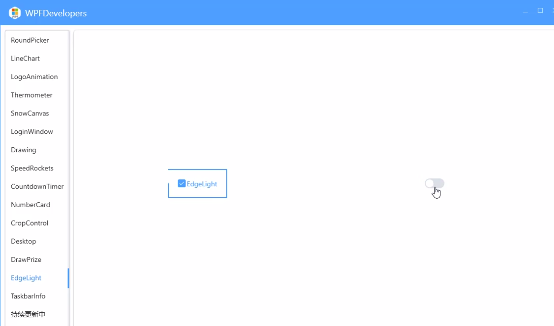
</UserControl>效果预览
感谢各位的阅读,以上就是“基于WPF如何实现控件轮廓跑马灯动画效果”的内容了,经过本文的学习后,相信大家对基于WPF如何实现控件轮廓跑马灯动画效果这一问题有了更深刻的体会,具体使用情况还需要大家实践验证。这里是亿速云,小编将为大家推送更多相关知识点的文章,欢迎关注!
免责声明:本站发布的内容(图片、视频和文字)以原创、转载和分享为主,文章观点不代表本网站立场,如果涉及侵权请联系站长邮箱:is@yisu.com进行举报,并提供相关证据,一经查实,将立刻删除涉嫌侵权内容。


