主页面 media.html
<!DOCTYPE html>
<html>
<head>
<meta charset="utf-8"/>
<title>响应式布局演示实例(Medias Query)</title>
<style>
body,h3{margin:0px;padding:0px;color:white}
section#main,header,aside,footer{
background:pink;
margin:5px 0;
}
h3 {text-align:center;foot-size:3em}
section#container{
margin:0 auto;
width:960px;
}
header {
float:left;
width:100%;
line-height:100px;
}
#left {
float:left;
width:200px;
line-height:400px;
}
section#main {
float:left;
width:540px;
line-height:400px;
margin-left:10px;
}
#right {
float:right;
width:200px;
line-height:400px;
}
footer {
float:left;
width:100%;
line-height:80px;
}
</style>
/*1000px 以上屏幕显示*/
<link rel="stylesheet" type="text/css" media="screen and (min-width:1000px)" href="pc.css" />
/*pad 640-1000px 屏幕显示*/
<link rel="stylesheet" type="text/css" media="screen and (min-width:640px) and (max-width:1000px)" href="pad.css" />
/*phone 640px以下 屏幕显示*/
<link rel="stylesheet" type="text/css" media="screen and (max-width:639px)" href="phone.css" />
</head>
<body>
<section id="container">
<header><h3>Header</h3></header>
<aside id="left"><h3>Left</h3></aside>
<section id="main"><h3>Main</h3></section>
<aside id="right"><h3>Right</h3></aside>
<footer><h3>Footer</h3></footer>
</section>
</body>
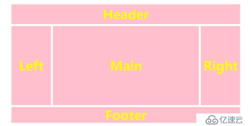
</html>PC端 pc.css
/*1000px 以上屏幕显示*/
h3{color:yellow;font-size:4em}
section#container{
width:1160px;
}
section#main {
width:740px;
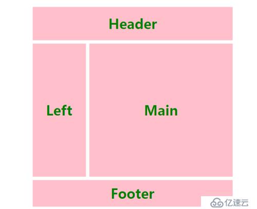
}pad端pad.css
/*pad 640-1000px 屏幕显示*/
h3 {color:green;font-size:2.5em}
section#container{
width:600px;
}
#left {
width:160px;
}
section#main{
width:430px;
}
#right {
display:none;
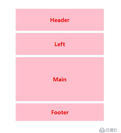
}phone端 phone.css
    /*phone 640px以下 屏幕显示*/

        h3 {color:red;font-size:1.5em}
        section#container {
            width:400px;
        }
        #left {
            float:left;
            width:100%;
            line-height:100px;
        }
        section#main {
            float:left;
            width:100%;
            line-height:200px;
            margin-left:0px;
        }
        #right {
            float:left;
            width:100%;
            line-height:100px;
            display:none;
        }
浏览器输出
pc端
pad端
phone端
免责声明:本站发布的内容(图片、视频和文字)以原创、转载和分享为主,文章观点不代表本网站立场,如果涉及侵权请联系站长邮箱:is@yisu.com进行举报,并提供相关证据,一经查实,将立刻删除涉嫌侵权内容。


