CSS3如何实现仿微信聊天小气泡,相信很多没有经验的人对此束手无策,为此本文总结了问题出现的原因和解决方法,通过这篇文章希望你能解决这个问题。
今天给大家分享一个我刚做的项目中的一个小案例, 因为我们在做一个聊天的功能,之前的聊天页面UI很丑,我就不在这里展示给大家了。
现在就教大家怎么用css3制作一个和微信聊天界面一样的页面。
首先给大家看看页面的样子吧,如下图所示:
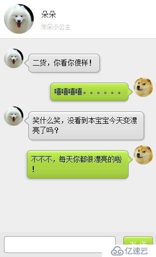
小月博客仿微信聊天界面
页面大致就是这个样子,接下来我们来一起学习制作步骤吧。
<div class="leftd">
    <span ng-class="leftd_h">
        <img ng-src="./img/c_pic.pn" />
    </span>
    <div class="speech left" ng-class="speech left">
        二货,你看你傻样!
    </div>
</div>
<div class="rightd">
    <span ng-class="rightd_h">
        <img ng-src="./img/u_pic.pn" />
    </span>
    <div class="speech right" ng-class="speech left">
        嘻嘻嘻嘻。。。。。。
    </div>
</div>
<div class="leftd">
    <span ng-class="leftd_h">
        <img ng-src="./img/c_pic.pn" />
    </span>
    <div class="speech left" ng-class="speech left">
        笑什么笑,没看到本宝宝今天变漂亮了吗?
    </div>
</div>
<div class="rightd">
    <span ng-class="rightd_h">
        <img ng-src="./img/u_pic.pn" />
    </span>
    <div class="speech right" ng-class="speech left">
         不不不,每天你都很漂亮的啦!
    </div>
</div>
PS(这里也算是最重要的部分了我就把全部的代码都展示出来吧!)
/* 微信气泡 */
div.speech {
    float: left;
    margin: 10px 0;
    padding: 8px;
    table-layout: fixed;
    word-break: break-all;
    position: relative;
    background: -webkit-gradient( linear, 50% 0%, 50% 100%, from(#ffffff), color-stop(0.1, #ececec), color-stop(0.5, #dbdbdb), color-stop(0.9, #dcdcdc), to(#8c8c8c) );
    border: 1px solid #989898;
    border-radius: 8px;
}
div.speech:before {
    content: '';
    position: absolute;
    width: 0;
    height: 0;
    left: 15px;
    top: -20px;
    border: 10px solid;
    border-color: transparent transparent #989898 transparent;
}
div.speech:after {
 content: '';
 position: absolute;
 width: 0;
 height: 0;
 left: 17px;
 top: -16px;
 border: 8px solid;
 border-color: transparent transparent #ffffff transparent;
}
div.speech.right {
 display: inline-block;
 box-shadow: -2px 2px 5px #CCC;
 margin-right: 10px;
 max-width: 75%;
 float: right;
 background: -webkit-gradient( linear, 50% 0%, 50% 100%, from(#e4ffa7), color-stop(0.1, #bced50), color-stop(0.4, #aed943), color-stop(0.8, #a7d143), to(#99BF40) );
}
div.speech.right:before {
 content: '';
 position: absolute;
 width: 0;
 height: 0;
 top: 9px;
 bottom: auto;
 left: auto;
 right: -10px;
 border-width: 9px 0 9px 10px;
 border-color: transparent #989898;
}
div.speech.right:after {
 content: '';
 position: absolute;
 width: 0;
 height: 0;
 top: 10px;
 bottom: auto;
 left: auto;
 right: -8px;
 border-width: 8px 0 8px 9px;
 border-color: transparent #bced50;
}
div .left {
 display: inline-block;
 box-shadow: 2px 2px 2px #CCCCCC;
 margin-left: 10px;
 max-width: 75%;
 position: relative;
 background: -webkit-gradient( linear, 50% 0%, 50% 100%, from(#ffffff), color-stop(0.1, #eae8e8), color-stop(0.4, #E3E3E3), color-stop(0.8, #DFDFDF), to(#D9D9D9) );
}
div .left:before {
 content: '';
 position: absolute;
 width: 0;
 height: 0;
 top: 9px;
 bottom: auto;
 left: -10px;
 border-width: 9px 10px 9px 0;
 border-color: transparent #989898;
}
div .left:after {
 content: '';
 position: absolute;
 width: 0;
 height: 0;
 top: 10px;
 bottom: auto;
 left: -8px;
 border-width: 8px 9px 8px 0;
 border-color: transparent #eae8e8;
}
.leftimg {
 float: left;
 margin-top: 10px;
}
.rightimg {
 float: right;
 margin-top: 10px;
}
.leftd {
 clear: both;
 float: left;
 margin-left: 10px;
}
.rightd {
 clear: both;
 float: right;
 margin-right: 10px;
}

.leftd_h{
 width: 39px;
 height: 39px;
 border-radius: 100%;
 display: block;
 float: left;
 overflow: hidden;
}

.leftd_h img{
 display: block;
 width: 100%;
 height: auto;
}
.rightd_h{
 width: 39px;
 height: 39px;
 border-radius: 100%;
 display: block;
 float: right;
 overflow: hidden;
}

.rightd_h img{
 display: block;
 width: 100%;
 height: auto;
}
这里基本是上用了CSS伪类元素,来制作的小气泡。网上有很多的案例都是吧用户聊天的头像作为背景图,但是我感觉这样子在实际项目中,并不是很合适,所以我就做了一些修改,然我们更加实用。
看完上述内容,你们掌握CSS3如何实现仿微信聊天小气泡的方法了吗?如果还想学到更多技能或想了解更多相关内容,欢迎关注亿速云行业资讯频道,感谢各位的阅读!
免责声明:本站发布的内容(图片、视频和文字)以原创、转载和分享为主,文章观点不代表本网站立场,如果涉及侵权请联系站长邮箱:is@yisu.com进行举报,并提供相关证据,一经查实,将立刻删除涉嫌侵权内容。


