这篇“Html和CSS怎样绘制三角形图标”文章,文中示例代码介绍的非常详细,具有一定的参考价值,感兴趣的小伙伴们一定要参考一下,对于“Html和CSS怎样绘制三角形图标”,小编整理了以下知识点,请大家跟着小编的步伐一步一步的慢慢理解,接下来就让我们进入主题吧。
html的全称为超文本标记语言,它是一种标记语言,包含了一系列标签.通过这些标签可以将网络上的文档格式统一,使分散的Internet资源连接为一个逻辑整体,html文本是由html命令组成的描述性文本,html命令可以说明文字,图形、动画、声音、表格、链接等,主要和css+js配合使用并构建优雅的前端网页。
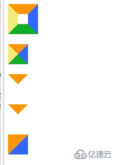
先看看效果图:
<!doctype html>
<html lang="en">
<head>
    <meta charset="UTF-8">
    <title>Document</title>
    <style type="text/css">
        #test1 {
            height:20px;
            width:20px;
            border-color:#FF9600 #3366ff #12ad2a #f0eb7a;
            border-style:solid;
            border-width:20px;
        }
        #test2 {
            height:0;
            width:0;
            overflow: hidden; /* 这里设置overflow, font-size, line-height */
            font-size: 0;     /*是因为, 虽然宽高度为0, 但在IE6下会具有默认的 */
            line-height: 0;  /* 字体大小和行高, 导致盒子呈现被撑开的长矩形 */
            border-color:#FF9600 #3366ff #12ad2a #f0eb7a;
            border-style:solid;
            border-width:20px;
        }
        #test3 {
            height:0;
            width:0;
            overflow: hidden;
            font-size: 0;
            line-height: 0;
            border-color:#FF9600 transparent transparent transparent;
            border-style:solid;
            border-width:20px;
        }
        #test4 {
            height:0;
            width:0;
            overflow: hidden;
            font-size: 0;
            line-height: 0;
            border-color:#FF9600 transparent transparent transparent;
            border-style:solid dashed dashed dashed;
            border-width:20px;
        }/*兼容IE6*/
        #test5 {
            height:0;
            width:0;
            overflow: hidden;
            font-size: 0;
            line-height: 0;
            border-color:#FF9600 #3366ff transparent transparent;
            border-style:solid solid dashed dashed;
            border-width:40px 40px 0 0 ;
        }
    </style>
</head>
<body>
    <p id="test1"></p><br>
    <p id="test2"></p><br>
    <p id="test3"></p><br>
    <p id="test4"></p><br>
    <p id="test5"></p><br>
</body>
</html>
以上是“Html和CSS怎样绘制三角形图标”这篇文章的所有内容,感谢各位的阅读!相信大家都有了一定的了解,希望分享的内容对大家有所帮助,如果还想学习更多知识,欢迎关注亿速云行业资讯频道!
免责声明:本站发布的内容(图片、视频和文字)以原创、转载和分享为主,文章观点不代表本网站立场,如果涉及侵权请联系站长邮箱:is@yisu.com进行举报,并提供相关证据,一经查实,将立刻删除涉嫌侵权内容。


