本篇文章给大家分享的是有关如何实现HTML与CSS中的3D转换模块,小编觉得挺实用的,因此分享给大家学习,希望大家阅读完这篇文章后可以有所收获,话不多说,跟着小编一起来看看吧。
文中的img标签 全部变成了macdown格式
一. 什么是2D和3D
1.什么是2D和3D
2D就是一个平面, 只有宽度和高度, 没有厚度
3D就是一个立体, 有宽度和高度, 还有厚度
默认情况下所有的元素都是呈2D展现的
2.如何让某个元素呈3D展现
和透视一样, 想看到某个元素的3d效果, 只需要给他的父元素添加一个transform-style属性, 然后设置为preserve-3d即可
3.transform-style的取值:
flat:默认取值,二维的;
preserve-3d:3D效果;
<html lang="en"> <head>     <meta charset="UTF-8">     <title>106-3D转换模块</title>     <style>
         *{             margin: 0;             padding: 0;         }
         .father{             width: 200px;             height: 200px;
         background-color: red;             border: 1px solid #000;             margin: 100px auto;
                      perspective: 500px;             transform-style: preserve-3d;
                      transform: rotateY(0deg);
                               }         .son{             width: 100px;             height: 100px;             background-color: blue;             border: 1px solid #000;             margin: 0 auto;             margin-top: 50px;             transform: rotateY(45deg);         }     </style> </head> <body> <p class="father">     <p class="son"></p> </p> </body> </html>
二. 正方体(有瑕疵,页面文字显示有问题)
<html lang="en"> <head> <meta charset="UTF-8"> <title>107-3D转换模块-正方体</title> <style> *{ margin: 0; padding: 0; } ul{ width: 200px; height: 200px; border: 1px solid #000; box-sizing: border-box; margin: 100px auto; position: relative; transform: rotateY(0deg) rotateX(0deg); transform-style: preserve-3d; } ul li{ list-style: none; width: 200px; height: 200px; font-size: 60px; text-align: center; line-height: 200px; position: absolute; left: 0; top: 0; } ul li:nth-child(1){ background-color: red; transform: translateX(-100px) rotateY(90deg); } ul li:nth-child(2){ background-color: green; transform: translateX(100px) rotateY(90deg); } ul li:nth-child(3){ background-color: blue; transform: translateY(-100px) rotateX(90deg); } ul li:nth-child(4){ background-color: yellow; transform: translateY(100px) rotateX(90deg); } ul li:nth-child(5){ background-color: purple; transform: translateZ(-100px); } ul li:nth-child(6){ background-color: pink; transform: translateZ(100px); } </style> </head> <body> <ul> <li>1</li> <li>2</li> <li>3</li> <li>4</li> <li>5</li> <li>6</li> </ul> </body> </html>
正方体(有瑕疵,仅供了解)
三. 正方体(终极方案)
旋转90度后,坐标系也跟着旋转了90度,故应该沿着z轴移动;
立体效果攻略:先旋转一定的度数,再沿z轴平移
<html lang="en"> <head>     <meta charset="UTF-8">     <title>108-3D转换模块-正方体终极</title>     <style>         *{             margin: 0;             padding: 0;         }         ul{             width: 200px;             height: 200px;             border: 1px solid #000;             box-sizing: border-box;             margin: 100px auto;             position: relative;             transform: rotateY(0deg) rotateX(0deg);             transform-style: preserve-3d;         }         ul li{             list-style: none;             width: 200px;             height: 200px;             font-size: 60px;             text-align: center;             line-height: 200px;             position: absolute;             left: 0;             top: 0;         }
ul li:nth-child(1){             background-color: red;             transform: rotateX(90deg) translateZ(100px);                    }
ul li:nth-child(2){             background-color: green;             transform: rotateX(180deg) translateZ(100px);         }         ul li:nth-child(3){             background-color: blue;             transform: rotateX(270deg) translateZ(100px);         }         ul li:nth-child(4){             background-color: yellow;             transform: rotateX(360deg) translateZ(100px);         }         ul li:nth-child(5){             background-color: purple;             transform: translateX(-100px) rotateY(90deg);         }         ul li:nth-child(6){             background-color: pink;             transform: translateX(100px) rotateY(90deg);         }     </style> </head> <body> <ul>     <li>1</li>     <li>2</li>     <li>3</li>     <li>4</li>     <li>5</li>     <li>6</li> </ul> </body> </html>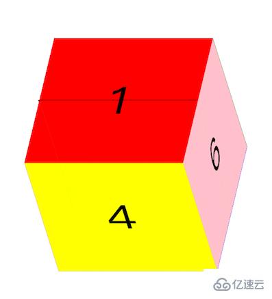
以上就是如何实现HTML与CSS中的3D转换模块,小编相信有部分知识点可能是我们日常工作会见到或用到的。希望你能通过这篇文章学到更多知识。更多详情敬请关注亿速云行业资讯频道。
免责声明:本站发布的内容(图片、视频和文字)以原创、转载和分享为主,文章观点不代表本网站立场,如果涉及侵权请联系站长邮箱:is@yisu.com进行举报,并提供相关证据,一经查实,将立刻删除涉嫌侵权内容。


