这篇“css中clip属性有什么用”文章,文中示例代码介绍的非常详细,具有一定的参考价值,感兴趣的小伙伴们一定要参考一下,对于“css中clip属性有什么用”,小编整理了以下知识点,请大家跟着小编的步伐一步一步的慢慢理解,接下来就让我们进入主题吧。
css是一种用来表现HTML或XML等文件样式的计算机语言,主要是用来设计网页的样式,使网页更加美化。它也是一种定义样式结构如字体、颜色、位置等的语言,并且css样式可以直接存储于HTML网页或者单独的样式单文件中,而样式规则的优先级由css根据这个层次结构决定,从而实现级联效果,发展至今,css不仅能装饰网页,也可以配合各种脚本对于网页进行格式化。
一、css什么是clip属性?
clip 属性剪裁绝对定位元素。clip 属性允许定义一个元素的可见尺寸,当一幅图像的尺寸大于包含此元素时,此图像就会被修剪并显示为这个元素定义的形状。
1.语法
img {
position:absolute;
clip:rect(0px,60px,200px,0px);
}
代码示例:
<!DOCTYPE html>
<html>
	<head>
		<meta charset="UTF-8">
		<title></title>
		<style>
			.demo{
				width: 200px;
				height: 500px;
				margin: 50px auto;
			}
			img{
				border: 1px solid #000;
			}
			.img {
				position:absolute;
				clip:rect(0px,165px,200px,34px);
			}
		</style>
	</head>
	<body>
		<div class="demo">
			<h5>原图:</h5>
			<img src="css.jpg" width="200" height="131" />
			<h5>裁剪后</h5>
			<img class="img" src="css.jpg" width="200" height="131" />
		</div>
	</body>
</html>
效果图:

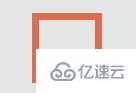
clip:rect(0px,165px,200px,34px)中的0px,165px,200px,34px分别对应图片的上,右,下,左四个方位 ;clip:rect()需要配合position属性使用,才能对图像进行裁剪。
注意:
如果先有"overflow:visible"定义了元素,clip属性就不起作用。
css中的clip:rect()只能在绝对定位的元素上使用,包括fixed属性的元素,因为fixed也算绝对定位
2.可用性隐藏
根据上面对top right bottom left的释义,如果left >= right或者bottom <= top,则元素会被完全裁掉而不可见,即“隐藏”。通过这种方式隐藏的元素是可以被屏幕阅读器等辅助设备识别的,从而提高了页面的可用性。
二、css3制作圆形进度条动画(css3 动画与clip:rect()结合使用)
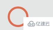
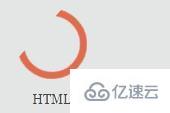
先看看加载效果图:

代码实例:
<!DOCTYPE html>
<html>

<head>
<meta http-equiv="content-type" content="text/html; charset=UTF-8">
<title>css3制作圆形进度条动画</title>
<style>
* {
margin: 0;
padding: 0;
}

body {
overflow-x: hidden;
overflow-y: scroll;
font-family: MuseoSans, Georgia, "Times New Roman", Times, serif;
font-size: 13px;
color: #444;
border-top: 3px solid #444;
background-color: #E4E6E5;
overflow-x: hidden;
}

section .demo {
width: 530px;
margin: 15em auto;
overflow: hidden;
}

ul.notes {
clear: both;
}

ul.notes li {
float: left;
margin-right: 3em;
display: inline;
}

ul.notes li:last-child {
margin: 0;
}

ul.notes li span.skill {
display: block;
text-align: center;
padding: 10px 0;
text-shadow: 1px 0 0 #FFFFFF;
}

.notesite {
display: inline-block;
position: relative;
width: 1em;
height: 1em;
font-size: 5.4em;
cursor: default;
}

.notesite>.percent {
position: absolute;
top: 20px;
left: 0;
width: 100%;
font-size: 25px;
text-align: center;
z-index: 2;
}

.notesite>.percent .dec {
font-size: 15px;
}

.notesite>#slice {
position: absolute;
width: 1em;
height: 1em;
clip: rect(0px, 1em, 1em, 0.5em);
}

.notesite>#slice.gt50 {
clip: rect(auto, auto, auto, auto);
}

.notesite>#slice>.pie {
position: absolute;
border: 0.1em solid #444;
width: 0.8em;
height: 0.8em;
-moz-border-radius: 0.5em;
-webkit-border-radius: 0.5em;
border-radius: 0.5em;
-webkit-animation: craw 2s linear;
-webkit-animation-iteration-count: 1;
}

@-webkit-keyframes craw {
0% {
clip: rect(0em, 1em, 0em, 0.5em);
}
50% {
clip: rect(0em, 1em, 1em, 0.5em);
-webkit-transform: rotate(0deg);
-moz-transform: rotate(0deg);
-ms-transform: rotate(0deg);
-o-transform: rotate(0deg);
transform: rotate(0deg);
}
100% {
clip: rect(0em, 1em, 1em, 0em);
-webkit-transform: rotate(90deg);
-moz-transform: rotate(90deg);
-ms-transform: rotate(90deg);
-o-transform: rotate(90deg);
transform: rotate(90deg);
}
}

li.html .notesite>#slice>.pie {
border-color: #DF6C4F;
}

.notesite.fill>.percent {
display: none;
}

li.html .notesite:before {
background: #DF6C4F;
}
</style>
</head>

<body class="home">
	<div class="wrapper">
		<section>
			<div class="demo">
				<ul class="notes">
					<li class="html">
						<div class="notesite" id="note_0" dir="100">
							<div class="percent"></div>
							<div id="slice" class="gt50">
								<div class="pie fill">
								</div>
							</div>
						</div><span class="skill">HTML</span>
					</li>
				</ul>
			</div>
		</section>
	</div>

</body>

</html>
思路:
1.先画一个正方形边框
2. 通过border-radius属性使他变成一个圆 (考虑兼容性)
-moz-border-radius: 0.5em;
-webkit-border-radius: 0.5em;
border-radius: 0.5em;
3. 设置动画效果,通过改变clip的裁剪位置(与定位结合)使这个圆慢慢显现
@-webkit-keyframes craw {
0% {
clip: rect(0em, 1em, 0em, 0.5em);
}
50% {
clip: rect(0em, 1em, 1em, 0.5em);
-webkit-transform: rotate(0deg);
-moz-transform: rotate(0deg);
-ms-transform: rotate(0deg);
-o-transform: rotate(0deg);
transform: rotate(0deg);
}
100% {
clip: rect(0em, 1em, 1em, 0em);
-webkit-transform: rotate(90deg);
-moz-transform: rotate(90deg);
-ms-transform: rotate(90deg);
-o-transform: rotate(90deg);
transform: rotate(90deg);
}
}
以上是“css中clip属性有什么用”这篇文章的所有内容,感谢各位的阅读!相信大家都有了一定的了解,希望分享的内容对大家有所帮助,如果还想学习更多知识,欢迎关注亿速云行业资讯频道!
免责声明:本站发布的内容(图片、视频和文字)以原创、转载和分享为主,文章观点不代表本网站立场,如果涉及侵权请联系站长邮箱:is@yisu.com进行举报,并提供相关证据,一经查实,将立刻删除涉嫌侵权内容。


