小编给大家分享一下CSS中Tooltip怎么用,相信大部分人都还不怎么了解,因此分享这篇文章给大家参考一下,希望大家阅读完这篇文章后大有收获,下面让我们一起去了解一下吧!
提示工具在鼠标移动到指定元素后触发,可以在四个方位显示:头部显示、右边显示、左边显示、底部显示。
一、基础提示框(Tooltip)
提示框在鼠标移动到指定元素上显示:
/* Tooltip 容器 */
.tooltip {
    position: relative;
    display: inline-block;
    border-bottom: 1px dotted black; /* 悬停元素上显示点线 */
}

/* Tooltip 文本 */
.tooltip .tooltiptext {
    visibility: hidden;
    width: 120px;
    background-color: black;
    color: #fff;
    text-align: center;
    padding: 5px 0;
    border-radius: 6px;

    /* 定位 */
    position: absolute;
    z-index: 1;
}

/* 鼠标移动上去后显示提示框 */
.tooltip:hover .tooltiptext {
    visibility: visible;
}
实例解析
HTML) 使用容器元素 (like <div>) 并添加 "tooltip" 类。在鼠标移动到 <div> 上时显示提示信息。
提示文本放在内联元素上(如 <span>) 并使用class="tooltiptext"。
CSS)tooltip 类使用 position:relative, 提示文本需要设置定位值 position:absolute。 注意: 接下来的实例会显示更多的定位效果。
tooltiptext 类用于实际的提示文本。模式是隐藏的,在鼠标移动到元素显示 。设置了一些宽度、背景色、字体色等样式。
CSS3 border-radius 属性用于为提示框添加圆角。
:hover 选择器用于在鼠标移动到到指定元素 <div> 上时显示的提示。
二、定位提示工具
以下实例中,提示工具显示在指定元素的右侧(left:105%) 。
注意 top:-5px 同于定位在容器元素的中间。使用数字 5 因为提示文本的顶部和底部的内边距(padding)是 5px。
如果你修改 padding 的值,top 值也要对应修改,这样才可以确保它是居中对齐的。
在提示框显示在左边的情况也是这个原理。
显示在右边:
.tooltip .tooltiptext {
    top: -5px;
    left: 105%;
}
显示在左边:
.tooltip .tooltiptext {
    top: -5px;
    right: 105%;
}
如果你想要提示工具显示在头部和底部。我们需要使用 margin-left 属性,并设置为 -60px。 这个数字计算来源是使用宽度的一半来居中对齐,即: width/2 (120/2 = 60)。
显示在头部:
.tooltip .tooltiptext {
    width: 120px;
    bottom: 100%;
    left: 50%;
    margin-left: -60px; /* 使用一半宽度 (120/2 = 60) 来居中提示工具 */
}
显示在底部:
.tooltip .tooltiptext {
    width: 120px;
    top: 100%;
    left: 50%;
    margin-left: -60px; /* 使用一半宽度 (120/2 = 60) 来居中提示工具 */
}
三、添加箭头
我们可以用CSS 伪元素 ::after 及 content 属性为提示工具创建一个小箭头标志,箭头是由边框组成的,但组合起来后提示工具像个语音信息框。
以下实例演示了如何为显示在顶部的提示工具添加底部箭头:
.tooltip .tooltiptext::after {
    content: " ";
    position: absolute;
    top: 100%; /* 提示工具底部 */
    left: 50%;
    margin-left: -5px;
    border-width: 5px;
    border-style: solid;
    border-color: black transparent transparent transparent;
}
实例解析
在提示工具内定位箭头: top: 100% , 箭头将显示在提示工具的底部。left: 50% 用于居中对齐箭头。
注意:border-width 属性指定了箭头的大小。如果你修改它,也要修改 margin-left 值。这样箭头在能居中显示。
border-color 用于将内容转换为箭头。设置顶部边框为黑色,其他是透明的。如果设置了其他的也是黑色则会显示为一个黑色的四边形。
以下实例演示了如何在提示工具的头部添加箭头,注意设置边框颜色:
底部提示框/顶部箭头:
.tooltip .tooltiptext::after {
    content: " ";
    position: absolute;
    bottom: 100%;  /* 提示工具头部 */
    left: 50%;
    margin-left: -5px;
    border-width: 5px;
    border-style: solid;
    border-color: transparent transparent black transparent;
}
以下两个实例是左右两边的箭头实例:
右侧提示框/左侧箭头:
.tooltip .tooltiptext::after {
    content: " ";
    position: absolute;
    top: 50%;
    right: 100%; /* 提示工具左侧 */
    margin-top: -5px;
    border-width: 5px;
    border-style: solid;
    border-color: transparent black transparent transparent;
}
左侧提示框/右侧箭头:
.tooltip .tooltiptext::after {
    content: " ";
    position: absolute;
    top: 50%;
    left: 100%; /* 提示工具右侧 */
    margin-top: -5px;
    border-width: 5px;
    border-style: solid;
    border-color: transparent transparent transparent black;
}
四、淡入效果
我们可以使用 CSS3 transition 属性及 opacity 属性来实现提示工具的淡入效果:
左侧提示框/右侧箭头:
.tooltip .tooltiptext {
    opacity: 0;
    transition: opacity 1s;
}

.tooltip:hover .tooltiptext {
    opacity: 1;
}
五、代码实例:
.wrapper {
text-transform: uppercase;
background: #ececec;
color: #555;
cursor: help;
font-family: "Gill Sans", Impact, sans-serif;
font-size: 20px;
margin: 100px 75px 10px 75px;
padding: 15px 20px;
position: relative;
text-align: center;
width: 200px;
-webkit-transform: translateZ(0); /* webkit flicker fix */
-webkit-font-smoothing: antialiased; /* webkit text rendering fix */
}
.wrapper .tooltip {
background: #1496bb;
bottom: 100%;
color: #fff;
display: block;
left: -25px;
margin-bottom: 15px;
opacity: 0;
padding: 20px;
pointer-events: none;
position: absolute;
width: 100%;
-webkit-transform: translateY(10px);
-moz-transform: translateY(10px);
-ms-transform: translateY(10px);
-o-transform: translateY(10px);
transform: translateY(10px);
-webkit-transition: all .25s ease-out;
-moz-transition: all .25s ease-out;
-ms-transition: all .25s ease-out;
-o-transition: all .25s ease-out;
transition: all .25s ease-out;
-webkit-box-shadow: 2px 2px 6px rgba(0, 0, 0, 0.28);
-moz-box-shadow: 2px 2px 6px rgba(0, 0, 0, 0.28);
-ms-box-shadow: 2px 2px 6px rgba(0, 0, 0, 0.28);
-o-box-shadow: 2px 2px 6px rgba(0, 0, 0, 0.28);
box-shadow: 2px 2px 6px rgba(0, 0, 0, 0.28);
}
/* This bridges the gap so you can mouse into the tooltip without it disappearing */
.wrapper .tooltip:before {
bottom: -20px;
content: " ";
display: block;
height: 20px;
left: 0;
position: absolute;
width: 100%;
}
/* CSS Triangles - see Trevor's post */
.wrapper .tooltip:after {
border-left: solid transparent 10px;
border-right: solid transparent 10px;
border-top: solid #1496bb 10px;
bottom: -10px;
content: " ";
height: 0;
left: 50%;
margin-left: -13px;
position: absolute;
width: 0;
}
.wrapper:hover .tooltip {
opacity: 1;
pointer-events: auto;
-webkit-transform: translateY(0px);
-moz-transform: translateY(0px);
-ms-transform: translateY(0px);
-o-transform: translateY(0px);
transform: translateY(0px);
}
/* IE can just show/hide with no transition */
.lte8 .wrapper .tooltip {
display: none;
}
.lte8 .wrapper:hover .tooltip {
display: block;
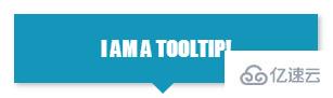
}效果图:
以上是“CSS中Tooltip怎么用”这篇文章的所有内容,感谢各位的阅读!相信大家都有了一定的了解,希望分享的内容对大家有所帮助,如果还想学习更多知识,欢迎关注亿速云行业资讯频道!
免责声明:本站发布的内容(图片、视频和文字)以原创、转载和分享为主,文章观点不代表本网站立场,如果涉及侵权请联系站长邮箱:is@yisu.com进行举报,并提供相关证据,一经查实,将立刻删除涉嫌侵权内容。


