小编给大家分享一下怎么使用css实现中国结的效果,相信大部分人都还不怎么了解,因此分享这篇文章给大家参考一下,希望大家阅读完这篇文章后大有收获,下面让我们一起去了解一下吧!
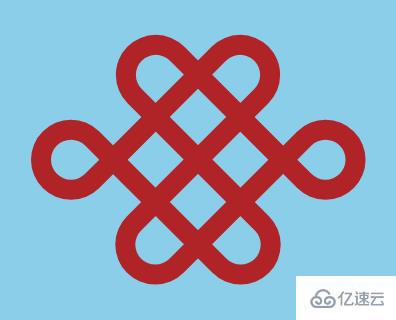
用 css 画中国结的最终效果如下:
首先,我们定义好画中国结需要的结构:
<div class="knot">
    <span class="box"></span>
    <span class="box"></span>
    <span class="box"></span>
    <span class="box"></span>
</div>
然后开始写样式,让中国结居中显示:
body {
  margin: 0;
  padding: 0;
  height: 100vh;
  display: flex;
  align-items: center;
  justify-content: center;
}
设置装中国结的容器样式:
.knot {
  box-sizing: border-box;
  font-size: 100px;
  width: 2em;
  height: 1.6em;
  background: skyblue;
  display: flex;
  align-items: center;
  justify-content: center;
}
我把中国结的基础样式拆分成4个长方形,首先来定义长方形的基础样式:
.box {
  position: absolute;
  box-sizing: border-box;
  width: 1em;
  height: 0.4em;
  border: var(--b) solid firebrick;
  --b: 0.1em;
}
然后我们来调整每一个长方形的样式,把它们组合成结的基础样子:
.knot .box:nth-child(1) {
  transform: rotate(45deg) translate(-15%, -38%);
  border-radius: 20% 0% 0% 20% / 50% 0 0 50%;
}

.knot .box:nth-child(2) {
  transform: rotate(45deg) translate(15%, 37%);
  border-radius: 0% 20% 20% 0% / 0% 50% 50% 0%;
}

.knot .box:nth-child(3) {
  transform: rotate(-45deg) translate(15%, -38%);
  border-radius: 0% 20% 20% 0% / 0% 50% 50% 0%;
}

.knot .box:nth-child(4) {
  transform: rotate(-45deg) translate(-15%, 37%);
  border-radius: 20% 0% 0% 20% / 50% 0 0 50%;
}
最后,我们利用第一个和第二个长方形的伪元素来画出余下的那两个小圆圈:
.knot .box:nth-child(1)::after {
  box-sizing: border-box;
  content: '';
  position: absolute;
  width: 0.4em;
  height: 0.4em;
  border: var(--b) solid firebrick;
  border-radius: 50% 50% 50% 0%;
  top: -0.4em;
  right: -0.4em;
}

.knot .box:nth-child(2)::after {
  box-sizing: border-box;
  content: '';
  position: absolute;
  width: 0.4em;
  height: 0.4em;
  border: var(--b) solid firebrick;
  border-radius: 50% 0% 50% 50%;
  top: 0.2em;
  right: 0.8em;
}
以上是怎么使用css实现中国结的效果的所有内容,感谢各位的阅读!相信大家都有了一定的了解,希望分享的内容对大家有所帮助,如果还想学习更多知识,欢迎关注亿速云行业资讯频道!
免责声明:本站发布的内容(图片、视频和文字)以原创、转载和分享为主,文章观点不代表本网站立场,如果涉及侵权请联系站长邮箱:is@yisu.com进行举报,并提供相关证据,一经查实,将立刻删除涉嫌侵权内容。


