一、模态框(Modal)是覆盖在父窗体上的子窗体。通常,目的是显示来自一个单独的源的内容,可以在不离开父窗体的情况下有一些互动。子窗体可提供信息、交互等。
二、如果想要单独引用该插件的功能,那么您需要引用 modal.js。或者可以引用 bootstrap.js 或压缩版的 bootstrap.min.js
引入之后直接上代码示例:
<!DOCTYPE html> <html> <head> <meta charset="utf-8"> <title>Bootstrap 实例 - 模态框(Modal)插件</title> <link rel="stylesheet" href="https://cdn.staticfile.org/twitter-bootstrap/3.3.7/css/bootstrap.min.css" rel="external nofollow" > <script src="https://cdn.staticfile.org/jquery/2.1.1/jquery.min.js"></script> <script src="https://cdn.staticfile.org/twitter-bootstrap/3.3.7/js/bootstrap.min.js"></script> </head> <body> <h3>创建模态框(Modal)</h3> <!-- 按钮触发模态框: class="btn btn-primary btn-lg":是指定class为"按钮的加大primary"样式 data-toggle="modal":应该是模态框的固定写法,只能为modal,至少自己试验发现是这样的 data-target="#myModal":通过选择器指向 id="myModal" 的元素,也就是要显示和隐藏的模态框目标 --> <button class="btn btn-primary btn-lg" data-toggle="modal" data-target="#myModal"> 开始演示模态框 </button> <!-- 模态框(Modal) --> <!-- class="modal fade": modal——用来把div识别成模态框 fade——当模态框被切换时,内容会淡入淡出 id="myModal":就是被指定为上面说的data-target属性选择的元素 tabindex:属性规定元素的 tab 键控制次序 aria-labelledby="myModalLabel":引用模态框的标题(去掉影响不大) aria-hidden:="true":设置模态框不可见,等到点击按钮之后显示 --> <div class="modal fade" id="myModal" tabindex="1" role="dialog" aria-labelledby="myModalLabel" aria-hidden="true"> <div class="modal-dialog"> <div class="modal-content"> <div class="modal-header"> <!-- data-dismiss="modal":加上这个,使得点击该button时会关闭模态框,下面的关闭按钮也是一样加了这个属性 --> <button type="button" class="close" data-dismiss="modal" aria-hidden="true"> × </button> <h5 class="modal-title" id="myModalLabel"> 模态框(Modal)标题 </h5> </div> <div class="modal-body"> <input type="text" placeholder="输入......"> </div> <div class="modal-footer"> <button type="button" class="btn btn-default" data-dismiss="modal">关闭</button> <button type="button" class="btn btn-primary">提交更改</button> </div> </div><!-- /.modal-content --> </div><!-- /.modal --> </div> </body> </html>
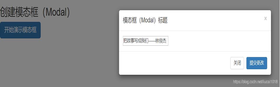
运行效果图如下:
如果大家还想深入学习,可以点击这里进行学习,再为大家附3个精彩的专题:
Bootstrap学习教程
Bootstrap实战教程
Bootstrap插件使用教程
以上就是关于本文的全部内容,希望对大家的学习有所帮助。
免责声明:本站发布的内容(图片、视频和文字)以原创、转载和分享为主,文章观点不代表本网站立场,如果涉及侵权请联系站长邮箱:is@yisu.com进行举报,并提供相关证据,一经查实,将立刻删除涉嫌侵权内容。


