本文实例为大家分享了python3使用matplotlib绘制散点图,并标注图例,轴,供大家参考,具体内容如下
代码
from matplotlib import pyplot as plt
from matplotlib import font_manager
# 使得中文可以显示出来
my_font = font_manager.FontProperties(fname="/usr/share/fonts/truetype/arphic/ukai.ttc")
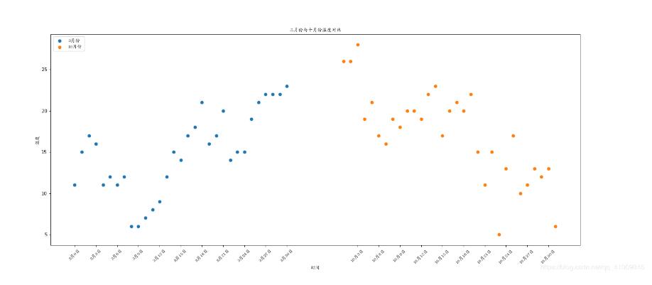
y_3 = [11, 15, 17, 16, 11, 12, 11, 12, 6, 6, 7, 8, 9, 12, 15, 14, 17, 18, 21, 16, 17, 20, 14, 15, 15, 19, 21, 22, 22,
22, 23]
y_10 = [26, 26, 28, 19, 21, 17, 16, 19, 18, 20, 20, 19, 22, 23, 17, 20, 21, 20, 22, 15, 11, 15, 5, 13, 17, 10, 11, 13,
12,
13, 6]
x = range(0, 31)
# print(len(y_3))
plt.figure(figsize=(20, 8), dpi=80)
# 使用scatter绘制散点图和绘制折线图的唯一区别
# x,y两个字段的个数应该要能够对应得上
plt.scatter(x, y_3,label="3月份")
x_2 = range(38, 69)
# lable字段可以为图表添加图例
plt.scatter(x_2, y_10,label="10月份")
# 调整x轴刻度
_x = list(x) + list(x_2)
_xtick_labels = ["3月{}日".format(i) for i in x]
_xtick_labels += ["10月{}日".format(i - 37) for i in x_2]
plt.xticks(_x[::3], _xtick_labels[::3], fontproperties=my_font, rotation=45)
# 添加坐标轴描述信息
plt.xlabel("时间", fontproperties=my_font)
plt.ylabel("温度", fontproperties=my_font)
# 设置图表title
plt.title("三月份与十月份温度对比", fontproperties=my_font)
# 添加图例
plt.legend(loc="upper left",prop=my_font)
plt.show()
效果图:
以上就是本文的全部内容,希望对大家的学习有所帮助,也希望大家多多支持亿速云。
免责声明:本站发布的内容(图片、视频和文字)以原创、转载和分享为主,文章观点不代表本网站立场,如果涉及侵权请联系站长邮箱:is@yisu.com进行举报,并提供相关证据,一经查实,将立刻删除涉嫌侵权内容。


