小编给大家分享一下Python中如何使用Pandas生成可视化图表,相信大部分人都还不怎么了解,因此分享这篇文章给大家参考一下,希望大家阅读完这篇文章后大有收获,下面让我们一起去了解一下吧!
一、线型图
对于pandas的内置数据类型,Series 和 DataFrame 都有一个用于生成各类 图表 的 plot 方法。 默认情况下, 它们所生成的是线型图。其实Series和DataFrame上的这个功能只是使用matplotlib库的plot()方法的简单包装实现。参考以下示例代码 -
import pandas as pd
import numpy as np

df = pd.DataFrame(np.random.randn(10,4),index=pd.date_range('2018/12/18',
 periods=10), columns=list('ABCD'))

df.plot()
执行上面示例代码,得到以下结果 -
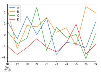
如果索引由日期组成,则调用gct().autofmt_xdate()来格式化x轴,如上图所示。
我们可以使用x和y关键字绘制一列与另一列。
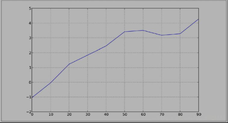
s = Series( np. random. randn( 10). cumsum(), index= np. arange( 0, 100, 10))
s. plot()
pandas 的大部分绘图方法都有 一个 可选的ax参数, 它可以是一个 matplotlib 的 subplot 对象。 这使你能够在网格 布局 中 更为灵活地处理 subplot 的位置。 DataFrame的plot 方法会在 一个 subplot 中为各列绘制 一条 线, 并自动创建图例( 如图所示):
df = DataFrame( np. random. randn( 10, 4). cumsum( 0), ...: columns=[' A', 'B', 'C', 'D'], index= np. arange( 0, 100, 10))

df. plot()

二、柱状图
在生成线型图的代码中加上 kind=' bar'( 垂直柱状图) 或 kind=' barh'( 水平柱状图) 即可生成柱状图。 这时,Series 和 DataFrame 的索引将会被用 作 X( bar) 或 (barh)刻度:
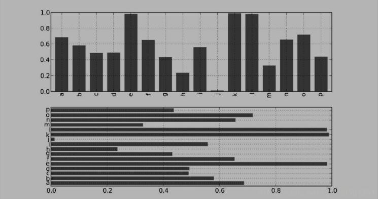
In [59]: fig, axes = plt. subplots( 2, 1)

In [60]: data = Series( np. random. rand( 16), index= list(' abcdefghijklmnop'))

In [61]: data. plot( kind=' bar', ax= axes[ 0], color=' k', alpha= 0. 7)

Out[ 61]: < matplotlib. axes. AxesSubplot at 0x4ee7750>

In [62]: data. plot( kind=' barh', ax= axes[ 1], color=' k', alpha= 0.
对于 DataFrame, 柱状 图 会 将 每一 行的 值 分为 一组, 如图 8- 16 所示:
In [63]: df = DataFrame( np. random. rand( 6, 4), ...: index=[' one', 'two', 'three', 'four', 'five', 'six'], ...: columns= pd. Index([' A', 'B', 'C', 'D'], name=' Genus'))

In [64]: df

Out[ 64]:

Genus

   A   B   C   D
one 0. 301686 0. 156333 0. 371943 0. 270731
two 0. 750589 0. 525587 0. 689429 0. 358974
three 0. 381504 0. 667707 0. 473772 0. 632528
four 0. 942408 0. 180186 0. 708284 0. 641783
five 0. 840278 0. 909589 0. 010041 0. 653207
six 0. 062854 0. 589813 0. 811318 0. 060217

In [65]: df. plot( kind=' bar')
三、条形图
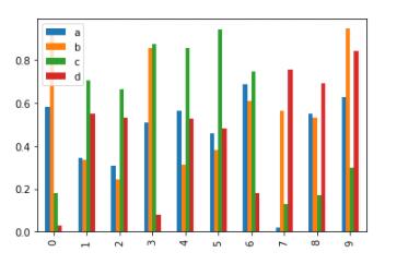
现在通过创建一个条形图来看看条形图是什么。条形图可以通过以下方式来创建 -
import pandas as pd
import numpy as np

df = pd.DataFrame(np.random.rand(10,4),columns=['a','b','c','d'])
df.plot.bar()
执行上面示例代码,得到以下结果 -
要生成一个堆积条形图,通过指定:pass stacked=True -
import pandas as pd
df = pd.DataFrame(np.random.rand(10,4),columns=['a','b','c','d'])
df.plot.bar(stacked=True)
执行上面示例代码,得到以下结果 -

要获得水平条形图,使用barh()方法 -
import pandas as pd
import numpy as np

df = pd.DataFrame(np.random.rand(10,4),columns=['a','b','c','d'])

df.plot.barh(stacked=True)
四、直方图
可以使用plot.hist()方法绘制直方图。我们可以指定bins的数量值。
import pandas as pd
import numpy as np

df = pd.DataFrame({'a':np.random.randn(1000)+1,'b':np.random.randn(1000),'c':
np.random.randn(1000) - 1}, columns=['a', 'b', 'c'])

df.plot.hist(bins=20)
执行上面示例代码,得到以下结果 -
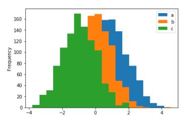
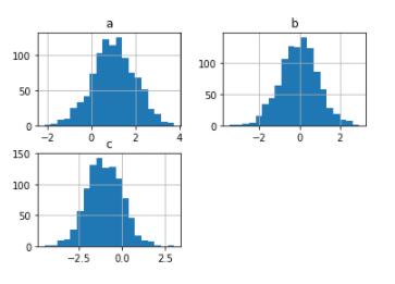
要为每列绘制不同的直方图,请使用以下代码 -
import pandas as pd
import numpy as np

df=pd.DataFrame({'a':np.random.randn(1000)+1,'b':np.random.randn(1000),'c':
np.random.randn(1000) - 1}, columns=['a', 'b', 'c'])

df.hist(bins=20)
执行上面示例代码,得到以下结果 -
五、箱型图
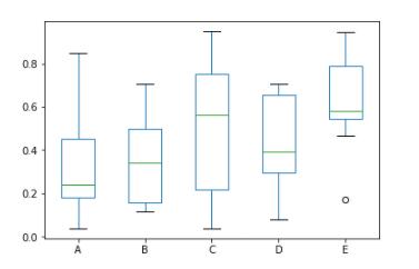
Boxplot可以绘制调用Series.box.plot()和DataFrame.box.plot()或DataFrame.boxplot()来可视化每列中值的分布。
例如,这里是一个箱形图,表示对[0,1)上的统一随机变量的10次观察的五次试验。
import pandas as pd
import numpy as np
df = pd.DataFrame(np.random.rand(10, 5), columns=['A', 'B', 'C', 'D', 'E'])
df.plot.box()
执行上面示例代码,得到以下结果 -
六、块型图
可以使用Series.plot.area()或DataFrame.plot.area()方法创建区域图形。
import pandas as pd
import numpy as np

df = pd.DataFrame(np.random.rand(10, 4), columns=['a', 'b', 'c', 'd'])
df.plot.area()
执行上面示例代码,得到以下结果 -

七、散点图
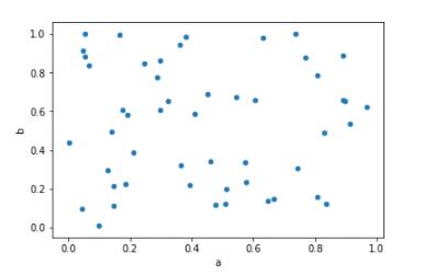
可以使用DataFrame.plot.scatter()方法创建散点图。
import pandas as pd
import numpy as np
df = pd.DataFrame(np.random.rand(50, 4), columns=['a', 'b', 'c', 'd'])
df.plot.scatter(x='a', y='b')
执行上面示例代码,得到以下结果 -
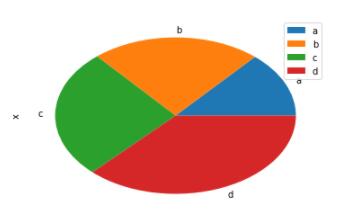
八、饼状图
饼状图可以使用DataFrame.plot.pie()方法创建。
import pandas as pd
import numpy as np

df = pd.DataFrame(3 * np.random.rand(4), index=['a', 'b', 'c', 'd'], columns=['x'])
df.plot.pie(subplots=True)
执行上面示例代码,得到以下结果 -
以上是“Python中如何使用Pandas生成可视化图表”这篇文章的所有内容,感谢各位的阅读!相信大家都有了一定的了解,希望分享的内容对大家有所帮助,如果还想学习更多知识,欢迎关注亿速云行业资讯频道!
免责声明:本站发布的内容(图片、视频和文字)以原创、转载和分享为主,文章观点不代表本网站立场,如果涉及侵权请联系站长邮箱:is@yisu.com进行举报,并提供相关证据,一经查实,将立刻删除涉嫌侵权内容。


