这篇文章将为大家详细讲解有关如何利用Js+Css实现折纸动态导航效果,小编觉得挺实用的,因此分享给大家做个参考,希望大家阅读完这篇文章后可以有所收获。
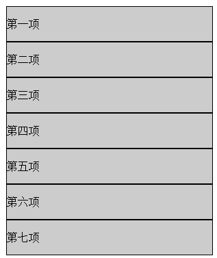
先来看看第一种实现方式
效果图如下:
不再采用ul li的布局方式
-webkit-transform-style:preserve-3d只对子元素有作用,所以每个div都加。
实例源码
<!doctype html>
<html>
<head>
<meta charset="utf-8">
<title>无标题文档</title>
<style>
.wrap{margin:30px auto;width:302px;-webkit-perspective:800px; -webkit-transform-style:preserve-3d; position:relative;}
.wrap div{ position:absolute; top:52px;left:0;-webkit-transform-style:preserve-3d; -webkit-transform-origin:top;}
.wrap span{ display:block;width:300px;border:1px solid #000;height:50px; font:16px/50px "宋体"; background:#ccc;}
</style>
</head>
<body>
<input type="button" value="展开" />
<input type="button" value="收缩" />
<div class="wrap" id="list">
 <span>第一项</span>
 <div>
  <span>第二项</span>
  <div>
   <span>第三项</span>
   <div>
    <span>第四项</span>
    <div>
    <span>第五项</span>
     <div>
      <span>第六项</span>
      <div>
       <span>第七项</span>
      </div>
     </div>
    </div>
   </div>
  </div>
 </div>
</div>
<script>
window.onload=function()
{
 var oList=document.getElementById("list");
 var aDiv=oList.getElementsByTagName("div");
 var aBtn=document.getElementsByTagName("input");
 aBtn[1].onclick=function()
 {
 for(var i=0;i<aDiv.length;i++)
 {
 aDiv[i].style.transition="0.5s "+(aDiv.length-i)*100+"ms";
 aDiv[i].style.WebkitTransform="rotateX(60deg)";
 }
 };
 aBtn[0].onclick=function()
 {
 for(var i=0;i<aDiv.length;i++)
 {
 aDiv[i].style.transition="0.5s "+i*100+"ms";
 aDiv[i].style.WebkitTransform="rotateX(0deg)";
 }
 };
};
</script>
</body>
</html>
第二种实现方式
效果图如下:

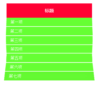
这个原先是隐藏的,点击后才展开。
通过关键帧控制每个div的展开状态,当要展开的时候给每个div添加className,但是这个className不是一下子全部添加上去的,而是有延时的,所以用到了定时器。
实例源码
<!doctype html>
<html>
<head>
<meta charset="utf-8">
<title>无标题文档</title>
<style>
@-webkit-keyframes open{
 0%
 {
 -webkit-transform:rotateX(-120deg);
 }
 40%
 {
 -webkit-transform:rotateX(30deg);
 }
 60%
 {
 -webkit-transform:rotateX(-20deg);
 }
 80%
 {
 -webkit-transform:rotateX(10deg);
 }
 100%
 {
 -webkit-transform:rotateX(0deg);
 }
}
.wrap{margin:30px auto;width:300px;-webkit-perspective:800px;position:relative;}
.wrap h3{ height:50px;background:#F03; text-align:center; font:16px/50px "微软雅黑"; color:#fff; position:relative;z-index:2;}
.wrap div{ position:absolute; top:32px;left:0;-webkit-transform-style:preserve-3d; -webkit-transform-origin:top; -webkit-transform:rotateX(-120deg); transition:.5s;}
.wrap>div{ top:50px;}
.wrap .open{-webkit-animation:open 2s;-webkit-transform:rotateX(0deg);}
.wrap span{ display:block;width:300px;height:30px; font:14px/30px "宋体"; background:#6F3; text-indent:15px; color:#fff; transition:.5s; box-shadow:inset 0 0 30px 20px rgba(0,0,0,1);}
.wrap .open>span{box-shadow:inset 0 0 30px 10px rgba(0,0,0,0);}
.wrap span:hover{ background:#FF0;text-indent:30px;}
</style>
</head>
<body>
<input type="button" value="展开" />
<input type="button" value="收缩" />
<div class="wrap" id="list">
 <h3>标题</h3>
 <div>
  <span>第一项</span>
  <div>
   <span>第二项</span>
   <div>
    <span>第三项</span>
    <div>
     <span>第四项</span>
     <div>
      <span>第五项</span>
      <div>
       <span>第六项</span>
       <div>
        <span>第七项</span>
       </div>
      </div>
     </div>
    </div>
   </div>
  </div>
 </div>
</div>
<script>
window.onload=function()
{
 var oList=document.getElementById("list");
 var aDiv=oList.getElementsByTagName("div");
 var aBtn=document.getElementsByTagName("input");
 var oTimer=null;
 aBtn[1].onclick=function()
 {
 var i=aDiv.length-1;
 clearInterval(oTimer);
 oTimer=setInterval(function(){
 aDiv[i].className="";
 i--;
 if(i<0)
 {
 clearInterval(oTimer);
 }
 },50);
 };
 aBtn[0].onclick=function()
 {
 var i=0;
 clearInterval(oTimer);
 oTimer=setInterval(function(){
 aDiv[i].className="open";
 i++;
 if(i==aDiv.length)
 {
 clearInterval(oTimer);
 }
 },200);
 };
};
</script>
</body>
</html>
关于“如何利用Js+Css实现折纸动态导航效果”这篇文章就分享到这里了,希望以上内容可以对大家有一定的帮助,使各位可以学到更多知识,如果觉得文章不错,请把它分享出去让更多的人看到。
免责声明:本站发布的内容(图片、视频和文字)以原创、转载和分享为主,文章观点不代表本网站立场,如果涉及侵权请联系站长邮箱:is@yisu.com进行举报,并提供相关证据,一经查实,将立刻删除涉嫌侵权内容。


