这篇文章给大家分享的是有关python中用matlibplot画时间序列图的案例的内容。小编觉得挺实用的,因此分享给大家做个参考。一起跟随小编过来看看吧。
一、读取数据及处理
通过pandas读取CSV文件,keep_default_na参数将空值数据改为空字符串
查看原数据信息,原数据分为3day, 时间粒度3min
通过pandas date_range函数生成时间序列时间数据,指定freq='180s'
import pandas as pd
import matplotlib.pyplot as plt
import matplotlib.dates as mdates
%matplotlib inline

plt.rcParams['font.sans-serif'] = ['SimHei']  # 显示中文(windows)
plt.rcParams['axes.unicode_minus'] = False   # 用来正常显示负号

df = pd.read_csv('traffic_analysis_macro.csv', keep_default_na=False)  # 无数据当做空字符串处理
# df.drop(['region_id'], axis=1, inplace=True)

# 查看原始数据集情况
print('shape:', df.shape)
print('describle:', df.describe())
print('data head:', df.head())

# 该数据集,分为3天,时间粒度3min;
# 首先按天切分数据
df_0912 = df[:480]
df_0915 = df[480:960]
df_0916 = df[960:]

# 生成时间序列:X轴刻度数据
table = pd.DataFrame([i for i in range(480)],columns=['value'],index=pd.date_range('00:00:00', '23:57:00', freq='180s'))
二、绘制图形
# 图片大小设置
fig = plt.figure(figsize=(15,9), dpi=100)
ax = fig.add_subplot(111)

# X轴时间刻度格式 & 刻度显示
ax.xaxis.set_major_formatter(mdates.DateFormatter('%H:%M'))
plt.xticks(pd.date_range(table.index[0],table.index[-1],freq='H'), rotation=45)

# 绘图
ax.plot(table.index,df_0912['avg_speed'],color='r', label='9月12日')
ax.plot(table.index,df_0915['avg_speed'],color='y', label='9月15日')
ax.plot(table.index,df_0916['avg_speed'],color='g', label='9月16日')

# 辅助线
sup_line = [35 for i in range(480)]
ax.plot(table.index, sup_line, color='black', linestyle='--', linewidth='1', label='辅助线')

plt.xlabel('time_point', fontsize=14)    # X轴标签
plt.ylabel("Speed", fontsize=16)         # Y轴标签
ax.legend()                              # 图例
plt.title("车速时序图", fontsize=25, color='black', pad=20)
plt.gcf().autofmt_xdate()

# 隐藏-上&右边线
# ax.spines['right'].set_color('none')
# ax.spines['top'].set_color('none')

# plt.savefig('speed.png')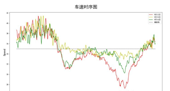
plt.show()三、效果图如下
感谢各位的阅读!关于python中用matlibplot画时间序列图的案例就分享到这里了,希望以上内容可以对大家有一定的帮助,让大家可以学到更多知识。如果觉得文章不错,可以把它分享出去让更多的人看到吧!
免责声明:本站发布的内容(图片、视频和文字)以原创、转载和分享为主,文章观点不代表本网站立场,如果涉及侵权请联系站长邮箱:is@yisu.com进行举报,并提供相关证据,一经查实,将立刻删除涉嫌侵权内容。


