这篇文章将为大家详细讲解有关纯css怎样实现多级折叠菜单折叠树效果,小编觉得挺实用的,因此分享给大家做个参考,希望大家阅读完这篇文章后可以有所收获。
1、运用checkbox的checked值来判断下级栏目是否展开,CSS3的选择器中提供了:checked 这个伪类,这个伪类提供我们,当元素拥有checked这个值的时候就执行你的CSS。
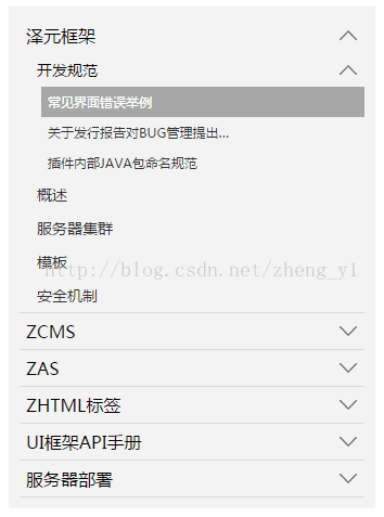
当有子菜单时,菜单项右侧有向下的箭头,当收起菜单项时,箭头朝上。图片可以自己替换。
2、效果图
3、代码片段
<ol class="tree"> <li> <label for="folder1" class="folderOne">泽元框架</label> <input type="checkbox" id="folder1" /> <ol> <li> <label for="subfolder1"class="folderTwo">开发规范</label> <input type="checkbox" id="subfolder1" /> <ol> <li class="file folderThree"><a href="#">常见界面错误举例</a></li> <li class="file folderThree"><a href="#">关于发行报告对BUG管理提出…</a></li> <li class="file folderThree"><a href="#">插件内部JAVA包命名规范</a></li> </ol> </li> <li class="file folderTwo"><a href="#">概述</a></li> <li class="file folderTwo"><a href="#">服务器集群</a></li> <li class="file folderTwo"><a href="#">模板</a></li> <li class="file folderTwo"><a href="#">安全机制</a></li> </ol> </li> <li> <label for="folder2" class="folderOne" >ZCMS</label> <input type="checkbox" id="folder2" /> <ol> <li class="file folderTwo"><a href="#">实时数据</a></li> <li> <label for="subfolder2" class="folderTwo">实时数据</label> <input type="checkbox" id="subfolder2" /> <ol> <li class="file folderThree"><a href="#">实时数据</a></li> <li class="file folderThree"><a href="#">实时数据</a></li> <li class="file folderThree"><a href="#">实时数据</a></li> </ol> </li> </ol> </li> <li> <label for="folder3" class="folderOne">ZAS</label> <input type="checkbox" id="folder3" /> <ol> <li class="file folderTwo"><a href="#">实时数据</a></li> <li class="file folderTwo"><a href="#">实时数据</a></li> </ol> </li> <li> <label for="folder4" class="folderOne">ZHTML标签</label> <input type="checkbox" id="folder4"/> <ol> <li class="file folderTwo"><a href="#">实时数据</a></li> <li class="file folderTwo"><a href="#">实时数据</a></li> </ol> </li> <li> <label for="folder5" class="folderOne">UI框架API手册</label> <input type="checkbox" id="folder5"/> <ol> <li class="file folderTwo"><a href="#">实时数据</a></li> <li class="file folderTwo"><a href="#">实时数据</a></li> </ol> </li> </ol> <style type="text/css"> .tree {margin: 0;padding: 0;background-color:#f2f2f2;overflow: hidden;} /*隐藏input*/ .tree li input{position: absolute;left: 0;opacity: 0;z-index: 2;cursor: pointer;height: 1em;width:1em;top: 0;} /*所有菜单项设置统一样式*/ .tree li {position: relative;list-style: none;} /*一级菜单加下边线*/ .tree>li{border-bottom: 1px solid #d9d9d9;} /*给有子菜单的菜单项添加背景图标*/ .tree li label {max-width:999px;cursor: pointer;display: block;margin:0 0 0 -50px;padding: 15px 10px 15px 70px;background: url(../../images/cp-detail-arrow-b.png) no-repeat right center;background-position:95% 50%;white-space:nowrap;overflow:hidden;text-overflow: ellipsis; } .tree li label:hover,li label:focus{background-color:#a7a7a7;color:#fff;} /*清除所有展开的子菜单的display*/ .tree li input + ol{display: none;} /*当input被选中时,给所有展开的子菜单设置样式*/ .tree input:checked + ol {padding-left:14px;height: auto;display: block;} .tree input:checked + ol > li { height: auto;} /*末层菜单为A标签,设置样式*/ .tree li.file a{margin:0 -10px 0 -50px;padding: 15px 20px 15px 70px;text-decoration:none;display: block;color:#333333;white-space:nowrap;overflow:hidden;text-overflow: ellipsis;} .tree li.file a:hover,li.file a:focus{background-color:#a7a7a7;color:#fff;} /*不同层级的菜单字体大小不同*/ .tree .folderOne{font-size: 18px;} .tree .folderTwo{font-size:16px;} .tree .folderThree{font-size:14px;} </style> <script type="text/javascript"> $(document).ready(function() { //每个有子菜单的菜单项添加点击事件 $(".tree label").click(function(){ //获取当前菜单旁边input的check状态 var isChecked = $(this).next("input[type='checkbox']").is(':checked'); //展开和收齐的不同状态下更换右侧小图标 if(isChecked){ $(this).css( "background-image","url(../images/cp-detail-arrow-b.png)" ); }else{ $(this).css( "background-image","url(../images/cp-detail-arrow-t.png)" ); } }); }); </script>
下面介绍下CSS 菜单折叠
先给大家展示效果图:
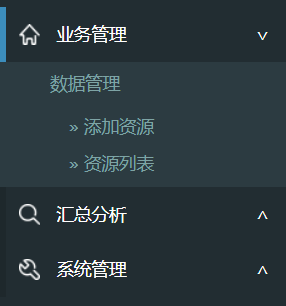
如上,假设一级菜单是 div,二级菜单是 ul。形如:
<div>业务管理<span></span></div>
<ul>
...
<ul>

<div class="collapsed">汇总分析<span></span></</div>
<ul>
...
<ul>

<div class="collapsed">>系统管理<span></span></</div>
<ul>
...
<ul>
当菜单展开时,左边有一个蓝色的标记,右边是折叠标记。
左边蓝色标记自不用表,CSS 设置 border 即可,右边利用 CSS 也超方便。
div span { float:right; padding-right:20px; }
div span:after { content: "∨" }
div.collapsed span:after { content: "∧" }
然后再说子菜单的折叠效果,有动画噢:
div.collapsed + ul { height: 0px; transition: height 0.5s ease-out; }
div ul { height: 80px; transition: height 0.5s ease-in; }
注意 ul 一定要有 height 的具体值,如果没有具体指明多少 px,则虽然能折叠,但是没有动画效果。
最后就是利用 jQuery 或 ezj 切换 className 了,当点击 div 的时候 toggleClass("collapsed")。
关于“纯css怎样实现多级折叠菜单折叠树效果”这篇文章就分享到这里了,希望以上内容可以对大家有一定的帮助,使各位可以学到更多知识,如果觉得文章不错,请把它分享出去让更多的人看到。
免责声明:本站发布的内容(图片、视频和文字)以原创、转载和分享为主,文章观点不代表本网站立场,如果涉及侵权请联系站长邮箱:is@yisu.com进行举报,并提供相关证据,一经查实,将立刻删除涉嫌侵权内容。


