这篇文章主要介绍“CSS3怎么实现可爱的小黄人动画 ”,在日常操作中,相信很多人在CSS3怎么实现可爱的小黄人动画 问题上存在疑惑,小编查阅了各式资料,整理出简单好用的操作方法,希望对大家解答”CSS3怎么实现可爱的小黄人动画 ”的疑惑有所帮助!接下来,请跟着小编一起来学习吧!
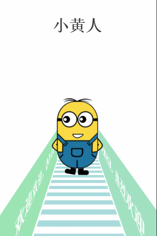
如图:

联想到我要做CSS3动画,呵呵……怎么办 ? ——没办法,抠呗!(此处勿喷,着实无素材)
……最后效果变成这样子,这是移动端的例子!(gif图有卡顿现象,请凑合看吧,非喜勿喷…):
OK,其实主要目的还是知识点的学习吧:
这个demo涉及的知识点有:
perspective
perspective-origin
transform-style
transform-origin
animation
@keyframes
translate3d,translateX,rotateY….
这些知识点有些涉及css3d动画,各个知识点的具体详解我就不解释了,有兴趣可以到这里了解一下:http://isux.tencent.com/css3/index.html
回到这个案例,话说这么挫的动画是怎么具体实现的呢? 我将分享代码给大家练习:
html结构:
XML/HTML Code复制内容到剪贴板
<body>
<div class="title">
<p>小黄人</p>
</div>
<div class="wrapper">
<div class="littleH">
<div class="light">
<div class="light_left">
<p>欢迎欢迎,热烈欢迎</p>
</div>
<div class="light_right">
<p>欢迎欢迎,热烈欢迎</p>
</div>
<div class="load"></div>
</div>
<div class="littleH_body">
<div class="leftHair"></div>
<div class="rightHair"></div>
<div class="leftBlackeye"></div>
<div class="leftWhiteeye"></div>
<div class="rightBlackeye"></div>
<div class="rightWhiteeye"></div>
<div class="mouse"></div>
<div class="leftFoot"></div>
<div class="rightFoot"></div>
</div>
</div>
</div>
</body>
css代码:
CSS Code复制内容到剪贴板
body{
margin: 0;
padding: 0;
width: 100%;
height: 100%;
}
.title p{
text-align: center;
font-size: 100px;
font-weight: bolder;
color:#333;
}
.wrapper{
margin: 400px auto;
}
.littleH{
position: relative;
-webkit-perspective: 800;
-webkit-perspective-origin: 50% 50%;
}
.light{
-webkit-transform-style: preserve-3d;
}
.light .light_left,.light .light_right{
position: absolute;
width: 100%;
height: 300px;
background: lightblue;
-webkit-transform: rotateY(90deg) translate3d(0,300px,-200px);
-webkit-animation: changeBgColor 2s linear infinite;
}
.light .light_right{
-webkit-transform: rotateY(-90deg) translate3d(0,300px,-215px);
-webkit-animation-delay: 1s;
}
@-webkit-keyframes changeBgColor{
0%,100%{
background: lightblue;
}
50%{
background: lightgreen;
}
}
.light .light_left p,.light .light_right p{
color:#fff;
font-size: 80px;
font-weight: bold;
margin-left: 100px;
}
.light .light_right p{
float: rightright;
margin-right: 100px;
}
.light .load{
position: absolute;
width: 500px;
height: 1500px;
background: -webkit-gradient(linear, left top, left bottombottom, color-stop(51%,#aadbdc), color-stop(52%,#ffffff));
background: -webkit-linear-gradient(top, #aadbdc 51%,#ffffff 52%);
background: linear-gradient(to bottombottom, #aadbdc 51%,#ffffff 52%);
background-size: 350px 80px;
-webkit-animation: move_load 5s linear infinite;
}
@-webkit-keyframes move_load{
0%{
-webkit-transform:rotateX(90deg) translate3d(250px,0,0);
}
100%{
-webkit-transform:rotateX(90deg) translate3d(250px,-320px,0);
}
}
.littleH_body{
position: absolute;
left:50%;
margin-left: -157px;
width: 314px;
height: 425px;
background: url(1.png);
-webkit-transform-style: preserve-3d;
}
.leftHair{
position: absolute;
rightright: 58px;
top:-5px;
width: 100px;
height: 17px;
background: url(lefthair.png);
-webkit-transform-origin: left bottombottom;
-webkit-animation: lefthair 1s .3s ease-in-out infinite;
}
@-webkit-keyframes lefthair{
0%,10%,40%,100%{
-webkit-transform: rotate(0deg) translateY(1px);
}
30%{
-webkit-transform: rotate(-3deg) translateY(1px);
}
}
.rightHair{
position: absolute;
left: 58px;
top:-8px;
width: 100px;
height: 16px;
background: url(righthair.png);
-webkit-transform-origin: rightright bottombottom;
-webkit-animation: righthair 1s ease-in-out infinite;
}
@-webkit-keyframes righthair{
0%,10%,40%,100%{
-webkit-transform: rotate(0deg) translateY(1px);
}
30%{
-webkit-transform: rotate(4deg) translateY(1px);
}
}
.leftBlackeye{
position: absolute;
rightright: 87px;
top:102px;
width: 43px;
height: 43px;
background: url(eyeblack.png);
-webkit-animation: leftblackeye 5s ease-in infinite;
}
@-webkit-keyframes leftblackeye{
0%,20%,50%,70%,100%{
-webkit-transform: translateX(0px);
}
30%,40%{
-webkit-transform: translateX(15px);
}
80%,90%{
-webkit-transform: translateX(-15px);
}
}
.leftWhiteeye{
position: absolute;
rightright: 92px;
top:110px;
width: 20px;
height: 21px;
background: url(whiteeye.png);
background-size: 95% 95%;
background-repeat: no-repeat;
-webkit-animation: leftwhiteeye 5s ease-in infinite;
}
@-webkit-keyframes leftwhiteeye{
0%,20%,50%,70%,100%{
-webkit-transform: translateX(0px);
}
30%,40%{
-webkit-transform: translate3d(15px,3px,0);
}
80%,90%{
-webkit-transform: translate3d(-30px,3px,0);
}
}
.rightBlackeye{
position: absolute;
left: 84px;
top:102px;
width: 43px;
height: 43px;
background: url(eyeblack.png);
-webkit-animation: rightblackeye 5s ease-in infinite;
}
@-webkit-keyframes rightblackeye{
0%,20%,50%,70%,100%{
-webkit-transform: translateX(0px);
}
30%,40%{
-webkit-transform: translateX(15px);
}
80%,90%{
-webkit-transform: translateX(-15px);
}
}
.rightWhiteeye{
position: absolute;
left: 102px;
top:112px;
width: 20px;
height: 21px;
background: url(whiteeye.png);
background-size: 95% 95%;
background-repeat: no-repeat;
-webkit-animation: rightwhiteeye 5s ease-in infinite;
}
@-webkit-keyframes rightwhiteeye{
0%,20%,50%,70%,100%{
-webkit-transform: translateX(0px);
}
30%,40%{
-webkit-transform: translate3d(15px,3px,0);
}
80%,90%{
-webkit-transform: translate3d(-30px,3px,0);
}
}
.mouse{
position: absolute;
left: 126px;
top:210px;
width: 71px;
height: 30px;
background: url(mouse.png);
-webkit-transform-origin: center top;
-webkit-animation: mouse 5s ease-in-out infinite;
}
@-webkit-keyframes mouse{
40%{
-webkit-transform: rotate(-15deg) translateX(22px);
}
0%,20%,60%,100%{
-webkit-transform: rotate(0deg);
}
}
.leftFoot{
position: absolute;
rightright: 85px;
top:424px;
width: 68px;
height: 43px;
background: url(leftfoot.png);
-webkit-transform-origin: left top;
-webkit-animation: leftfoot .6s ease-in-out infinite;
}
@-webkit-keyframes leftfoot{
0%,50%,100%{
-webkit-transform: rotate(0deg);
}
80%{
-webkit-transform: rotate(-10deg);
}
}
.rightFoot{
position: absolute;
left: 85px;
top:424px;
width: 68px;
height: 43px;
background: url(rightfoot.png);
margin-bottom: 100px;
-webkit-transform-origin: rightright top;
-webkit-animation: rightfoot .6s ease-in-out infinite;
}
@-webkit-keyframes rightfoot{
0%,50%,100%{
-webkit-transform: rotate(0deg);
}
30%{
-webkit-transform: rotate(10deg);
}
}
代码应该还是很简单就能看懂的,不足之处在于图片没有合并,就凑合吧,主要目的还是对CSS3动画(特别是3d)知识点的学习及实践。多练习,才能记得更牢,用得更顺,这只是开始……
PS:附上我抠的图片
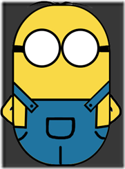 1.png
1.png
 righthair.png
 lefthair.png
 eyeblack.png
 whiteeye.png
 mouse.png
 rightfoot.png
 leftfoot.png
到此,关于“CSS3怎么实现可爱的小黄人动画 ”的学习就结束了,希望能够解决大家的疑惑。理论与实践的搭配能更好的帮助大家学习,快去试试吧!若想继续学习更多相关知识,请继续关注亿速云网站,小编会继续努力为大家带来更多实用的文章!
免责声明:本站发布的内容(图片、视频和文字)以原创、转载和分享为主,文章观点不代表本网站立场,如果涉及侵权请联系站长邮箱:is@yisu.com进行举报,并提供相关证据,一经查实,将立刻删除涉嫌侵权内容。


