本篇内容介绍了“怎么用css3实现颜色渐变按钮”的有关知识,在实际案例的操作过程中,不少人都会遇到这样的困境,接下来就让小编带领大家学习一下如何处理这些情况吧!希望大家仔细阅读,能够学有所成!
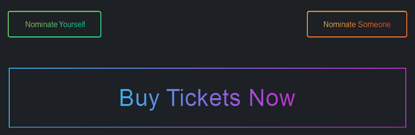
之前为大家分享很多纯css3实现的实用按钮,今天给大家带来一款纯css3实现的颜色渐变按钮。这款按钮的边框和文字的颜色通过css3实现两种颜色的渐变,效果非常好看,一起看下效果图:
实现的代码。
html代码:
XML/HTML Code复制内容到剪贴板
<div class="container">
<a target="_blank" class="btn green" href="https://www.yisu.com/"><span>Nominate Yourself</span></a>
<a target="_blank" class="btn orange" href="https://www.yisu.com/"><span>Nominate Someone</span></a>
<a target="_blank" class="btn blue" href="https://www.yisu.com/"><span>Buy Tickets Now</span></a>
</div>
css3代码:
CSS Code复制内容到剪贴板
.btn
{
display: inline-block;
margin: 1em 0;
padding: 1em 2em;
background: transparent;
border: 2px;
border-radius: 3px;
font-weight: 400;
text-align: center;
}
.btn.green
{
box-shadow: 0 1px 0 1px rgba(43, 220, 146, 0.25), 0 -1px 0 1px rgba(129, 214, 106, 0.25), 1px 0 0 1px rgba(43, 220, 146, 0.25), -1px 0 0 1px rgba(129, 214, 106, 0.25), 1px -1px 0 1px rgba(86, 217, 126, 0.5), -1px 1px 0 1px rgba(86, 217, 126, 0.5), 1px 1px 0 1px rgba(0, 223, 166, 0.75), -1px -1px 0 1px rgba(173, 211, 86, 0.75);
}
.btn.green span
{
background: -webkit-linear-gradient(left, #add356, #00dfa6);
-webkit-background-clip: text;
-webkit-text-fill-color: transparent;
}
.btn.orange
{
box-shadow: 0 1px 0 1px rgba(255, 102, 43, 0.25), 0 -1px 0 1px rgba(255, 169, 69, 0.25), 1px 0 0 1px rgba(255, 102, 43, 0.25), -1px 0 0 1px rgba(255, 169, 69, 0.25), 1px -1px 0 1px rgba(255, 136, 56, 0.5), -1px 1px 0 1px rgba(255, 136, 56, 0.5), 1px 1px 0 1px rgba(255, 69, 31, 0.75), -1px -1px 0 1px rgba(255, 203, 82, 0.75);
}
.btn.orange span
{
background: -webkit-linear-gradient(left, #ffcb52, #ff451f);
-webkit-background-clip: text;
-webkit-text-fill-color: transparent;
}
.btn.blue
{
-webkit-border-image: -webkit-linear-gradient(left, #3dade9, #bf2fcb) round;
border-image-slice: 1;
}
.btn.blue span
{
background: -webkit-linear-gradient(left, #3dade9, #bf2fcb);
-webkit-background-clip: text;
-webkit-text-fill-color: transparent;
}
.btn:nth-of-type(1)
{
float: left;
}
.btn:nth-of-type(2)
{
float: rightright;
}
.btn:nth-of-type(3)
{
width: 100%;
clear: left;
padding: .75em;
font-size: 3em;
font-weight: 100;
line-height: 1;
letter-spacing: 1px;
}
*
{
-moz-box-sizing: border-box;
box-sizing: border-box;
}
body
{
font: normal 1em 'Helvetica Neue' , Helvetica, sans-serif;
background: #1d2025;
-webkit-font-smoothing: antialiased;
text-rendering: optimizeLegibility;
}
.container
{
width: 60%;
margin: auto;
position: absolute;
top: 50%;
left: 50%;
-webkit-transform: translate(-50%, -50%);
-ms-transform: translate(-50%, -50%);
transform: translate(-50%, -50%);
}
.container:after
{
display: table;
content: '';
clear: both;
}
a
{
color: inherit;
text-decoration: none;
}
h2.method1
{
background: -webkit-linear-gradient(left, #ef0, #f00);
-webkit-background-clip: text;
-webkit-text-fill-color: transparent;
}
“怎么用css3实现颜色渐变按钮”的内容就介绍到这里了,感谢大家的阅读。如果想了解更多行业相关的知识可以关注亿速云网站,小编将为大家输出更多高质量的实用文章!
免责声明:本站发布的内容(图片、视频和文字)以原创、转载和分享为主,文章观点不代表本网站立场,如果涉及侵权请联系站长邮箱:is@yisu.com进行举报,并提供相关证据,一经查实,将立刻删除涉嫌侵权内容。


