这篇文章主要讲解了“怎么用vue以及echarts实现堆叠柱状图”,文中的讲解内容简单清晰,易于学习与理解,下面请大家跟着小编的思路慢慢深入,一起来研究和学习“怎么用vue以及echarts实现堆叠柱状图”吧!
本文实例为大家分享了vue+echarts实现堆叠柱状图的具体代码,供大家参考,具体内容如下
echarts-子组件
<template>
  <div class="chart" ref="chartEle"></div>
</template>
<script>
  import echarts from "echarts";
  import eventBus from '@/components/event/event-bus'
  export default {
    props: {
      legendData: {
        type: Array,
        default: []
      },
      xAxisData: {
        type: Array,
        default: []
      },
      seriesData: {
        type: Array,
        default: []
      }

    },

    data() {
      return {
        echartsObj: null,
      }
    },

    mounted() {
      var that = this
      eventBus.$on("window-resize", target => {
        that.echartsObj && that.echartsObj.resize()
      });
    },

    methods: {
      initCharts() {
        this.echartsObj = echarts.init(this.$refs.chartEle)
        this.setOption()
        // window.onresize = function() {
        //   this.echartsObj.resize()
        // }
      },

      resizeChart() {
        this.echartsObj.resize()
      },

      setOption() {
        const that = this
        var option = {
          color: ['#2DC6C8', '#B6A2DD'],
          // tooltip: { trigger: 'item', formatter: "{a} : {c}" },
          tooltip: {  },
          //右侧数据视图、折线图、还原、保存显示标志
          toolbox: {
            feature: {
              // dataView: {show: true, readOnly: false},
              // magicType: {show: true, type: ['line', 'bar']},
              // restore: {show: true},
              // saveAsImage: {show: true}
              magicType: {
                show: true,
                type: ["line", "bar"],
                icon: {
                  line: "image:///static/images/toolbox_zhexian.png",
                  bar: "image:///static/images/toolbox_zhuzhuangtu.png"
                }
              },
              restore: {
                show: true,
                icon: "image:///static/images/toolbox_shuaxin.png"
              },
              saveAsImage: {
                show: true,
                icon: "image:///static/images/toolbox_xiazai.png"
              }
            }
          },
          legend: {
            bottom: '5',
            data: this.legendData
          },
          grid: {
            top: '40'
          },
          xAxis: [
            {
              type: 'category',
              data: this.xAxisData,
              axisLine: { lineStyle: { color: '#7DABB0' }} // x轴刻度线颜色
            }
          ],
          yAxis: [
            {
              type: 'value',
              axisLine: {
                lineStyle: { color: '#7DABB0' } // y轴坐标轴颜色
              },
              axisTick: {
                lineStyle: { color: '#7DABB0' } // y轴坐标刻度颜色
              }
            }
          ],
          series: this.seriesData
        }
        this.echartsObj.setOption(option)
      }
    }
  }
</script>
<style scoped>
  .chart {
    height: 360px;
    width: 100%;
  }
</style>
echarts父组件
<template>
<div>
<form-search @onSearch="onSearch"> </form-search>
<div class="panel orioc-table-panel" slot="center">
<!-- 图表 -->
<diversification-BarChart
ref="barCharts"
:legendData="legendData"
:seriesData="seriesData"
:xAxisData="xAxisData"
></diversification-BarChart>
<!-- 表格 -->
</div>
</div>
</template>
<script>
import FormSearch from '@/components/formSearch/formSearch'
import eventBus from '@/components/event/event-bus'
import DiversificationBarChart from '@/components/echarts/diversificationBarChart/index'
export default {
name: 'list',
// 组件
components: { FormSearch, eventBus, DiversificationBarChart },
data() {
return {
legendData: [], // 图例
xAxisData: [], // x轴
seriesData: []// 图数据
}
},
mounted() {
// 加载列表
this.legendData = ['自动接警', '人工接警']
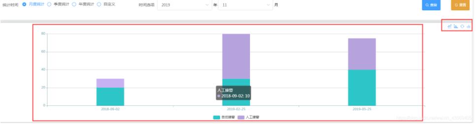
this.xAxisData = ['2018-09-02', '2019-02-25', '2019-05-25']
this.seriesData = [
{
name: '自动接警',
type: 'bar',
stack:'111',//堆叠
barMaxWidth: '100',//柱状图最大宽度
data: [20, 30, 40]
},
{
name: '人工接警',
type: 'bar',
stack:'111',//堆叠
barMaxWidth: '100',//柱状图最大宽度
data: [10, 50, 35]
}
]
this.$nextTick(() => {
eventBus.$emit('window-resize')
this.$refs.barCharts.initCharts()
})
},
methods: {
onSearch(data) {}
}
}
</script>
<style scoped>
</style>效果图
感谢各位的阅读,以上就是“怎么用vue以及echarts实现堆叠柱状图”的内容了,经过本文的学习后,相信大家对怎么用vue以及echarts实现堆叠柱状图这一问题有了更深刻的体会,具体使用情况还需要大家实践验证。这里是亿速云,小编将为大家推送更多相关知识点的文章,欢迎关注!
免责声明:本站发布的内容(图片、视频和文字)以原创、转载和分享为主,文章观点不代表本网站立场,如果涉及侵权请联系站长邮箱:is@yisu.com进行举报,并提供相关证据,一经查实,将立刻删除涉嫌侵权内容。


